Forbes Interactive Article
Forbes Best States For Business
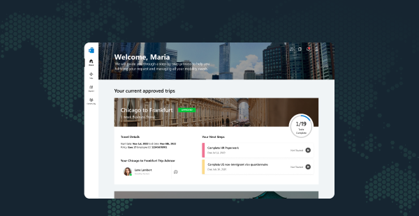
UX/UI Motion Research
Promoting traditional media online using new web-based design tools and information matching reader expectations.
Finding a way to promote traditional media in an online setting using new web-based design tools and reader expectations.
01 -
Overview
Forbes has had a difficult time transitioning to the online marketplace and needs a solution to drive-up traffic. Forbes tasked us with finding a way to bring more readers, subscribers, and revenue to the website.
 Tools Used
Figma Cinema 4D After Effects
 Roles
Roles
(Independent) UX/UI User Research Motion Visual Design
 Timeline
Spring 2019
Solution
Round 1
Conducted primary research to gather insights from 44 potential readers for Forbes; this included finding what people want from a financial news website.
Round 2
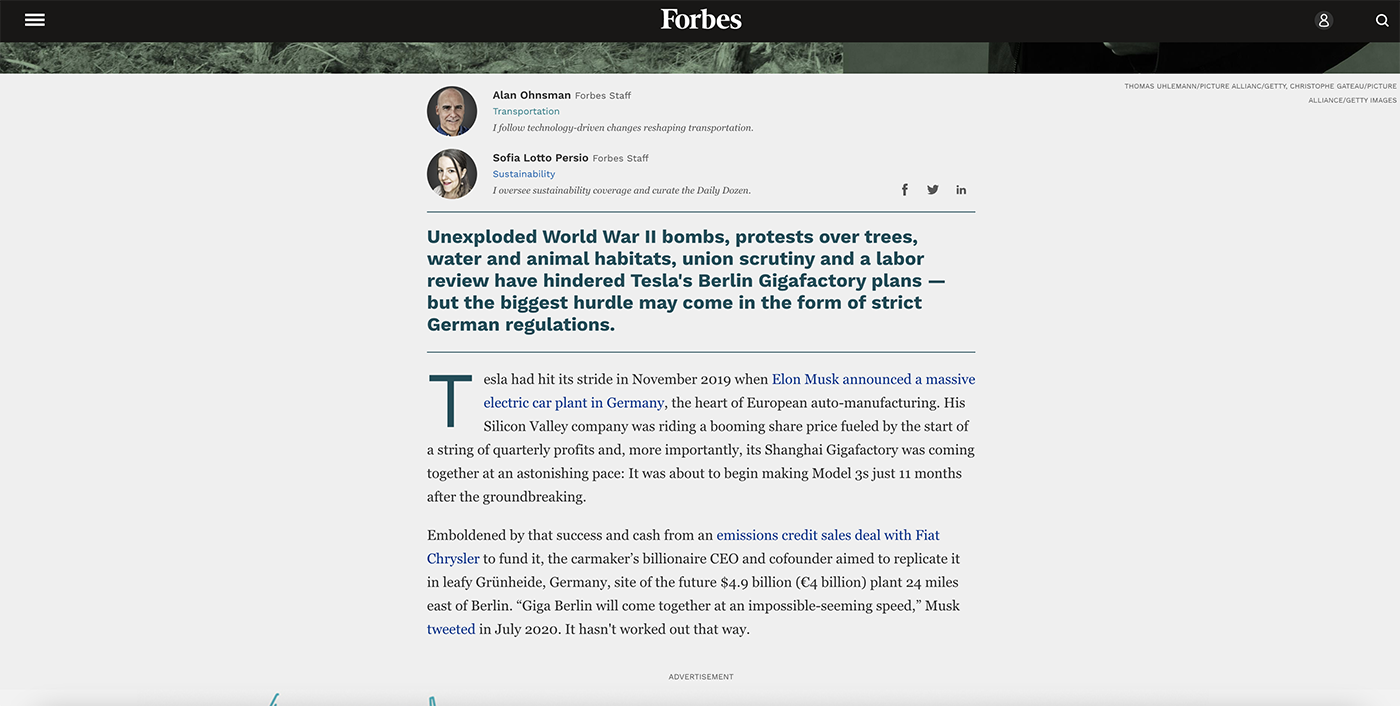
Created an interactive article informed by feedback from the interviews to hit user needs. The deliverables included wireframes, high-fidelity mock-ups, and motion graphics.
02 -
Prompt
Promt
Connecting Readers to the Forbes Brand
It is difficult for established journalism to thrive in the online world. Many users go to a news site, read an article, and never come back. The decrease in retention rates has significantly lowered the profit margin of traditional media.
Forbes CEO, CFO, and a primary developer asked us to find a way to create a stronger bond between users and the Forbes website so that users come back to the website more often.
Problems and Current Strategy
Forbes primarily focuses on retaining the audience that it gained while being a print publication and transitioning them onto the online sphere. However, they have issues with attracting new readers.
Solely relying on the name of Forbes and word of mouth from long-term users is only getting users to visit the site, but not encouraging them to return. News websites live off of users coming back and interacting with the site repeatedly. Although 70 million users would read an article on the Forbes website, they never find their way back.
03 -
Interviews
To get a better idea of why people were not coming back, I decided to conduct a public interview with 44 participants who matched Forbes' internal metrics for the most engaged users between the ages of 18 and 34. These are the common trends I found.
↔️ Decisions
People expect an economic news website to help them make informed financial decisions. Forbes does not do this well.
 Exploration
Potential readers felt that there was no benefit to explore outside the article they found from a Google search.
 Information
There is no compendium of useful information on Forbes' website so that users can refer to a topic efficiently.
 Boring Display
The Forbes brand may come off as “boring and too wordy” as some users suggested, repelling potential readers.
 Lack of Sharing
Users don’t like sharing opinionated articles because it may lead to judgment from peers who believe otherwise; Forbes primarily shared these articles as of the production of this project. People like sharing things they find “cool and useful” on social media.
Pain Points
Users find that there is not a lot of content that matches what they want from a Forbes experience. They express that, while there may be some useful information, it does not help with the actual decision.

Take-Aways
Create a web-based article application that shows users information that will help them make financial decisions. Build a sharable website so that users come back for more.
Here are some interactive articles used for competitive analysis:
04 -
Goals
In order of importance:
 Bring in new subscribers
 Retain current readers
 Give users helpful information
 Provide Forbes readers with a unique experience
05 -
My Solution
Transform current articles visually and content-wise so that they meet the goals stated above.
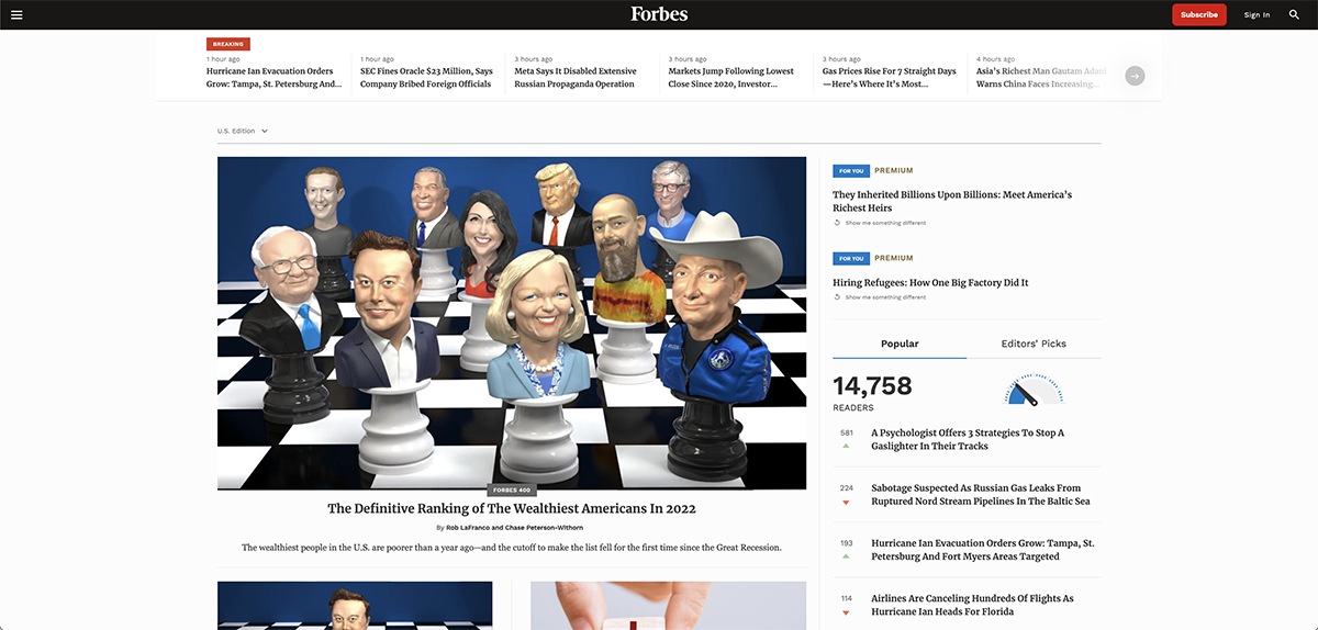
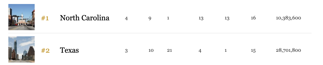
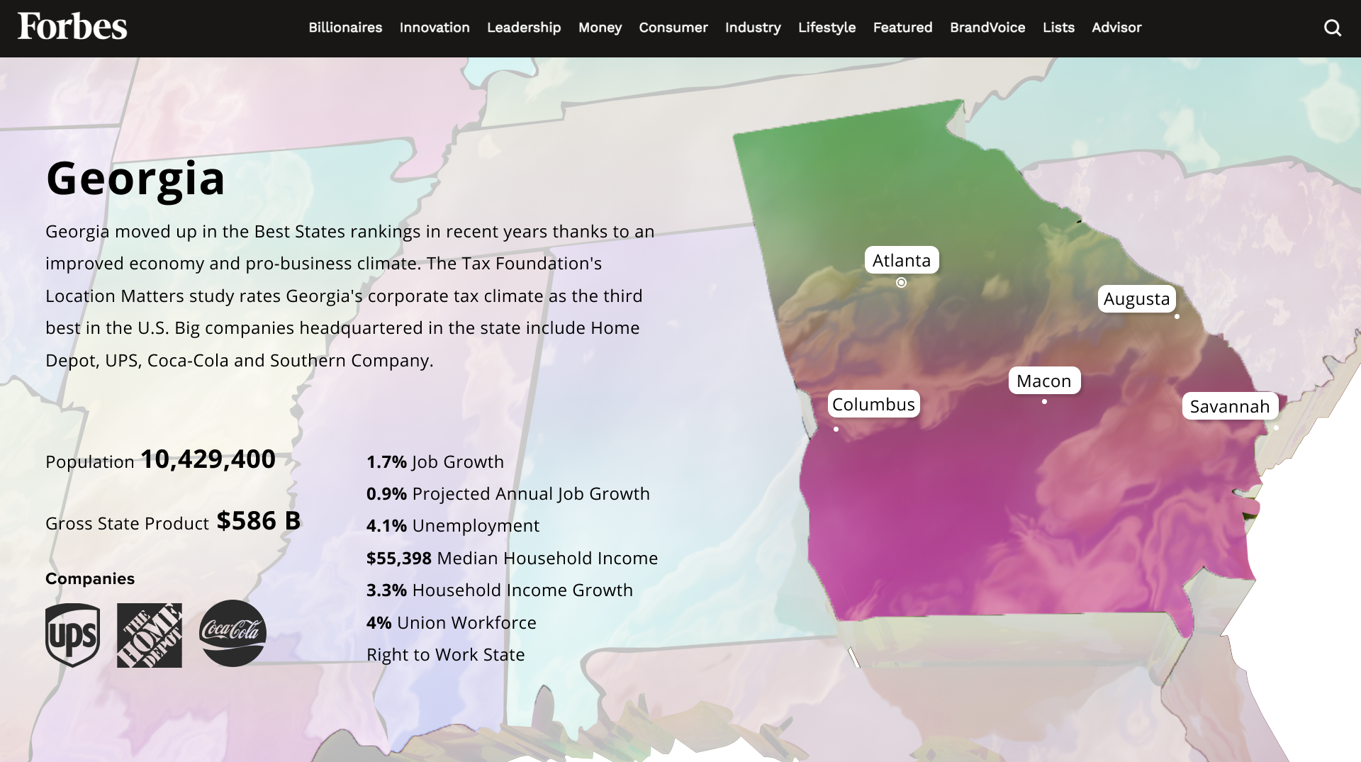
I found Forbes' 2018 article Best States For Business as an example to showcase my solution since it provides information that could help readers make financial decisions.
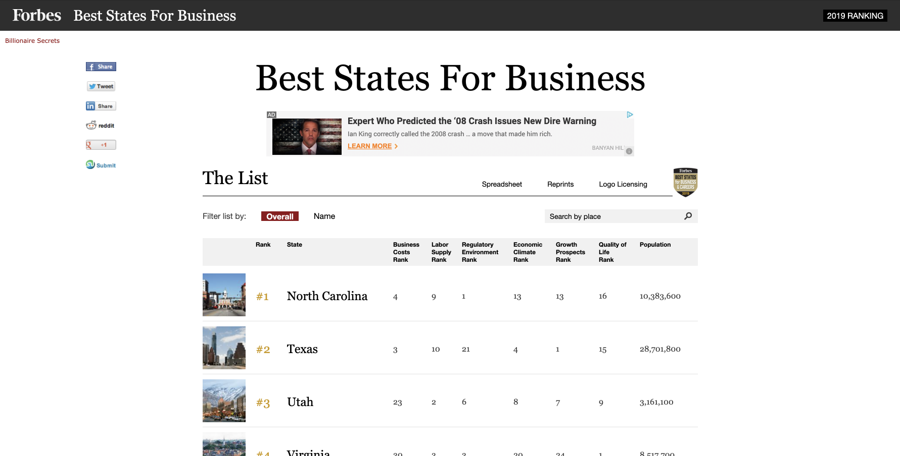
Issues with the current design
01 - Type
Black text on a white background makes the article blend in with other content on the site.
It is currently just black text on a white background making it blend in with other content on the site.
02 - Depth
It lacks detail on each state's economy such as which industries are the most prevalent in the state.
There is no information the pertains to specific aspects of each state such as types of businesses in the state.
03 - Tracking
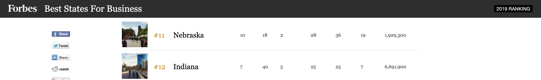
Column names of the data table disappear as the user scrolls down.
There are no labels saying what each number means as you scroll down the page making it hard to remember what each number means.
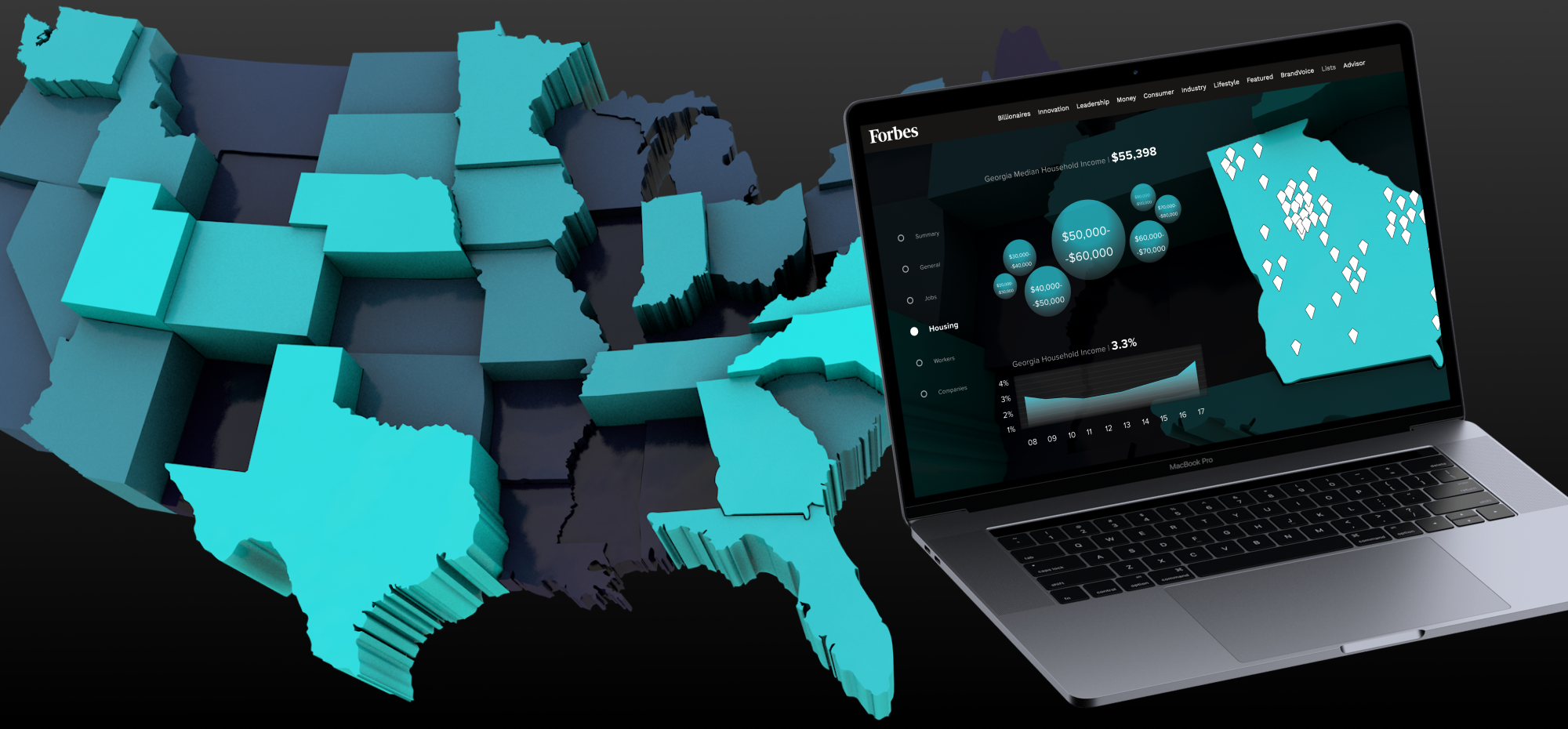
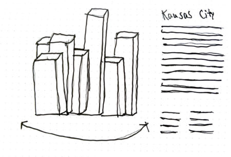
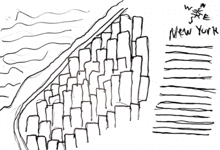
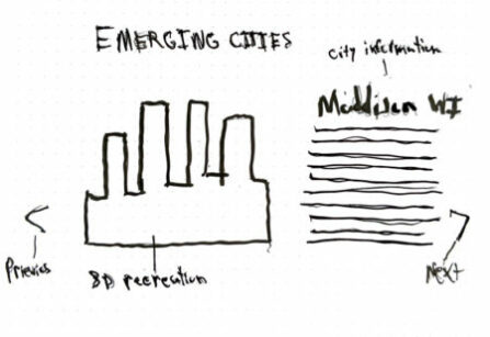
Initial Solution: 3D-Visualization of Cities
My first idea was to create detailed visualization of major cities completed with information about local economies in each state. I sketched out a few ideas and made a test animation, but I abandoned this idea because I found that a U.S. map better captures the essence of this article.
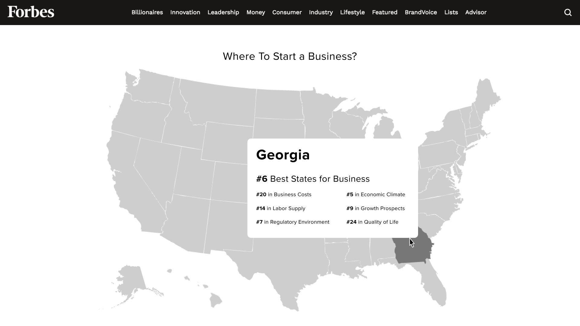
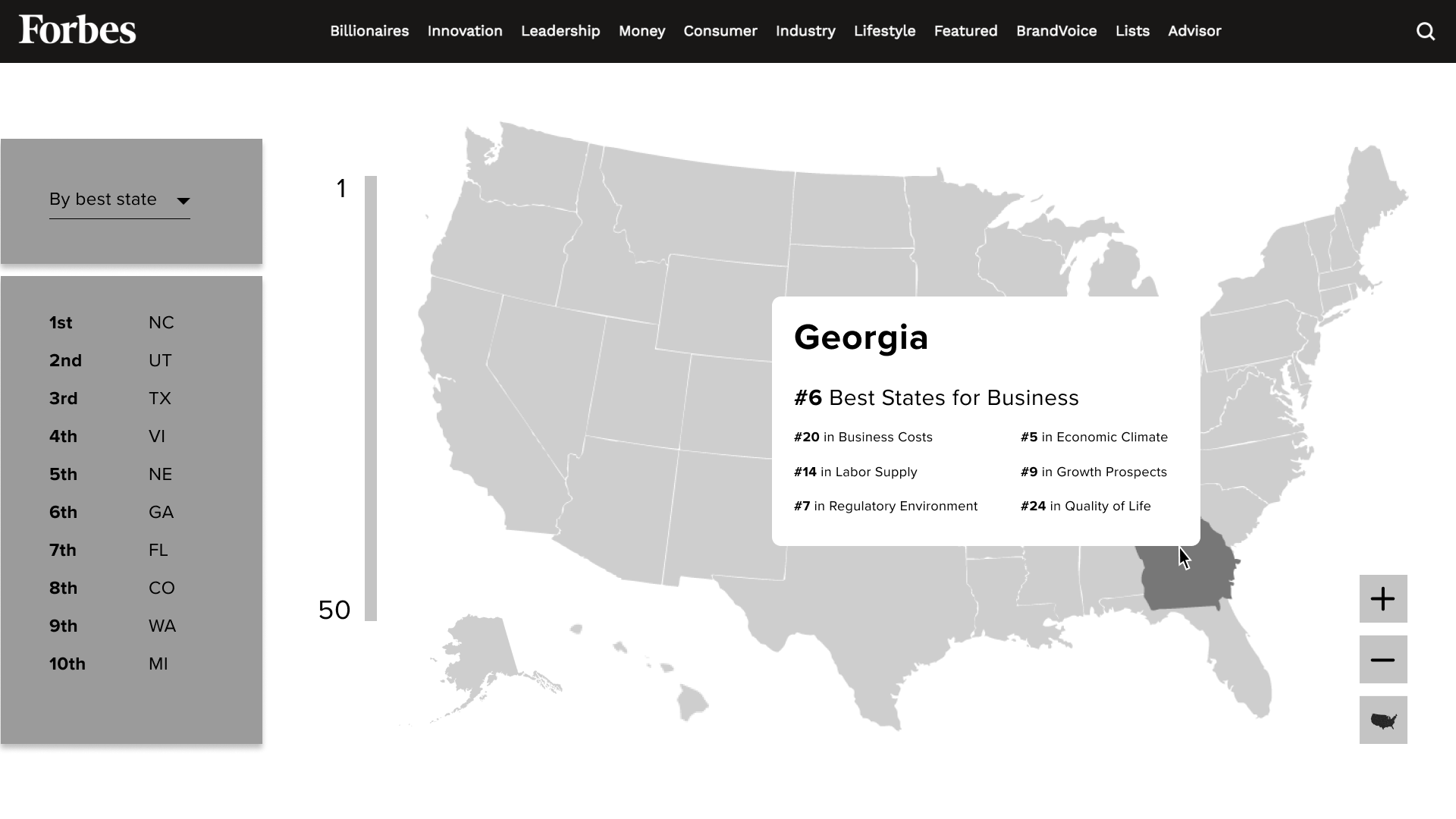
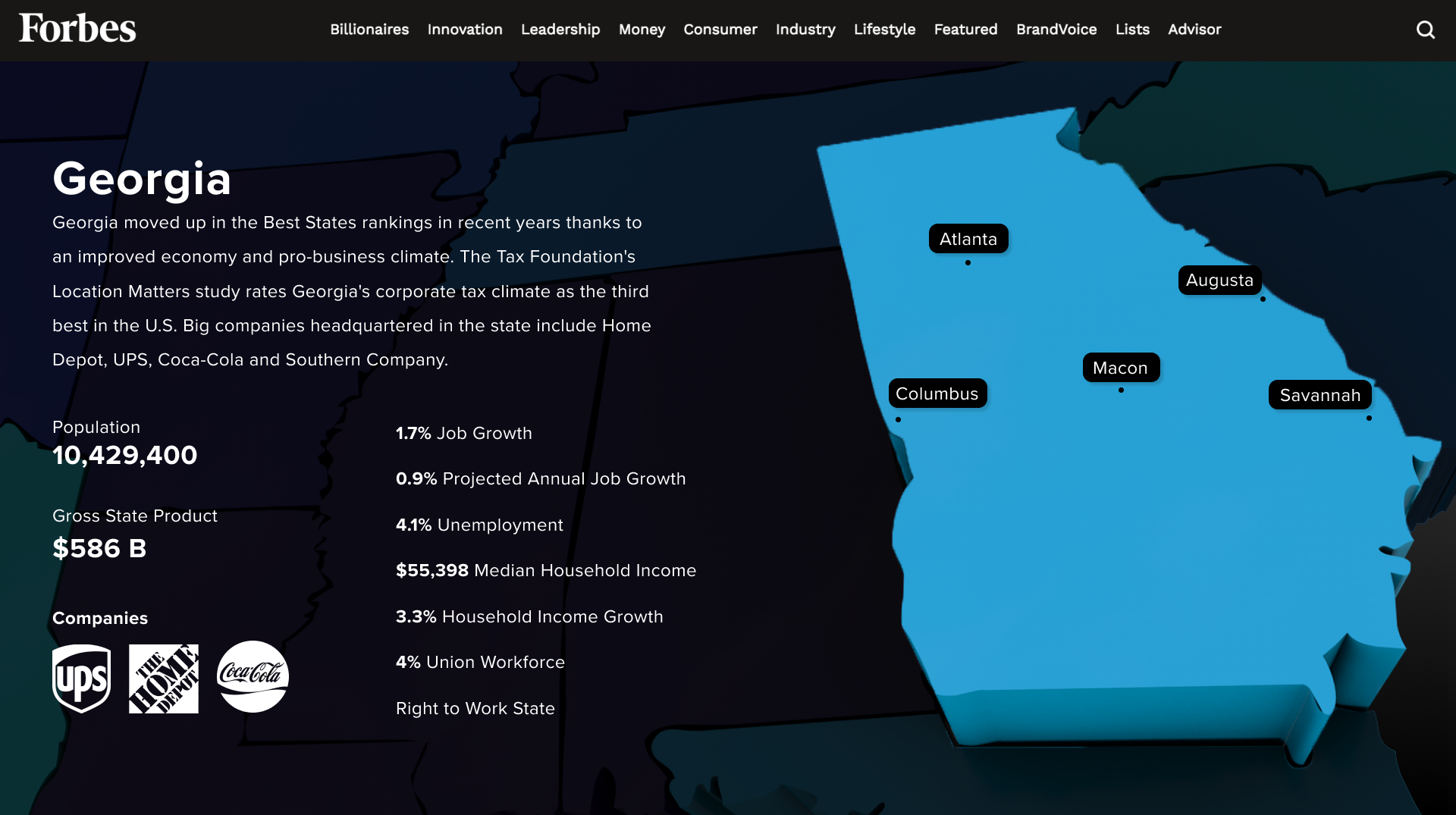
Final Solution: Better Visualization of State Rankings
The new iteration is based on the U.S. map. I created a few wireframes to show how a user could move through the map. A user can click on a state to access multiple pages of data specific to that state, helping them make financial decisions.
06 -
Visual Design
I made 2 different mood boards to explore visual directions.
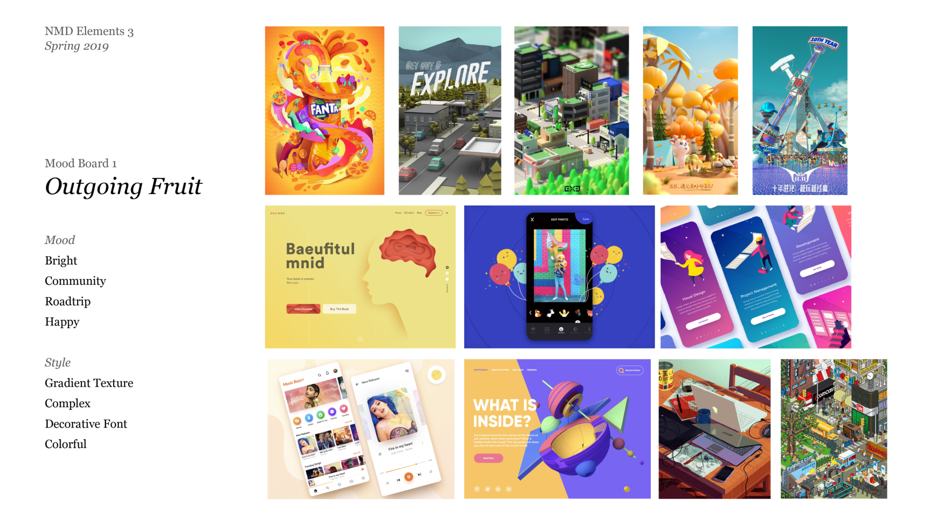
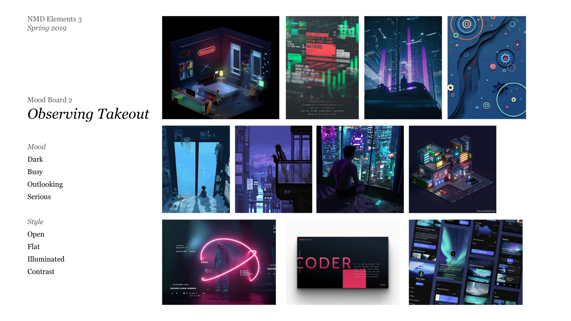
I chose the Observing Takeout board as it is consistent with my goal of making the application more “cool and useful” and the Forbes branding that is darker and more achromatic.
07 -
Final Comps
I developed the idea further by adding shades of blue to the user interface; this adds depth and ties the design better to the map visually.
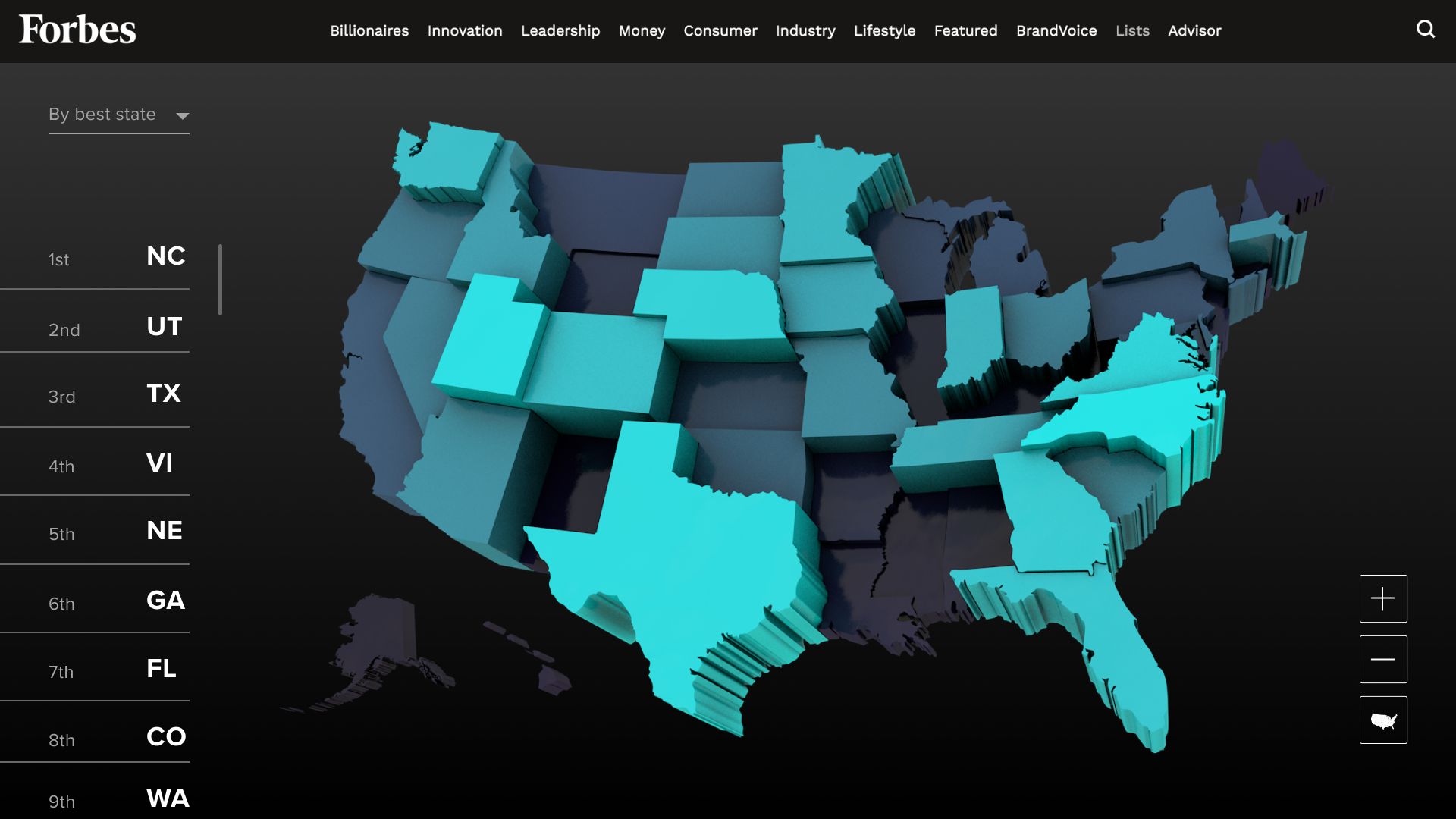
Landing
The first screen shows the reader a map of all the states. States ranked higher by Forbes are in brighter shades of blue and taller.
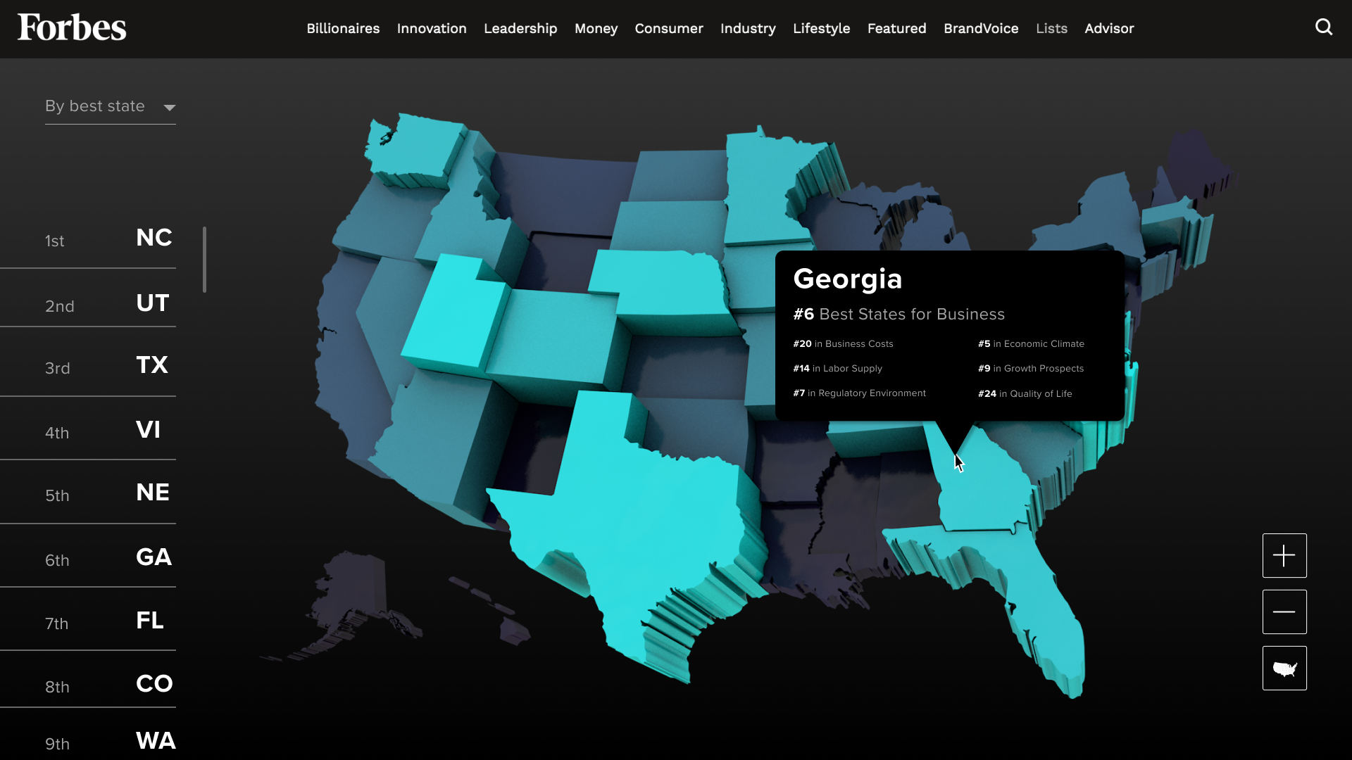
Summary
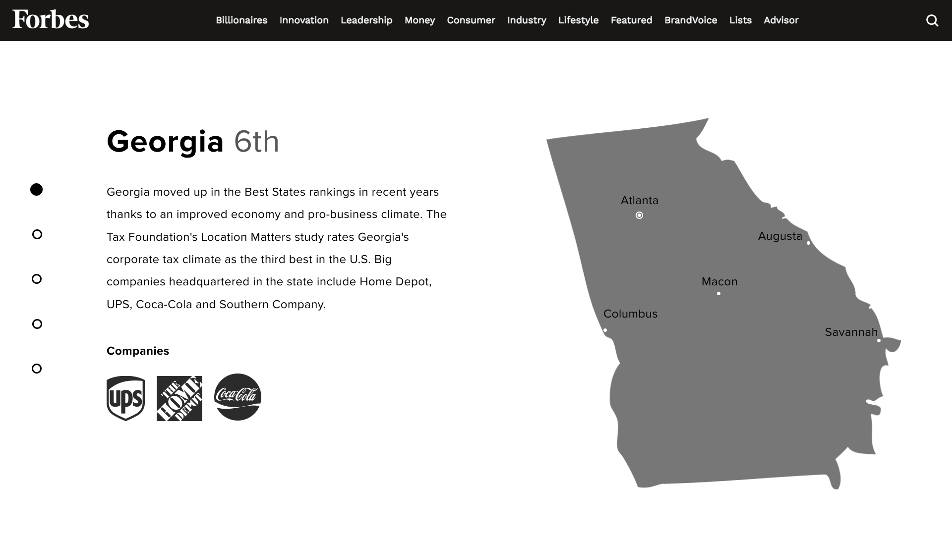
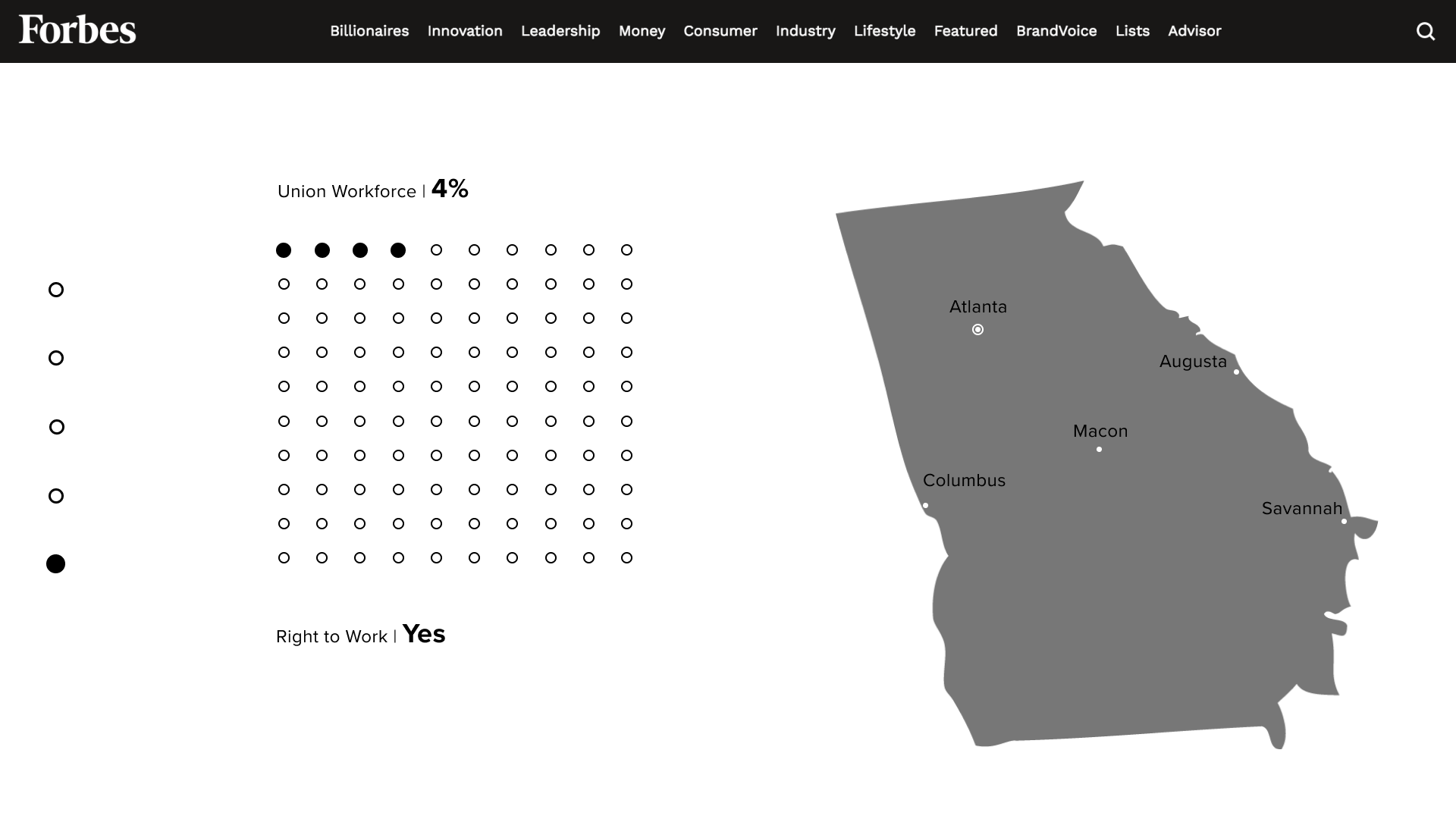
State data is separated into 5 sections to provide more information without being overwhelming.
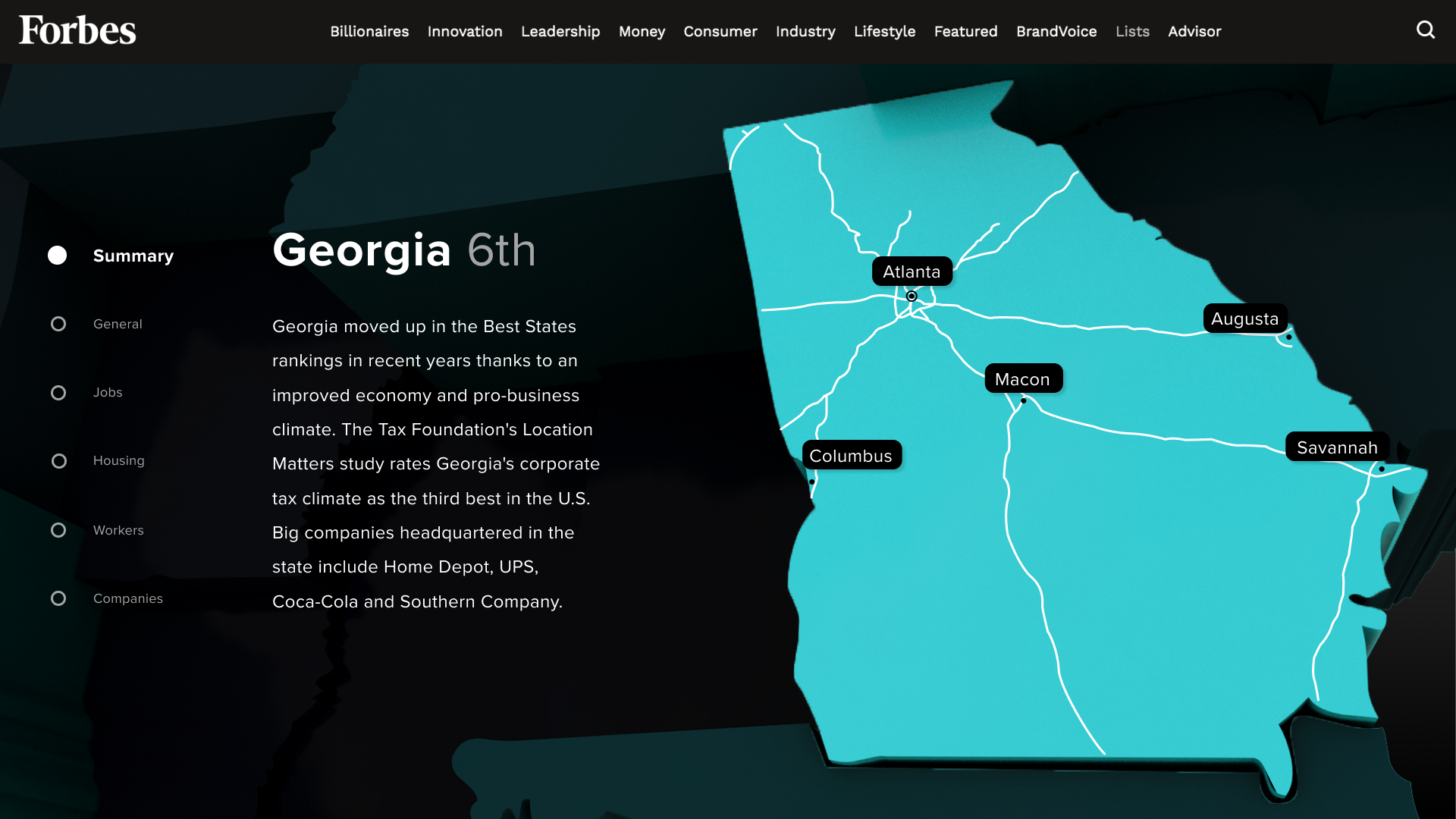
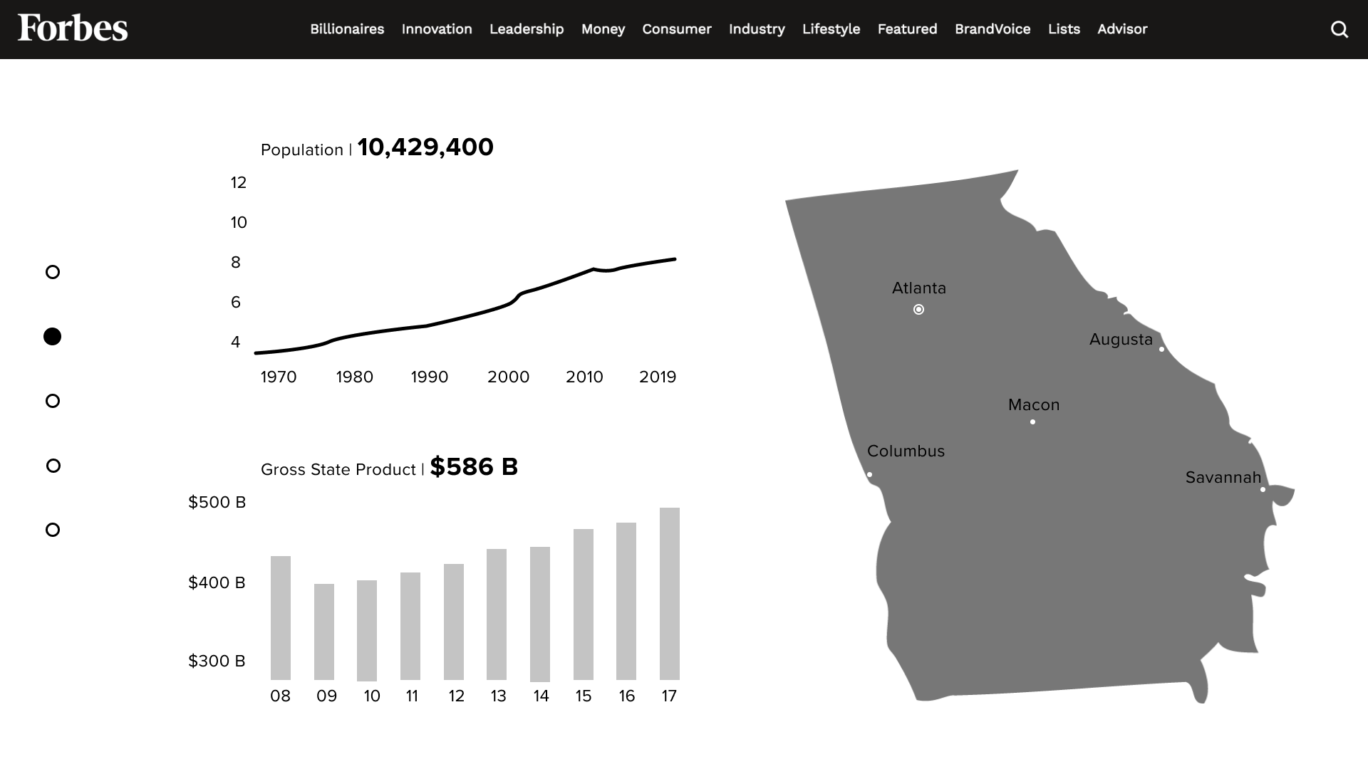
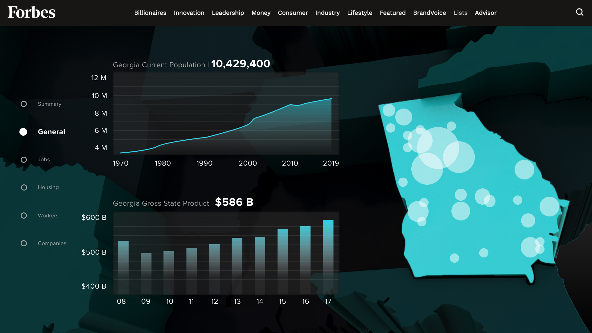
General
This page shows the growth trajectories of each state's population and GDP.
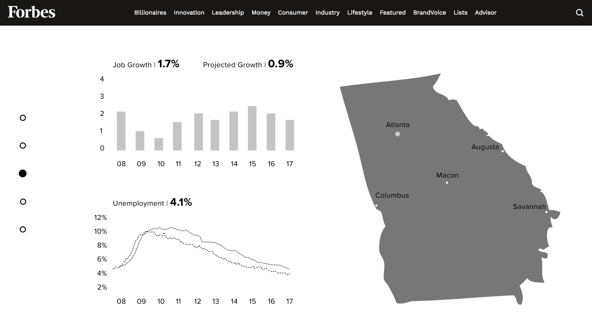
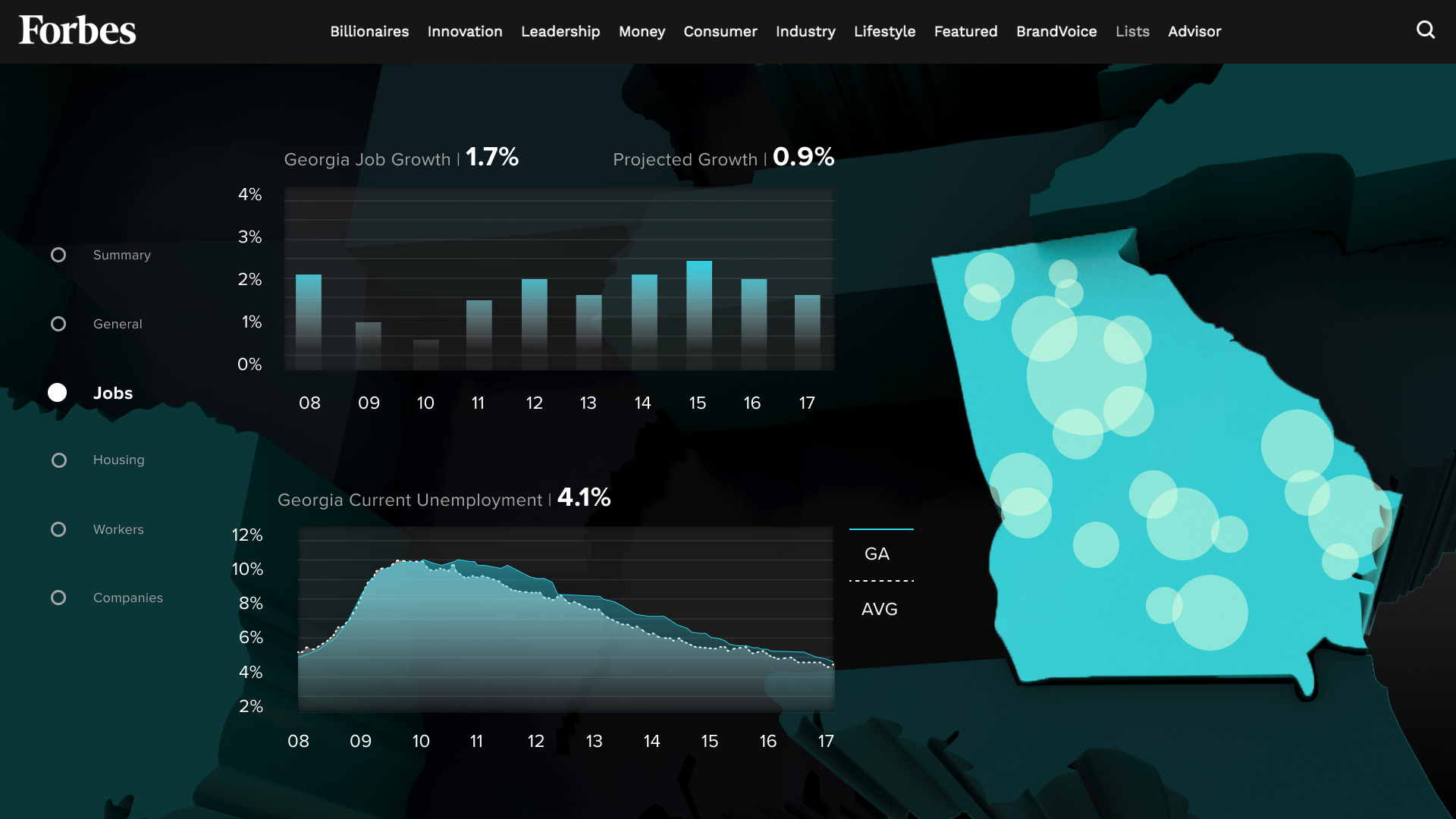
Jobs
Trends in employment rate are complemented by visualization of the number of jobs in different locations in the state.
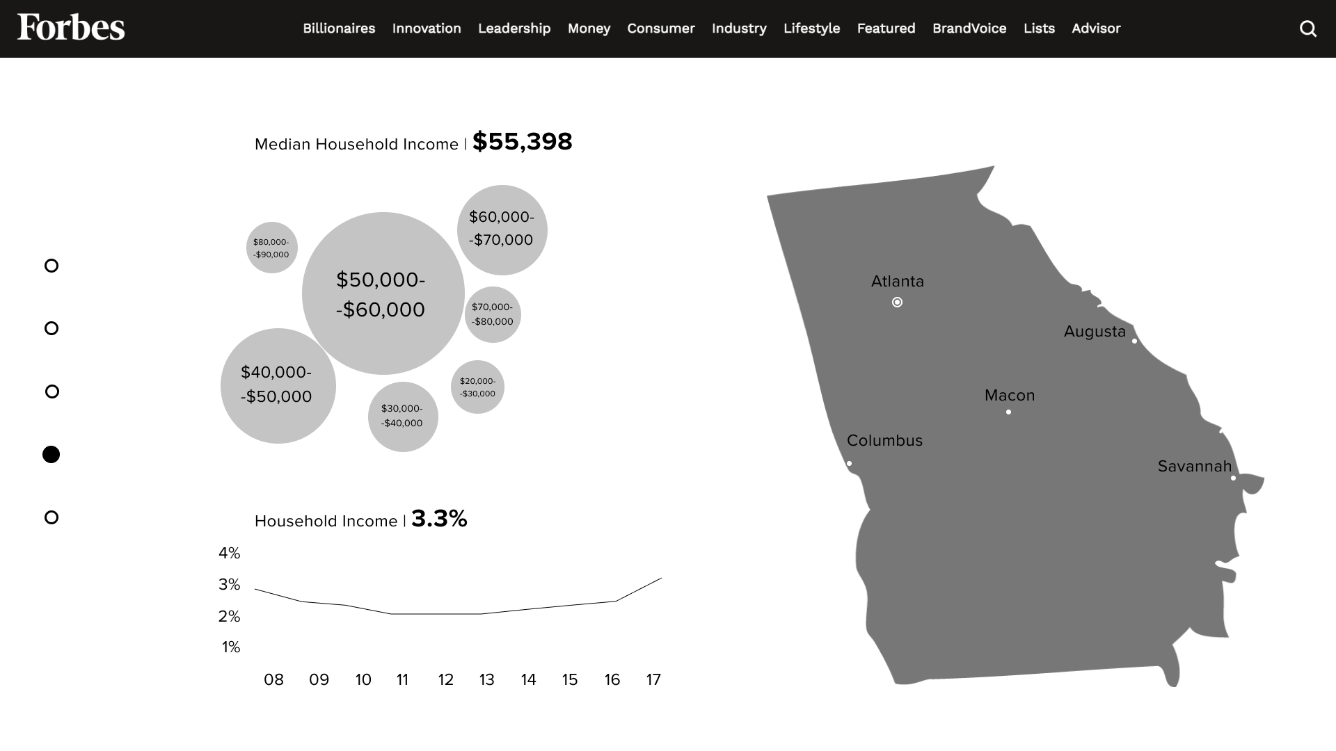
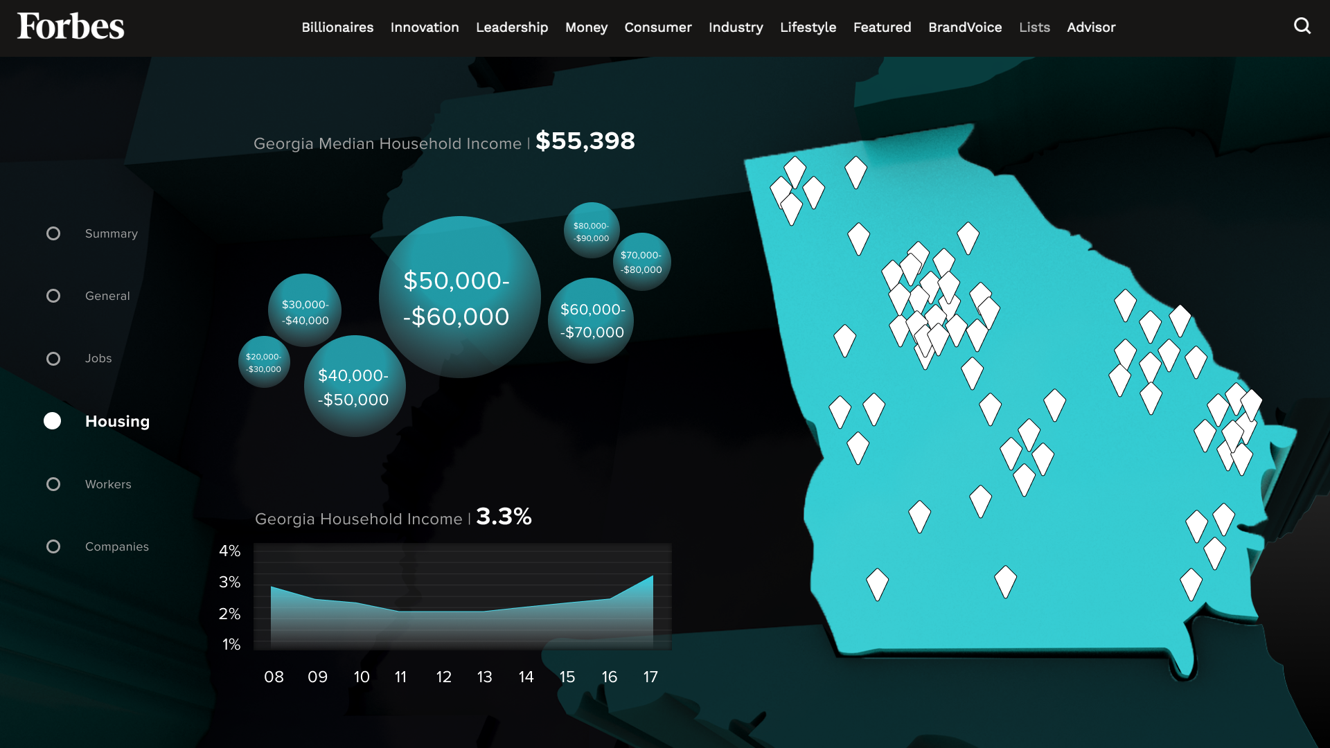
Housing
The average county housing prices and wages help employers figure out how much labor costs.
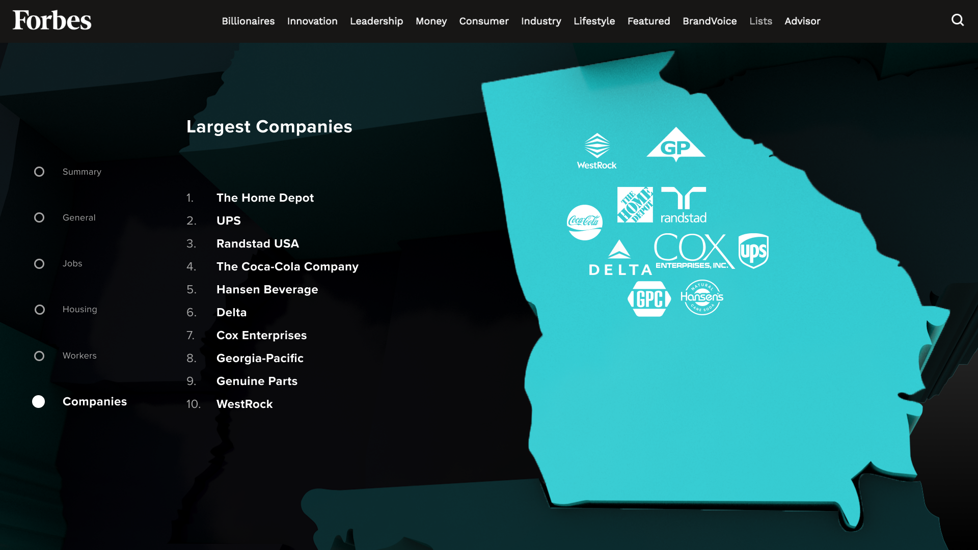
Companies
The final piece of data shows the biggest companies in each state and where they are located.
08 -
Closing Thoughts
Challenges
Working with Data
Although it took a lot of effort to find trends in the data and determine what to discard, I learned how to better quantify user feedback.
Researching the Client
It took time and patience to learn what Forbes had to offer and what could be improved. This project taught me how to better understand a client.
Presenting
I had to present information efficiently since I was talking to the CEO and CFO of Forbes. I also needed to explain how my solution would change the rest of the site and why it could increase Forbes' profit.
Gains
This project was an opportunity for me to practice combining skills in motion graphics, user experience, and data-driven user research. It was fun learning how these 3 skills can work together to make a better-designed product.
If I Had More Time
Mobile
I would like to make a mobile version of my design as many young users prefer reading news on their phones over laptops.
Check out more 
Check out more
Lead Suspect Management

Working With Buz