 Timeline
4 Weeks, Fall 2022
 Tools Used
Figma Maze
Figma
 Roles
Roles
Lead Designer for Logging Flow User Researcher Visual Designer Micro Animatior
User Experience User Research Visual Design Micro Animation
01 -
Project Overview
This project was commissioned by a wealth management company looking to update their designs. They wanted to encourage employees' usage of the company’s internal system when identifying potential clients. Our goal is to get agents to complete a full profile multiple times a day.
 The client will remain unnamed as per NDA agreements
Process

Results
The work was sold to the client and productivity was raised on every metric.
 Time to complete Lead profile

 Average Adoption Rate by Agents

Scroll Down to Read Full Case Study
Problems
Too much redundant information and having to fill it out manually was reducing productivity.
The tool for client logging is not being used by the employees of the agency, resulting in incomplete client information being recorded all over the system. The tool is outdated, requires full manual inputs for information to be logged, and users have to type while on the phone with potential clients. Redundant information is often required. As a result, agents were barely using the tool; an ecosystem where records are poorly kept was created.
Goals
 Improve Retention
"Tackle the issue of agent retention to the system and ensure that proper records are logged of potential clients."
 Easy to Navigate
 Easy to Navigate
"Providing completion status and asking simpler questions to help level set expectations, boost transparency, and reduce cognitive burden."
 New Look
"A clean and simple interface makes this otherwise overwhelming process much more manageable."
 Drop and Pick Up
"Allowing agents to pause and resume progress so that agents input the most critical information."
Timeline

02 -
Client Rundown
Our goal is to encourage agents to complete a full profile multiple times a day. To achieve this, I first needed to understand the agents' perspectives—how they felt about the current tools and what they needed them to become.
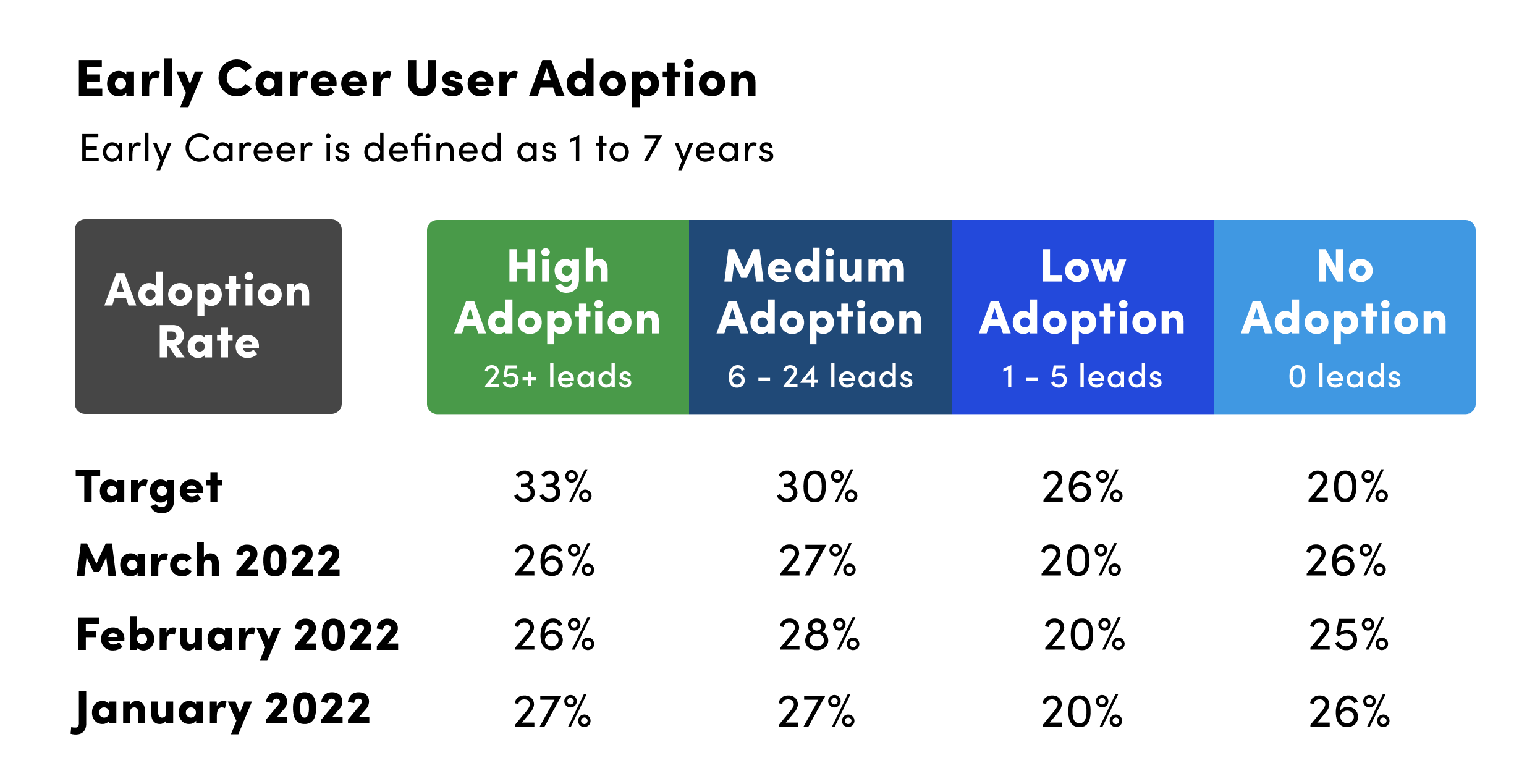
Adoption Rates Were Too Low
The data shown demonstrated that agents 1 to 7 years into their careers only logged about 20% of the Leads they talked with. This statistic only barely rose with the expansions of their client base.
Outdated Logging System Slowing Down Productivity
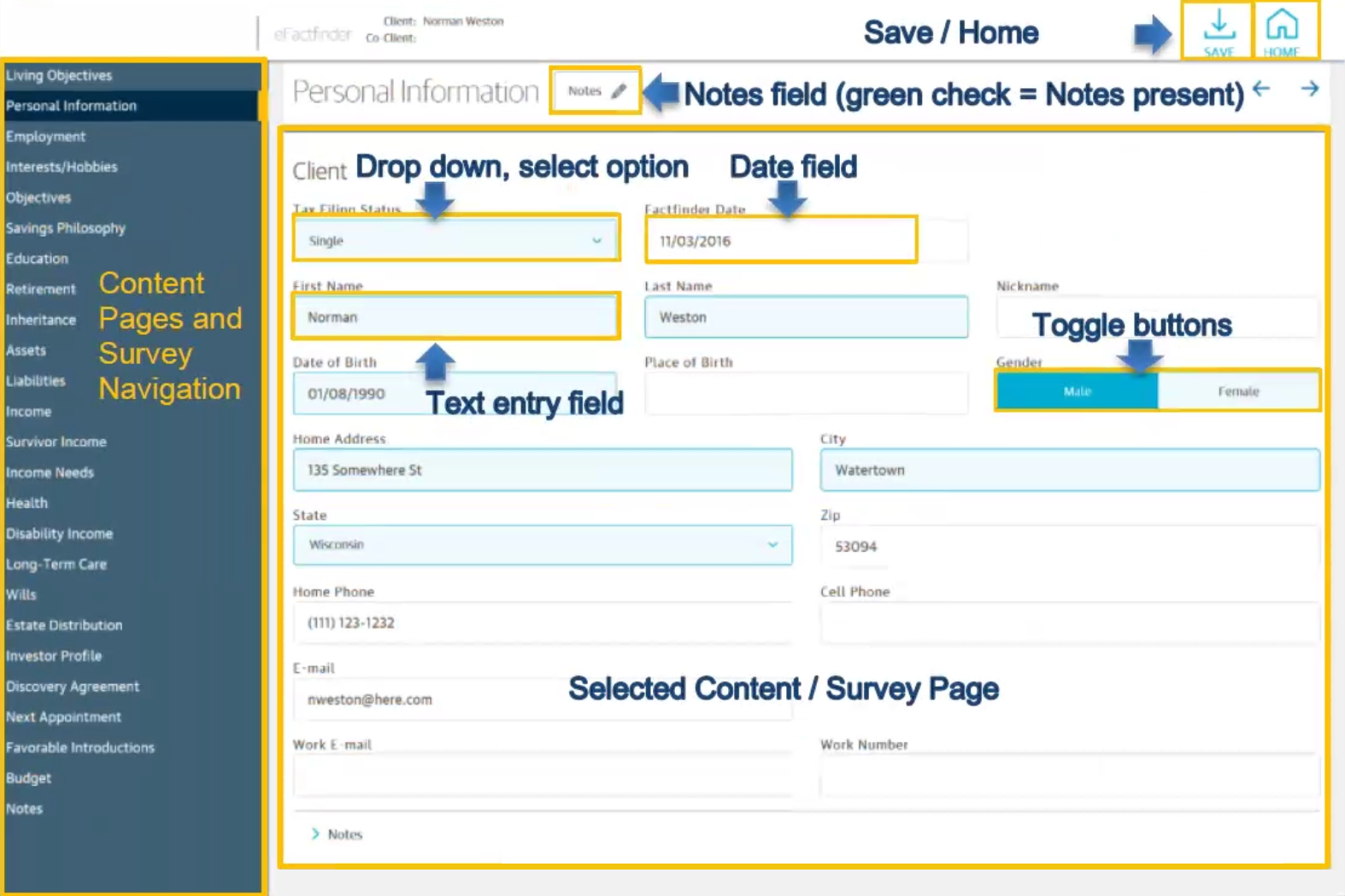
Primarily, the low adoption rates come from the outdated design of the Lead system. The original design was only a list of text boxes that had to be filled manually. Most of the information served no purpose other than to take up agents' time. I needed to transform the tool so that it is more effective for both the agency and the agents.
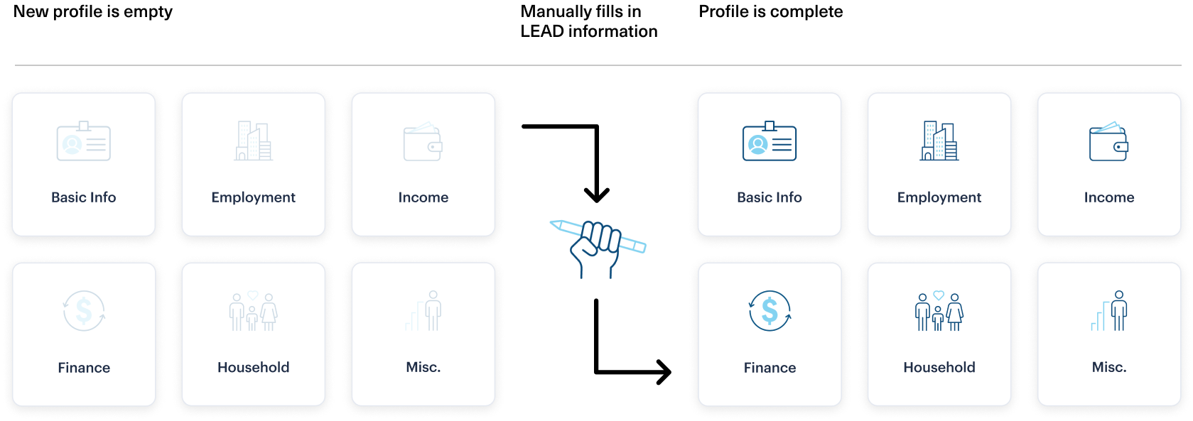
Pain Points
Then, I needed to get to know my audience. I performed a few user interviews with 2 agents. I observed their feedback to understand where their pain points were to better address their concerns.
All feedback provided by the agents of the client
“The CRM tool asks too many questions that don’t seem important, or I don't know the answer to.”
“I feel overwhelmed when using the CRM. I just don't know where to start.”
“Manually entering information from Efact finder in CRM is duplicative and frustrating.”
“Sometimes people say that they're already a NM client and wonder why we are calling.”
“Entering information is time consuming so I prefer to manage my Leads offline until I’m confident they will move forward.”
“Joint work is difficult – sharing and merging contacts doesn't always work leading to duplicate records.”
User Personas
The result of this exercise gave us the user flows that we would use in our final solution.
Based on the pain points I created 2 user personas to represent a Financial Representative and a Client Services Associate. These two positions embody the primary occupations that would be interacting with our solution. Both have familiarity with backend tech products, yet they have different years of experience in the financial world. With both agent's perspectives being defined a user flow to solve their issues came together informing the final user flow of the engagement.
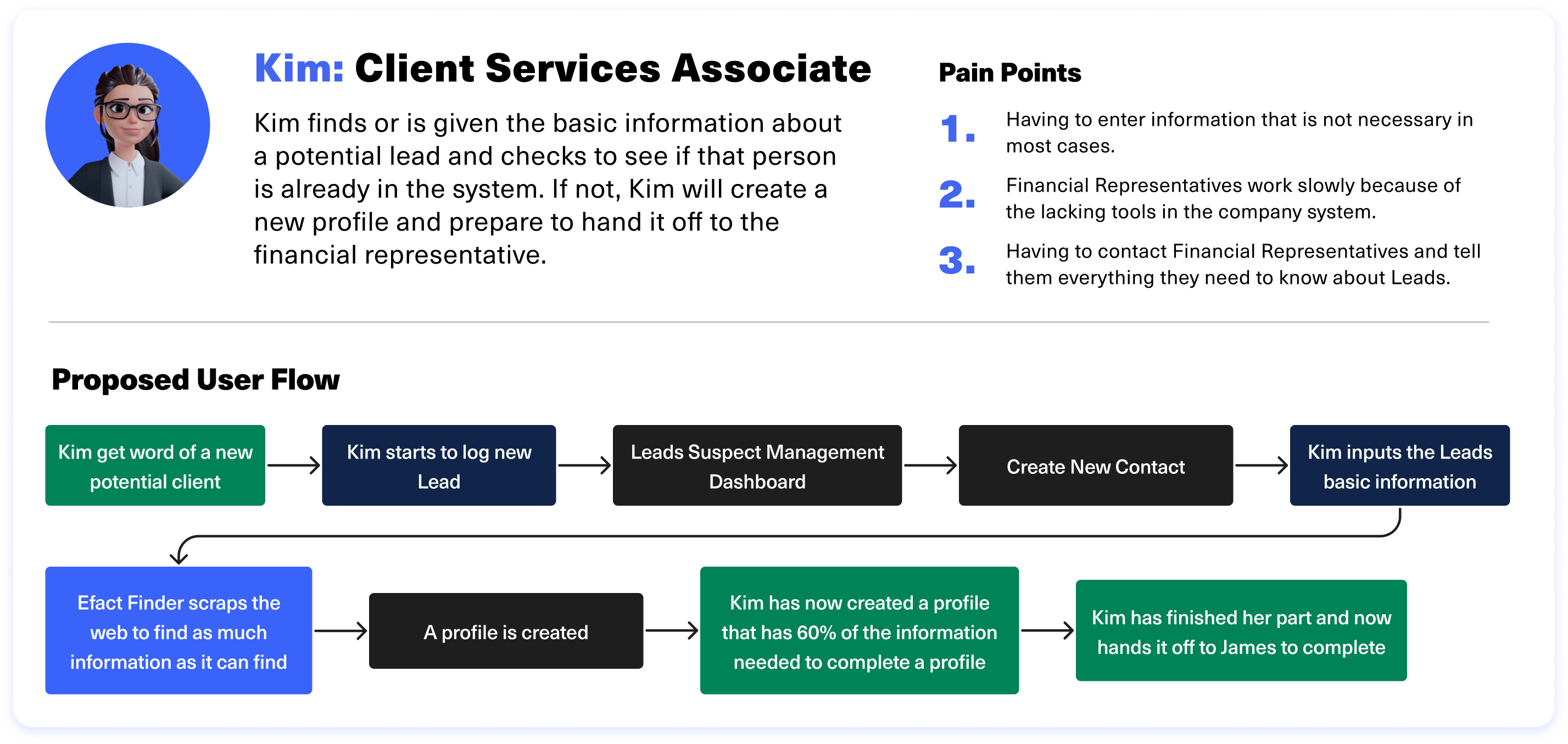
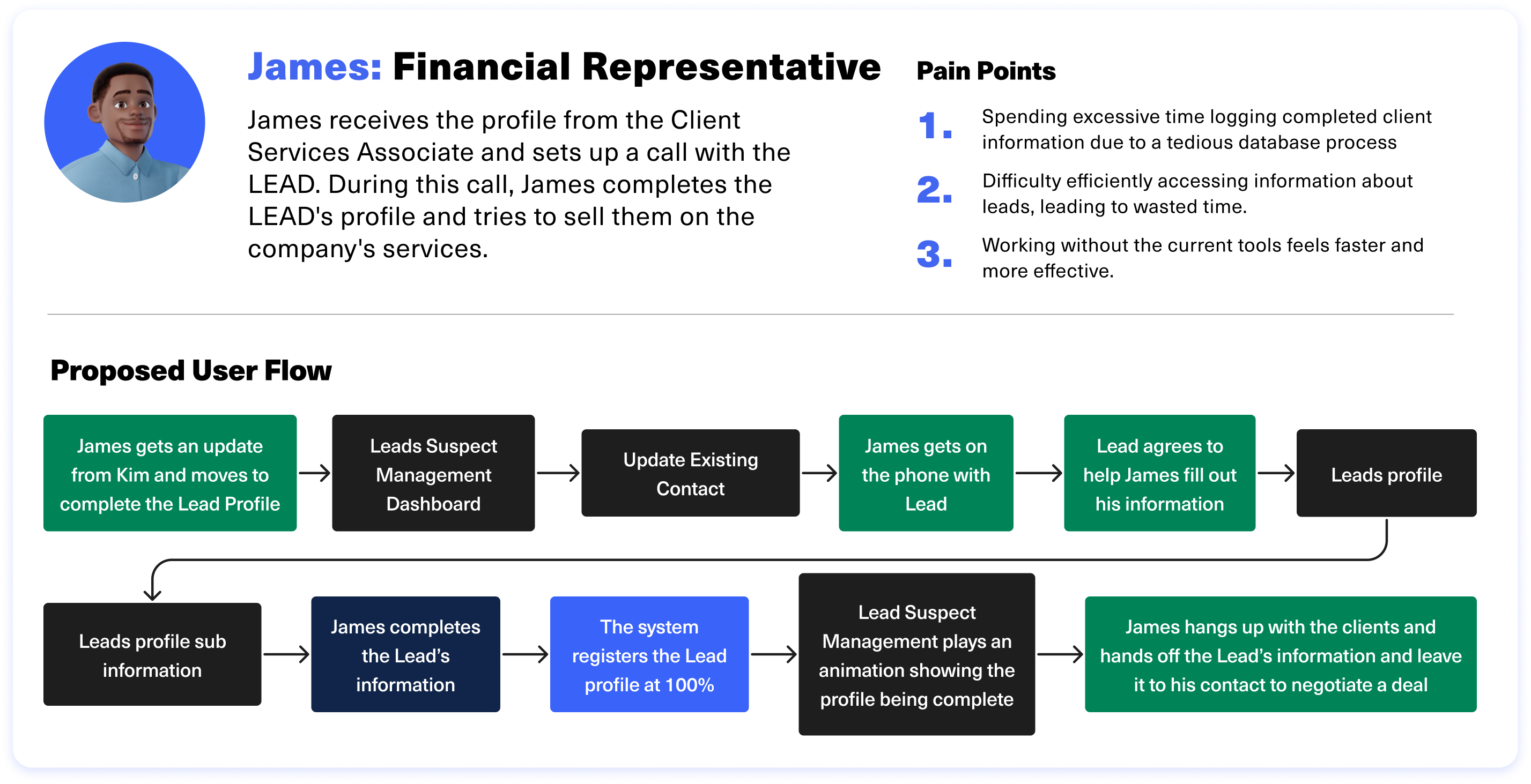
Product Goals
With knowledge of the users’ and clients’ needs, I had a clear idea of what was desired from both. This allowed us to push forward into the creation of the new Lead Suspect Management system.

03 -
Ideation
Wireframes
I had to address the pain points of the current design to create a new experience that helps both agents log and hand off their findings and simplify the data entry process.
We had to address the pain points of the current design to create a new experience that helps both agents log and hand off their findings and simplify the data entry process.
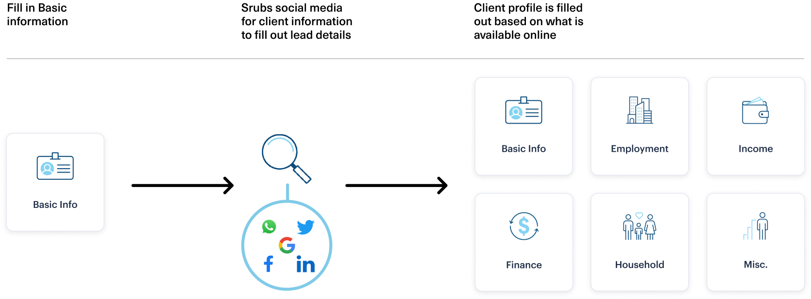
Reduction of Information Through Automation With Efact Finder
Using Efact Finder information entry can be automated by using basic information.
Kim needed a system to track Leads, and Efact Finder, developed by the client, could automate much of the process. I designed a streamlined workflow that leveraged Efact Finder’s web-scraping capabilities to gather Lead data from public sources like LinkedIn and Glassdoor using just a name, phone number, and address. This significantly boosted agents’ productivity by simplifying data collection and improving efficiency.
Visual Inspiration
I aimed to streamline the complicated old user interface, drawing inspiration from TurboTax's design, which simplifies complex tasks and guides agents smoothly through each step. A design audit of TurboTax highlighted key themes I wanted to incorporate.
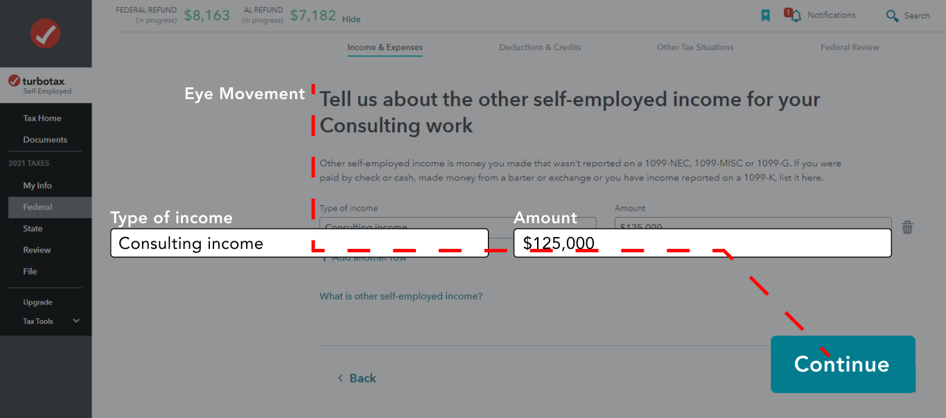
1. Large Type
TurboTax had excellent typography that condensed what the task was on each page into a few words.
2. Simple Tasks
To help with agents’ process of filling out complicated information, I learned from TurboTax and limited the tasks on screen to 1 or 2 at a time.
3. Progress Tracking
Making users’ progression clear is a big part of making sure that agents know where they are in a flow and that they are approaching a finished state.
Wireframes
Next, I built wireframes with our users' needs in mind. I began by wireframing a simple name entry page, which would serve as a starting point for building the rest of the product.
1. Agent Name
Displays the name of the agent filling out the Lead.
2. Progress Bar
Shows completion status of the logging of the Lead.
3. Questions
Questions are kept bolded and concise to keep the agent moving, preventing them from getting overwhelmed.
4. Text Boxes
Text boxes are larger to make scanning simple.
5. Continue
Calls To Action (CTA) are in a consistent location at the bottom so that quick muscle memory takes over and speeds up the Lead logging process.
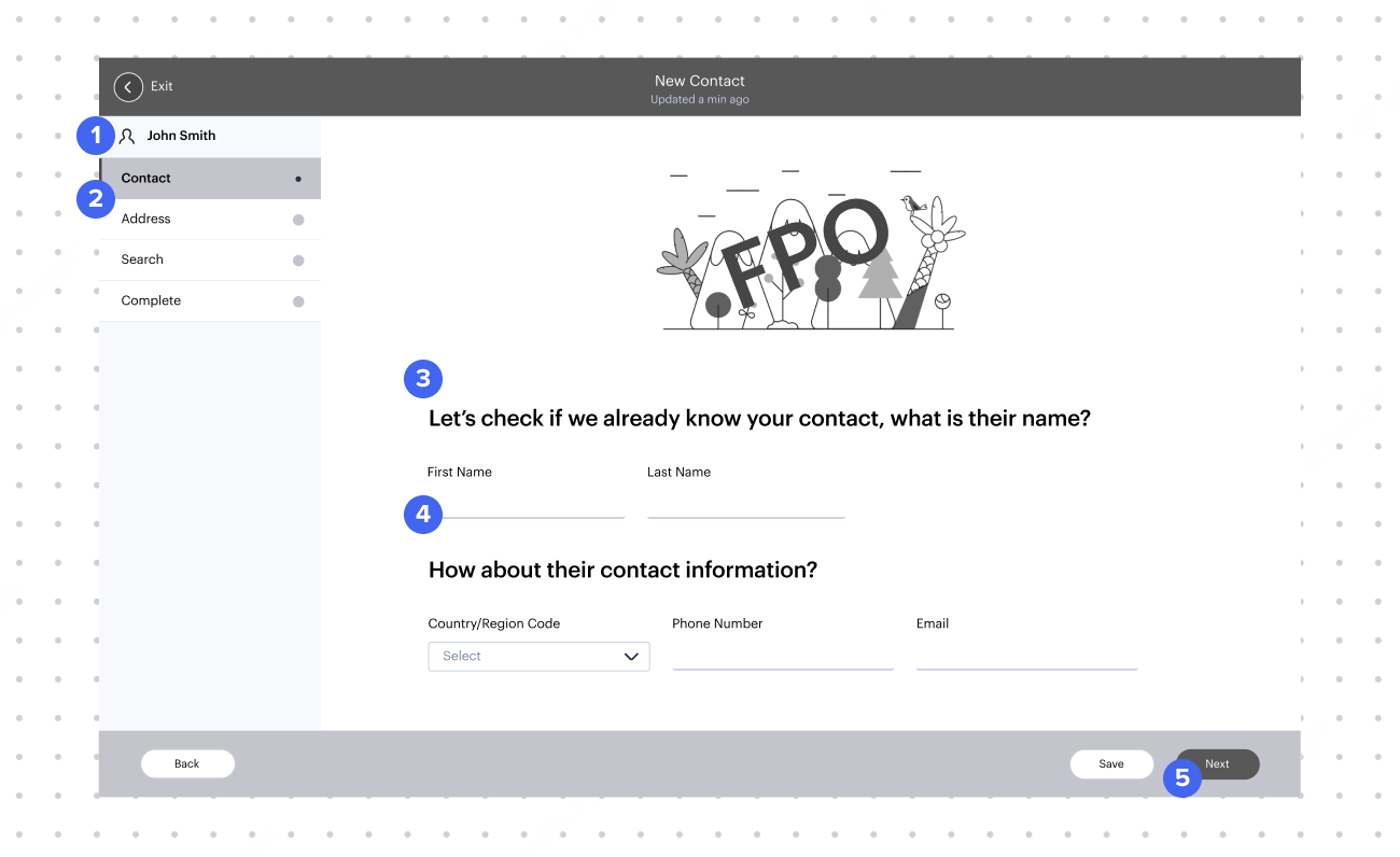
I minimized input fields per page in the contact-filling flow to reduce cognitive load and address back-end processing challenges. This adjustment, informed by discussions with the development team, helped distribute data more evenly, resulting in a smoother experience for clients, agents, and the system.
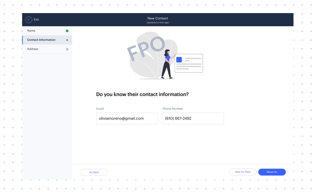
1. Lead Profiles
Displays the profiles that have already been created and can be added to.
2. Create New Profile
If the Lead profile does not exist, agents can create a new one.
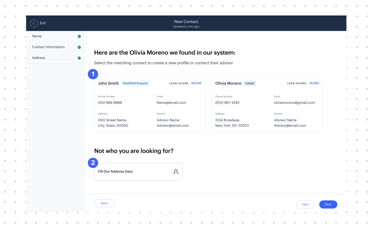
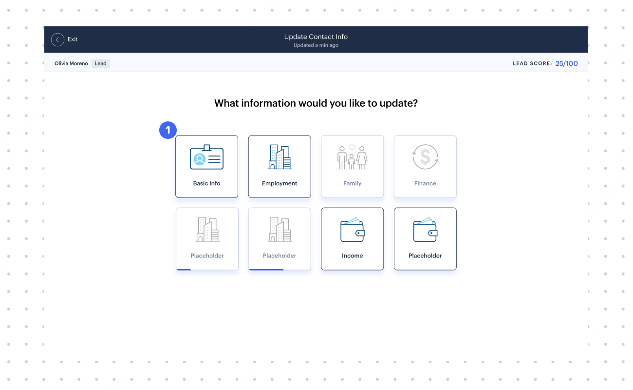
1. Profile Information
Blocks display the information the agents still need to fill in to complete the profile.

04 -
Final Solution
With our research and feedback on the wireframes, I moved onto our final deliverables.

For the Client Services Associate, they would start by selecting the “Create New Contact.” This adds a new profile in the Leads Suspect Management system and moves Kim onto the flow to fill out basic information.
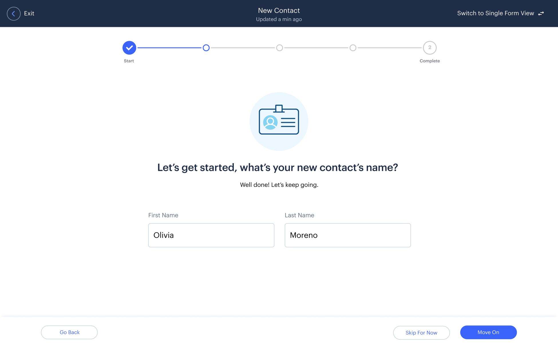
Filling The Forms
Adding the Lead’s basic information, i.e., name, contact information, and address, into the Leads Suspect Management system allows the system to search the web for the Lead’s complete profile.
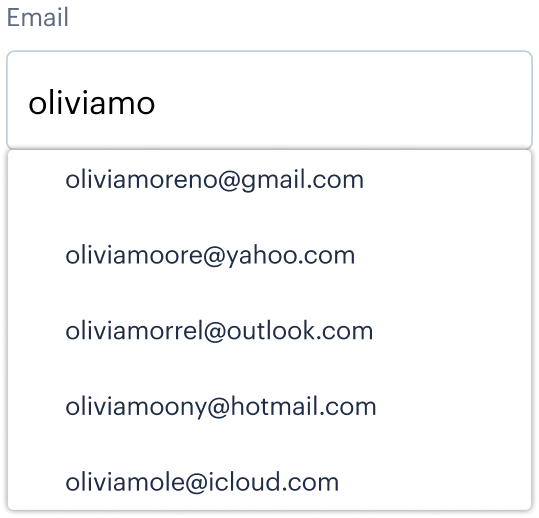
Fuzzy Search
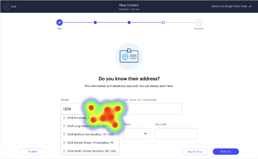
Autofill was added to speed up the process of entering basic information.
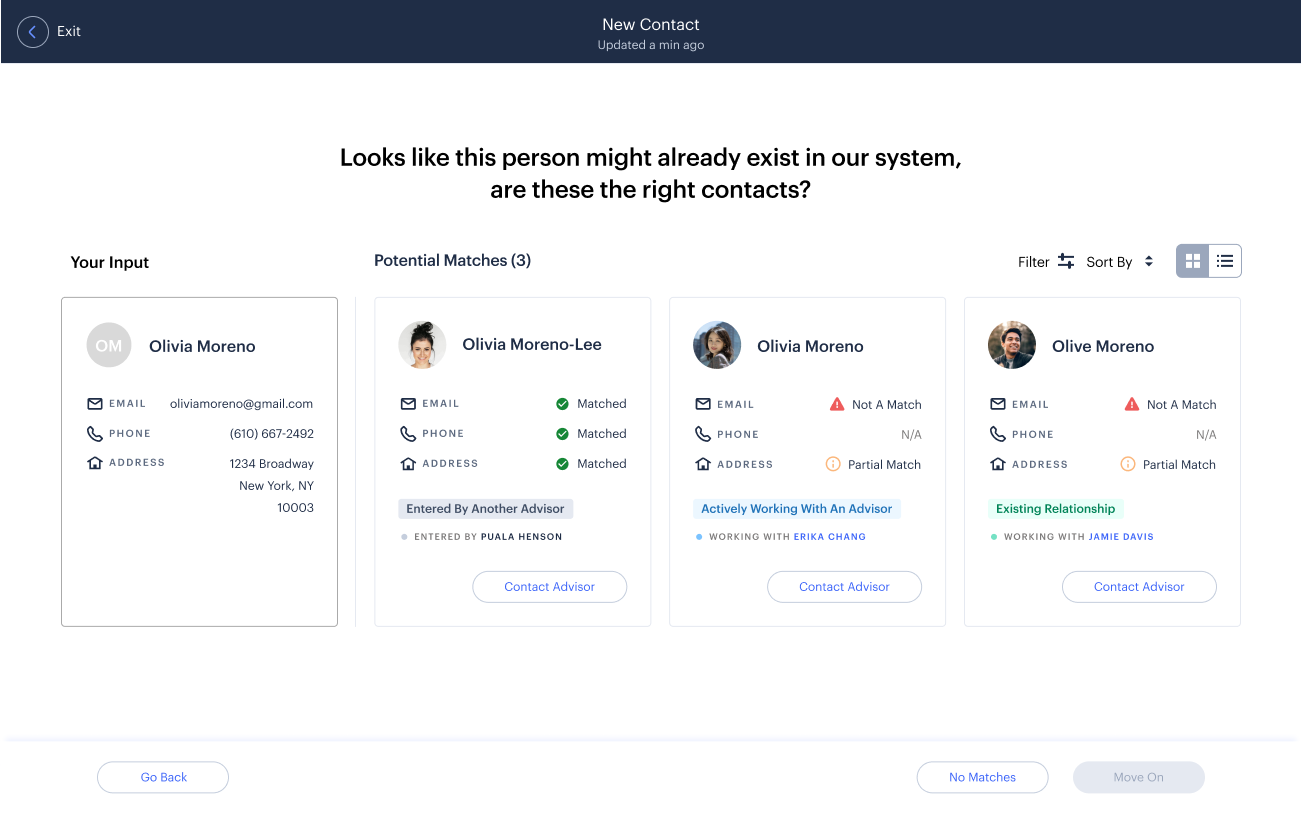
Duplicate Matches
If an associate enters the information of someone who is already in the Leads Suspect Management system, they can see if that Lead already exists. If that is the case, then the associate hands their profile over to the Financial Representative.
If an associate enters the information of someone who is already in the Leads Suspect Management system, they can see if that Lead already exists. If that is the case, then the associate hands their profile over to the Financial Representative.
New Leads
If the Lead is not in the system, then the associate will create a profile for them.
If the Lead is not in the system, then the associate will create a profile for them. With the power of Efact finder the Leads Suspect Management system will add as much information that it can find on the web. Afterwards, it is up to the Financial Representative to cold-call the Lead and make the sale.
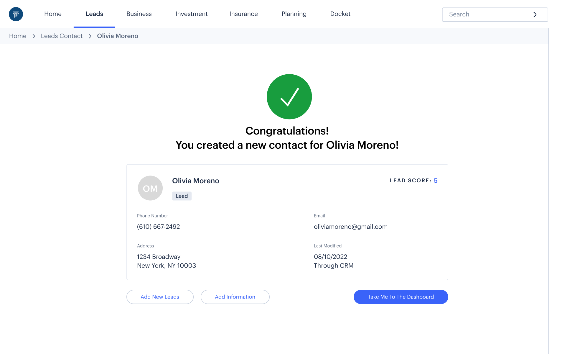
Automatic Profile Completion
With the power of Efact finder the Leads Suspect Management system will add as much information that it can find on the web.

After the initial profile is completed by the Client Services Associate, it is sent to the Financial Representative, who cold-calls the Lead to make the sale.
Logging In To Connect With A Lead
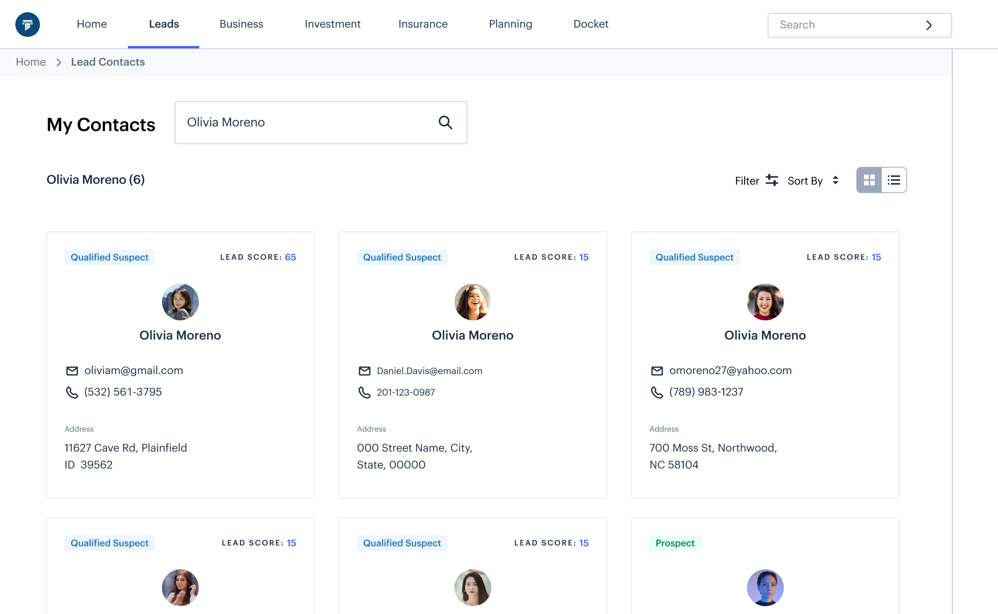
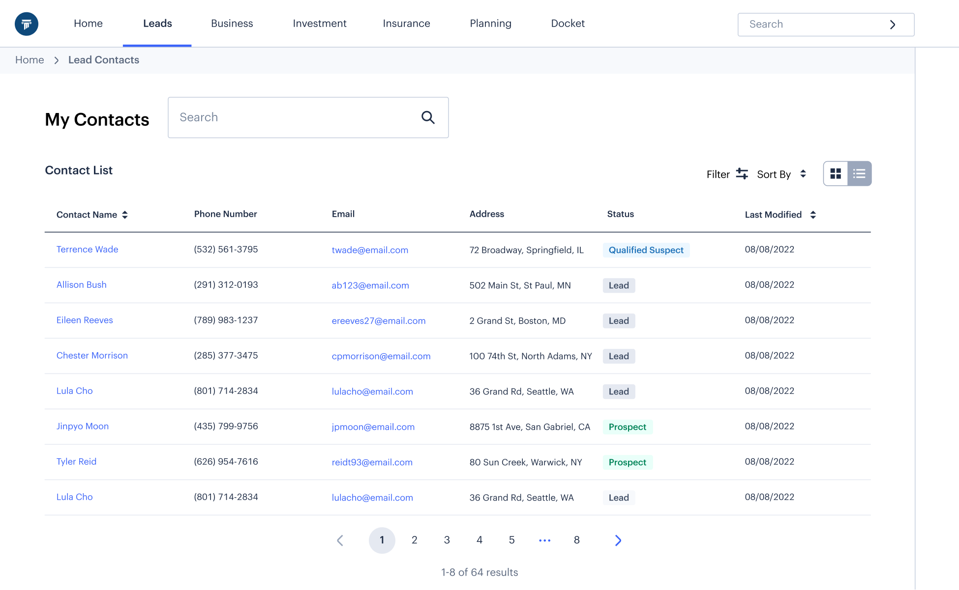
James, the Financial Representative, starts by picking up where the Client Services Associate left off with the profile creation. He clicks on the “Update Existing Contacts” link from the dashboard.
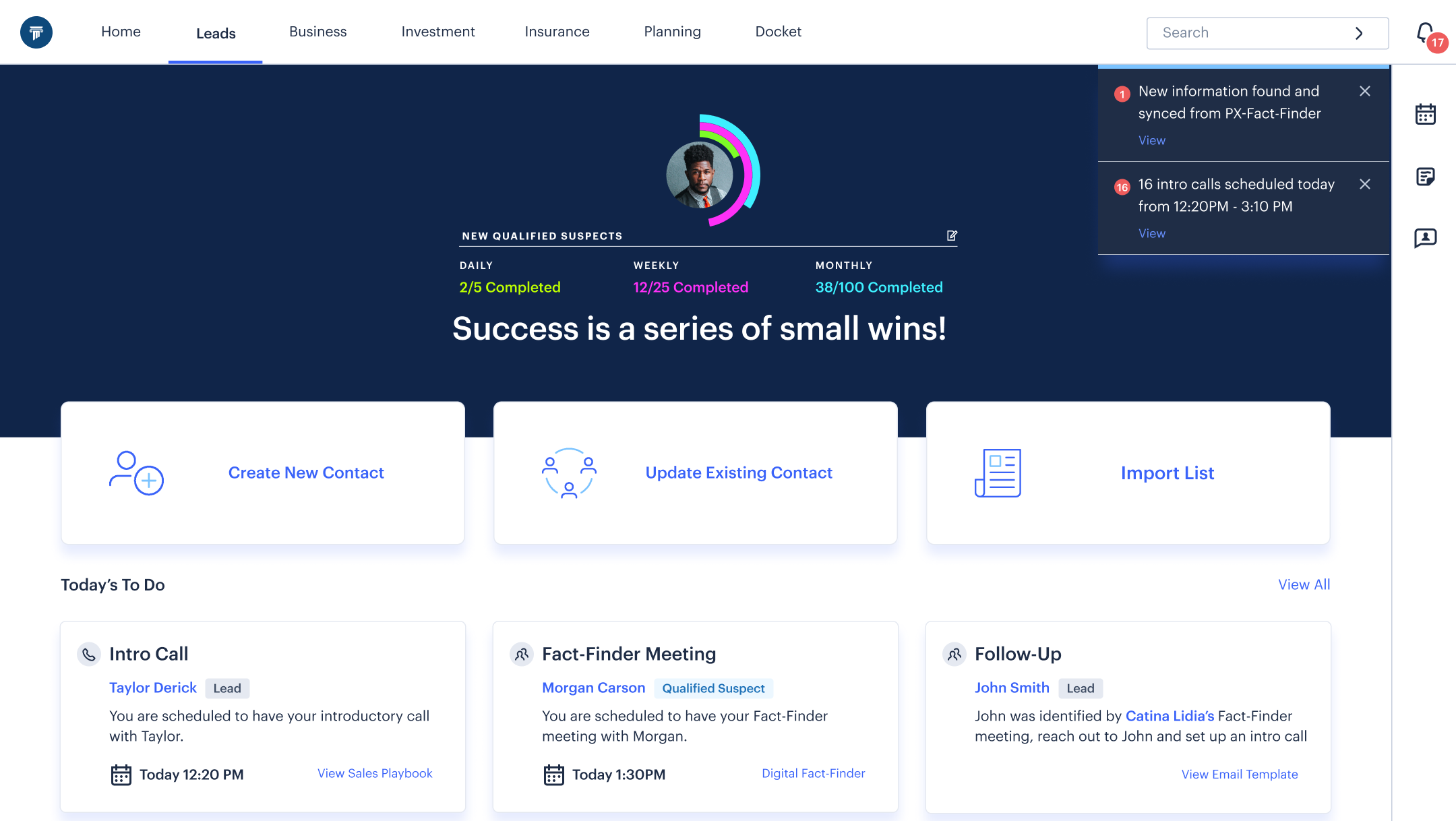
Finding Your Contacts
Once James clicks on “Update Existing Contacts,” he looks through the list of Leads in the contacts list. James scrolls though the list and picks the one he was instructed to update by the Client Services Associate.
Starting A Cold Call
James cold-calls the Lead in the hopes of asking them to help him complete their profile.

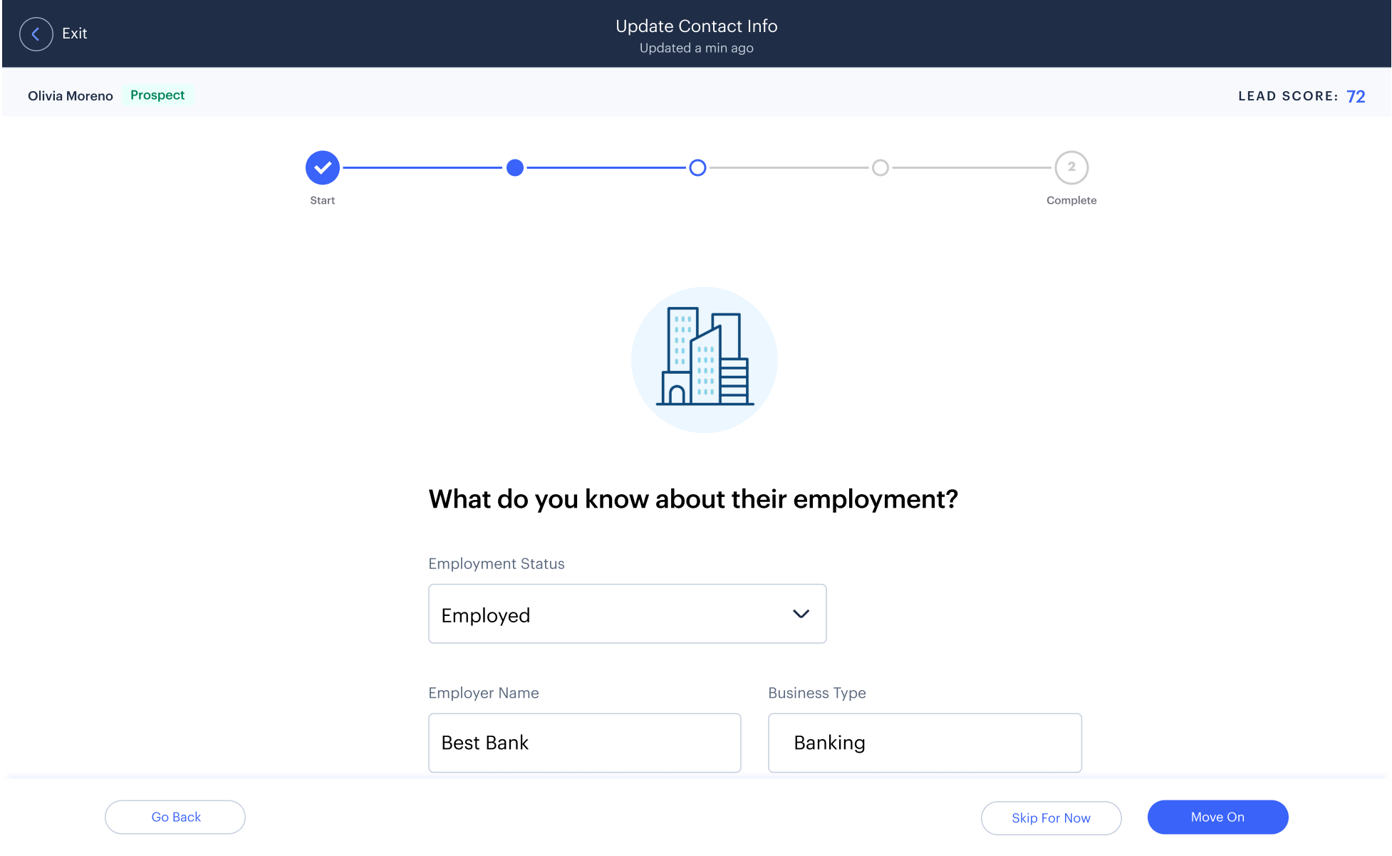
Continuing To Build A Profile
Filling out the additional data brings the Financial Manager back to the TurboTax-inspired design where James enters in the additional information.
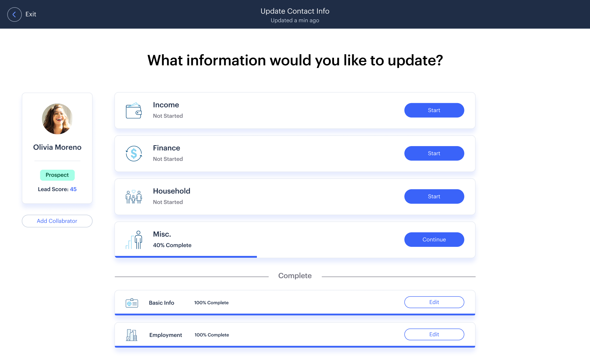
Completing Lead Profile
Once a new section is completed, the Lead score is updated. Agents can keep working on the updating process until the score reaches 100, at which point, all fields are completed.
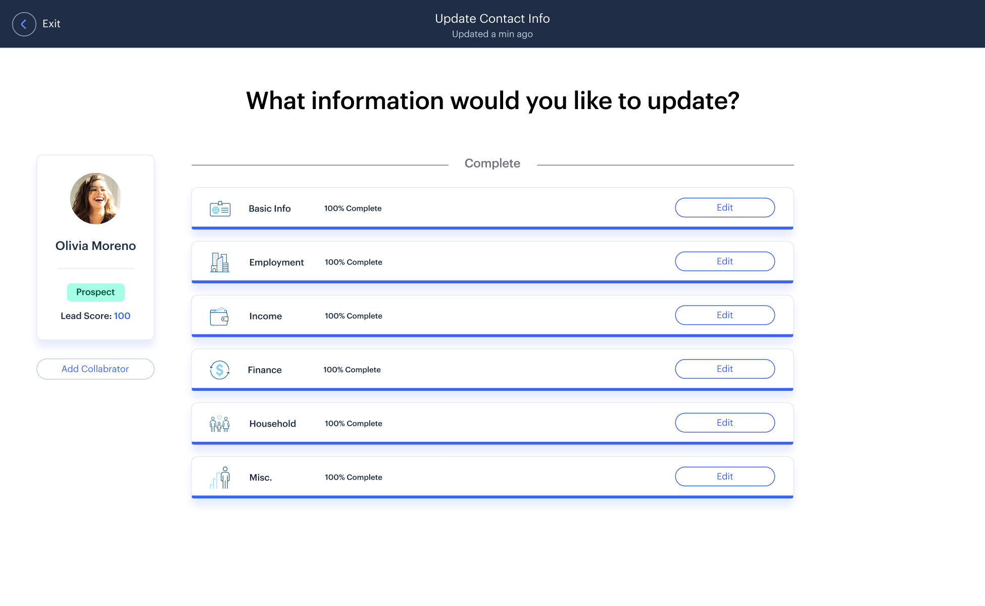
Now that the profile has been completed and saved, it is up to the Lead and the agency to discuss the arrangements of the deal and how they want their money to be managed.
05 -
Design Validation
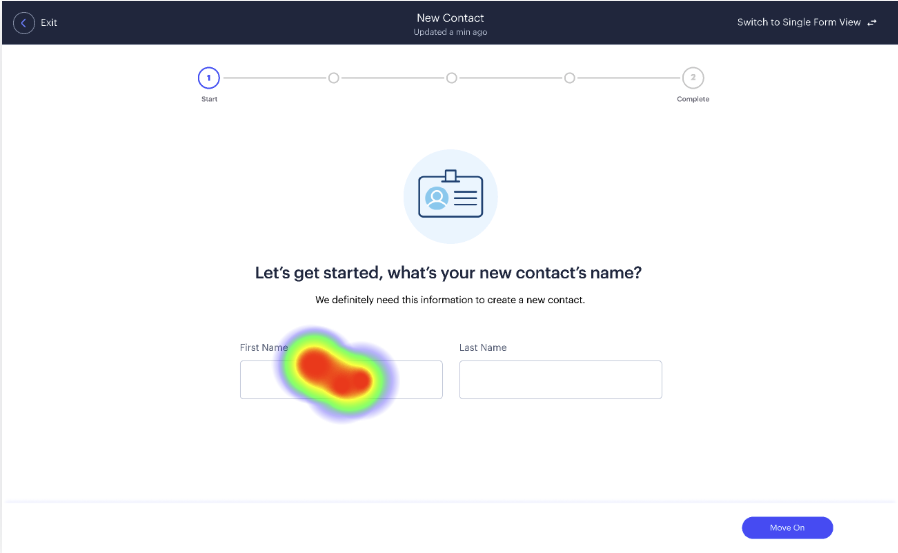
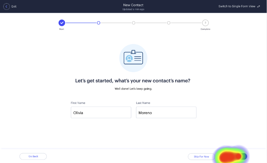
To validate my designs, I set up a series of user tests in Maze to determine whether I was achieving my design goals. Primarily, I tested for speed, misclicks, and overall user sentiment.
Success
100%
Average Duration
45s
Misclicks
6%
06 -
Animating Lead Interactions
Animating Lead Interactions
One of the most important skills I got from this engagement was the ability to use Figma’s micro-animation system. I wanted our solution to stand out and complement our visual design statement (as mentioned in Overview - Goals).
Progress Bar
I went on YouTube to learn to make a progression bar animation so that the agents can get a stronger sense of achievement when they clear each step.
Confetti Celebration
Next, I wanted to give the agents a dopamine rush when they finished filling in a section. I added confetti to create a sense of celebration.
Displaying The State
Icons were animated to spark up flat designs, making them friendlier to agents.
07 -
Conclusion
Conclusion
The client was more than satisfied with our work and put the pitch into production right away. They loved our new design for their system and reported the improvements to their workflow.
Micro Interactions
I decided that I wanted to have more sliding motions in the game as opposed to taps. This adds a greater level of player interaction. It also gives the player a greater eye candy.
 Time to complete Lead profile

 Average Adoption Rate by Agents

Gains
This project taught me how to use and conduct user research with actual agents while communicating with the client. It was an excellent opportunity to analyze who was using a product and how to tailor the experience for them.
Through this project, I learned about both the backend technical details of financial management systems and how to empathize with users in the wealth management industry who have their unique needs and feelings.
I also learned to use the Figma prototyping tool better, adding more clarity to any future prototypes I make. As a former animator, I enjoyed applying my animation skills in completely new contexts.
"John was a pleasure to work with. His technical skills and experience in design and applications brought life to our project. He was able to add special touches to our prototype through his designs and animations, which really thrilled the client."
Chadwick Shao: Creative Director at EY
"John took initiative to include animations to delight our clients and improve the appeal of the guided onboarding experience. Our clients were impressed with this effort and it really took our work to the next level."
Jakob Gorgens: Manager at EY


