 TImeline
3 Weeks, Summer 2022
 Tools Used
Figma Mural
Figma
 Roles
Roles
User Experience User Research Accessibility Mobile
User Experience User Research Visual Design Micro Animation
01 -
Project Overview
My team and I were commissioned to assist a life insurance client in modernizing their desktop and mobile apps, making them more user-friendly for both insurance agents and policyholders. My role in this engagement was to improve policy organization and enhance accessibility, particularly for older and less physically able users, to ensure the app was usable for them.
 The client will remain unnamed as per NDA agreements
 Final visual designs are under NDA agreements
Problems
We needed to determine how users could work abroad, which involved addressing complex issues such as booking flights and filing international taxes. Every step of the process had to be meticulously considered to ensure the product was thoroughly developed and met the client's expectations.
Challenges
🧑💻 Our development team was behind schedule and could only provide limited support for any new features I proposed. As a result, we had to create a solution that would be easy for them to implement.
👴 I had to become familiar with our user base, as many of our users were older, less tech-literate, and often confused by complicated systems.
02 -
Research
For this engagement, I focused on optimizing the experience for two primary user groups.

Policyholders
The average age of our client’s users was 45, with many being much older and significantly less tech-savvy.

Insurance Agents
Insurance agents are responsible for managing multiple policies at a given time. Our qualitative research revealed that they struggle to efficiently locate the policies they manage. Like policyholders, these agents are also older users, with an average age of around 48.
03 -
Goals
🔍 Make it easier to find and read through policies.
👵 Make the experience more accessible for older users.
📱 Design the app to be a mobile experience, not a direct conversion of the desktop version.
04 -
Policy Information
Before I figured out how to find policies in the system, I had to first redesign the policy cards to make them more readable and accessible.
Original Design Issues
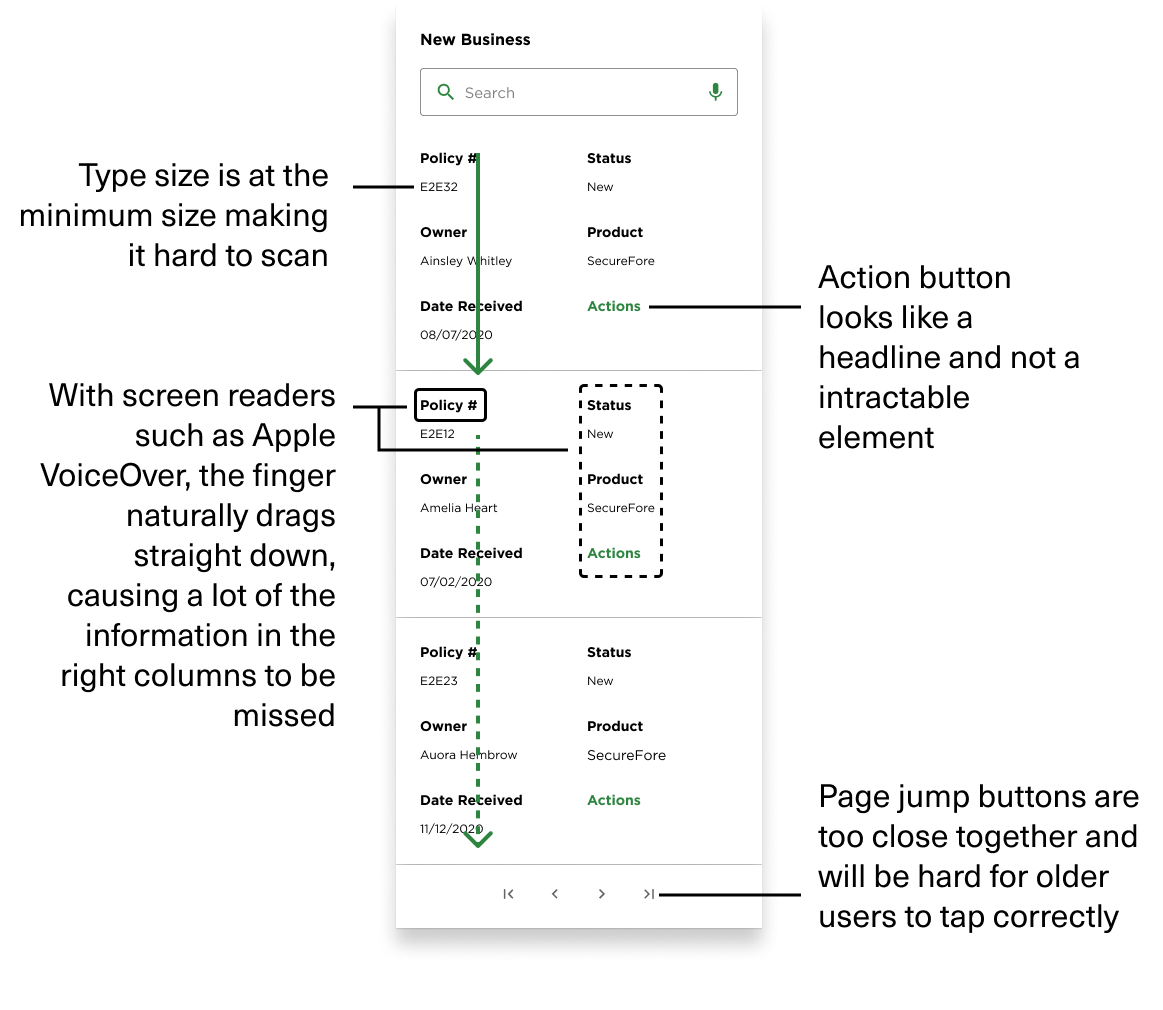
All the issues listed in the diagram represent a few goals for the new design.
1. Text sizes need to be larger for the current user base.
2. Buttons need to indicate that they are interactive.
3. Agents and Policy holders who use screen readers will likely miss half the information on their card with the 2 column design.
4. Interactive elements need proper padding to prevent misclicks.
One major issue with the 2-column design was that it led to a cluttered appearance. Additionally, some users increase the text size in their phone settings, which caused the text to look unprofessional during testing. Given the user demographics identified in our research, a new design was needed to accommodate larger text sizes.
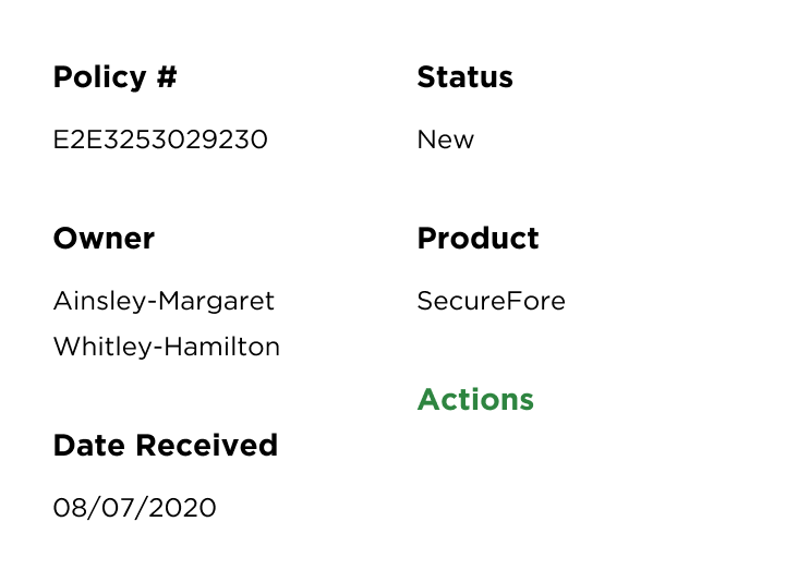
With default text sizes
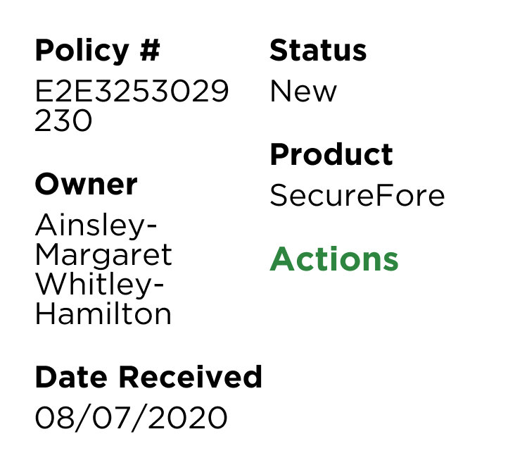
With maxed out text sizes
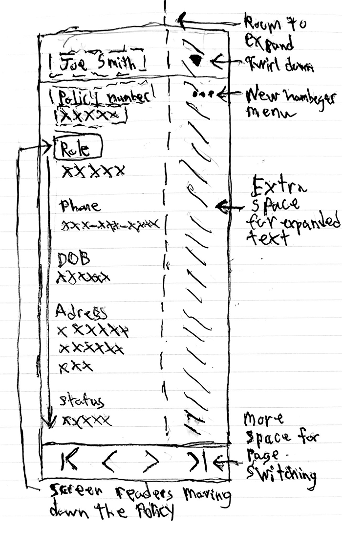
With all the problems outlined above, I sketched a new design to address them. Considering the issues with expanding text sizes and longer names, I created extra space on the right to provide better readability for users who may need it.
I also ensured that the new layout would accommodate users with impaired eyesight, as I wanted to consider how a screen reader might navigate the page.
New Policy Design
To address the readability issues, I moved the policy information to a single column to better accommodate long string entries and increased text sizes.
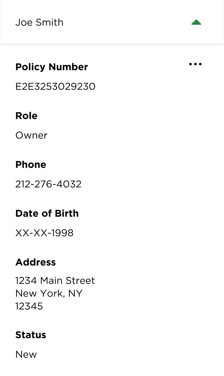
With default text sizes
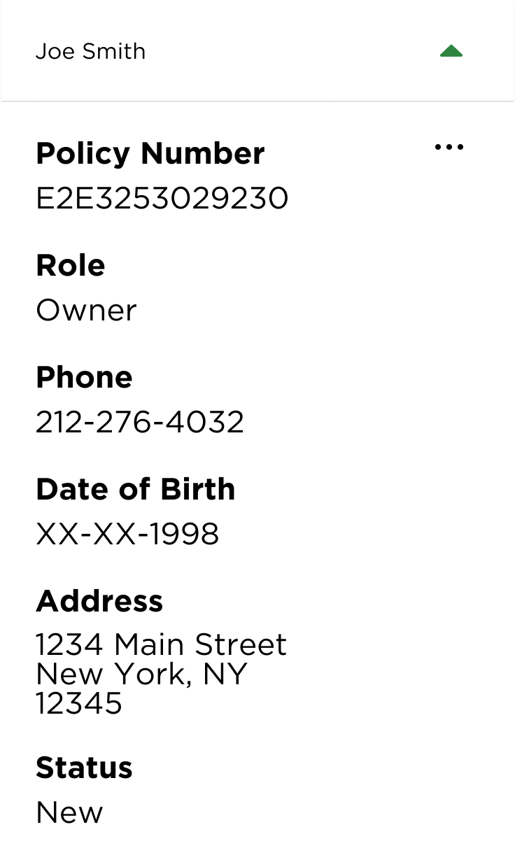
With maxed out text sizes
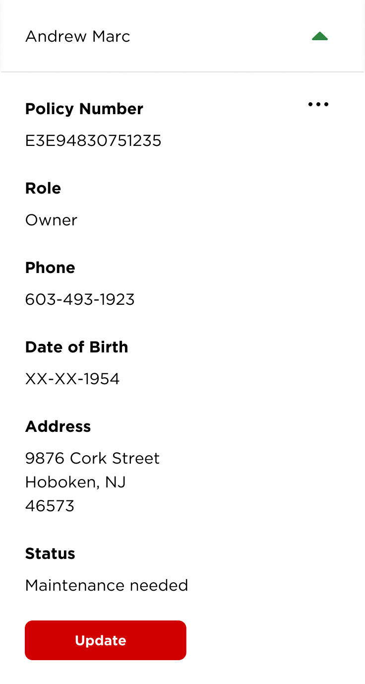
Next, the action button was changed to a three-dot menu to make it more recognizable for additional actions, while the button design is used only for direct actions.

The action button was not frequently used by the agents according to internal usage stats, so deemphasizing it and making it smaller made the displayed actions on the page more relevant for the agents.
Another benefit of the new design is its improved compatibility with Apple VoiceOver and other accessibility tools. These programs work better when content is stacked vertically, as this aligns with the way the user's finger moves across the screen.

Lastly, I added extra padding to the page jump button to assist users with poor hand-eye coordination and eyesight problems. I also added a page jump option, but the development team said that it would be too much work to implement.
Before

After

To help the developers on their end, I removed the page jump option to ensure we could deliver these updates on time.
05 -
Policy Collapsing
With the policy card redesign completed, I next needed to consider how a policyholder or an agent would search for them.

The issue arose from the sheer number of policies an agent may have to handle at any given time, sometimes amounting to hundreds of policies.
With limited resources available from the tech team, I had to develop a solution that would accommodate the team's constrained bandwidth.
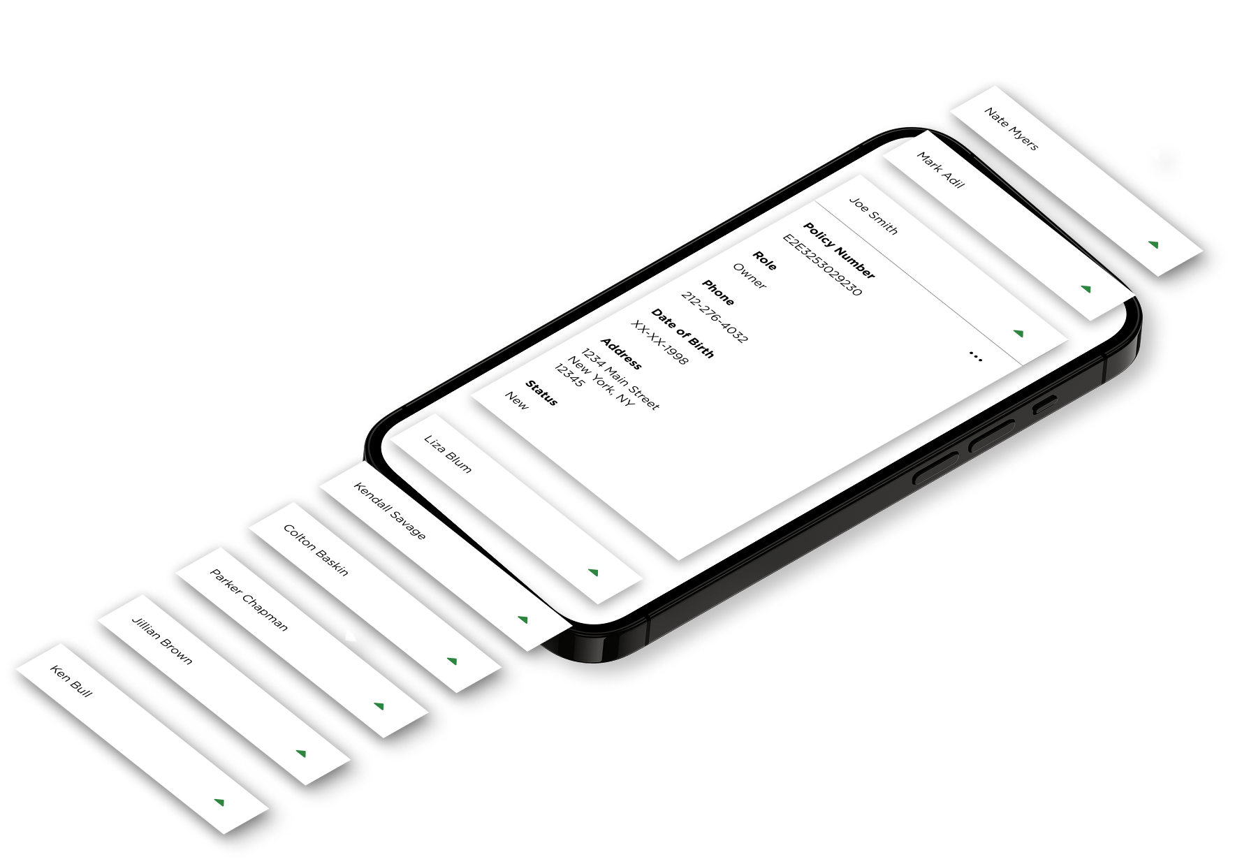
To solve the issue efficiently, I employed collapsible policies, making only the policyholder's name visible until expanded.
This fix was simple for the developers to implement and led to a drastically reduced time for agents to find the policies they were looking for.
06 -
Conclusion
We presented our findings and had the development team join the project, completing it in one month. Agents reported faster search times as many redundancies in the design were eliminated. The client was also pleased to see more accessibility considerations implemented.
Micro Interactions
I decided that I wanted to have more sliding motions in the game as opposed to taps. This adds a greater level of player interaction. It also gives the player a greater eye candy.
68%
Faster search times to find policies
Gains
This served as a great opportunity to learn how to manage strained resources on a cross-functional team. I had ample time to get to know the development team and learn to work with them through their challenges.
This project gave me the opportunity to work with Apple VoiceOver and other accessibility options. I strive for my output to be as accessible as possible, and it was great to explore this aspect of user experience.
"John took the initiative to bring our client's product up to speed and went above and beyond what we asked of him. [Client Name] was delighted to see that their portal was now more accessible to their users, and we are moving toward contract renewals on a positive note."
Nellie Ortiz: Design Manager


