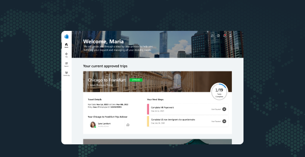
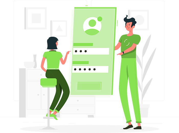
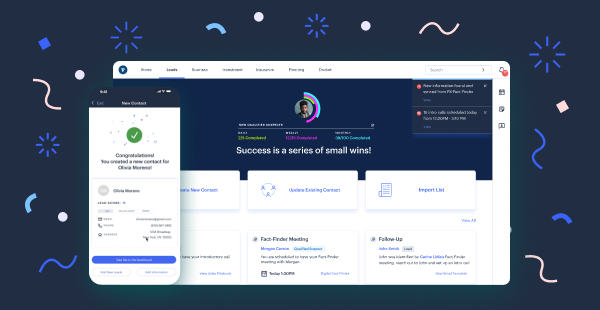
Buz Mobile Email Registration
Buz Email Registration
UX/UI User Research Visual Design IOS Android
UX/UI User Research Visual Design IOS Android
Redefining Account Creation for Buz to match user comfort and security preferences.
Redefining Account Creation for Buz to match user comfort and security preferences.
01 -
01 -
Project Overview
Buz is a fresh-to-market voice communication app looking to compete with the titans of its sector. Being new to the app store, there was a decent amount of discovery needed to find its pain points for new users. As a new hire, I was asked to lead a project aimed at incentivizing new users to join Buz. We were also given the constraint that this new feature be designed in less than a month.
 Tools Used
Figma Qatalyst
 Roles
Roles
Lead Designer Lead User Researcher Project Management
Lead Designer Lead User Researcher Project Management
 Timeline
1 Month, July 2023
About Buz
About Buz
Buz is a voice communication app that was released less than a year ago at the start of my time working with it. As the tool was new and lagging behind its competitors by years, we needed to match them in features and functionality. The app also had a skeleton crew working on it at the time, so there were plenty of potential projects to choose from that would require a second round of design.
Micro Interactions
I decided that I wanted to have more sliding motions in the game as opposed to taps. This adds a greater level of player interaction. It also gives the player a greater eye candy.
I started by reading our previous user research and surveys, as well as direct feedback given to us on the app store, to try and find a thread of thought that would lead us to a clear issue needing solving.
Micro Interactions
I decided that I wanted to have more sliding motions in the game as opposed to taps. This adds a greater level of player interaction. It also gives the player a greater eye candy.
After thoroughly examining our research, I discovered that many users never completed the sign-up process for Buz. Numerous individuals expressed discomfort with providing their phone numbers to a new app, especially considering they were unsure if their friends were using or even liked it.
This led me to dig deeper, and I found that some cultures, Japan as an example, did not like giving out their phone numbers to any app in general. It was suspected that we were losing up to 10% of our user base due to this issue. It also came with a lot of younger user may not even have a phone number
I brought these issues to our stakeholders and was given the green light to develop an email registration flow for Buz.
Goals
 Increase our user registration rate by 10%
 Simplify and refine our signup process
 Enhance the visual appeal of this flow
Process
02 - Audit & User Testing
User testing was conducted in the office to ensure that my designs were working. We received a couple of comments about the cognitive load on many of the pages, so I spent time splitting up the information.
03 - Design
During the one-month challenge, we conducted frequent check-ins and reviews with Buz’s stakeholders. I worked with some assets that were already created from previous sprints, as there was not enough time for wireframes. Once we had feedback, I went in and updated the lo-fi screens and applied visual design to them.
04 - Development
As part of this process, I checked the specs of the visual design to ensure that they were ready for developers. After the files were sent over to the developers, I transitioned into a project management role, ensuring that the project was moving forward. I also took charge of QA testing and alerted developers to issues with their code.
Stakeholder Alignment
Stakeholder Alignment
CEO & Leadership
I was given orders and constraints by the CEO of VocalBeats. He wanted to see the number of users signing up for Buz increase by 10%.
Development
Developers were involved from an early stage to assist in identifying any technical limitations. They needed a feature that would not be too difficult to implement within the given time limits.
UX
I collaborated closely with our app UX designer to familiarize myself with our app patterns and file structure within Figma. Additionally, I presented progress during regular review sessions to receive prompt feedback from the rest of the team, ensuring consistency.
02 -
Audit & User Testing
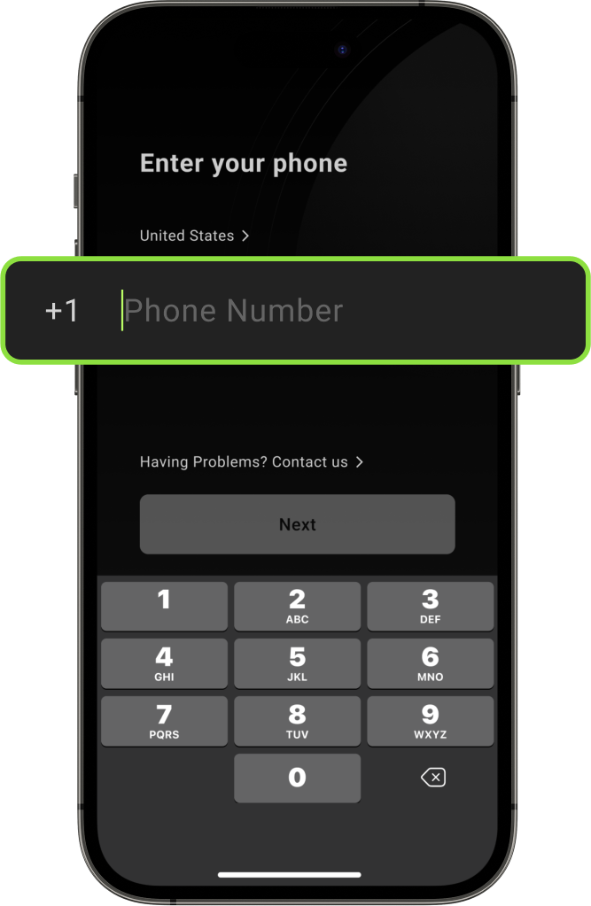
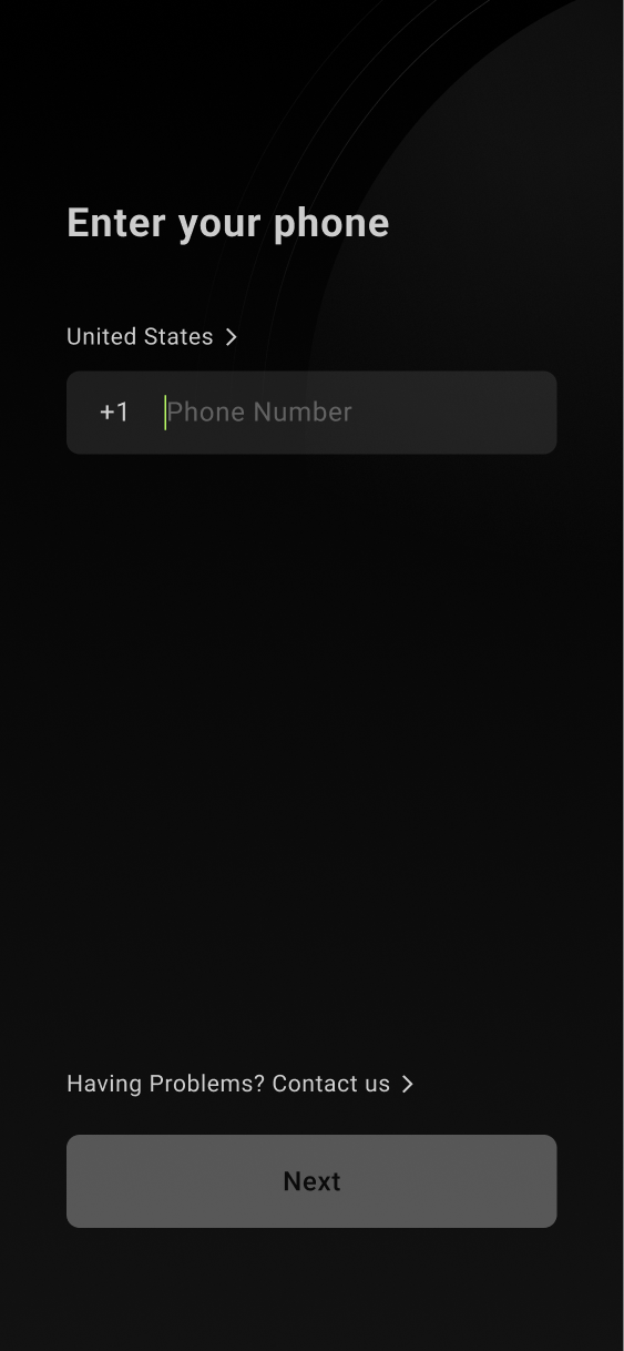
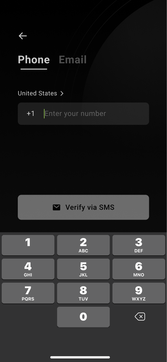
From our research, we found that most of the registration drop-off occurred on the 'enter phone number' page. Currently, when 13% of users drop off when they see this page as some people were not comfortable giving their phone number to a new app.
The absence of an alternative sign-up method was a deal breaker that had to be addressed.
Additionally, there was a lot of cognitive overload, with most of the process being squeezed into one page. This finding was based on internal research as well as some user testing I conducted myself. I identified that the information present needed to be split up for it to work.
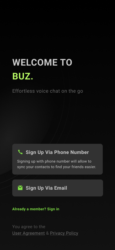
Redefining the Flow
I conducted an exercise to determine a new flow that would simplify the steps of signing up, as opposed to the original design that aimed to have as few pages as possible.
This makes each page more focused and faster to navigate overall.
Solution For The New Flow
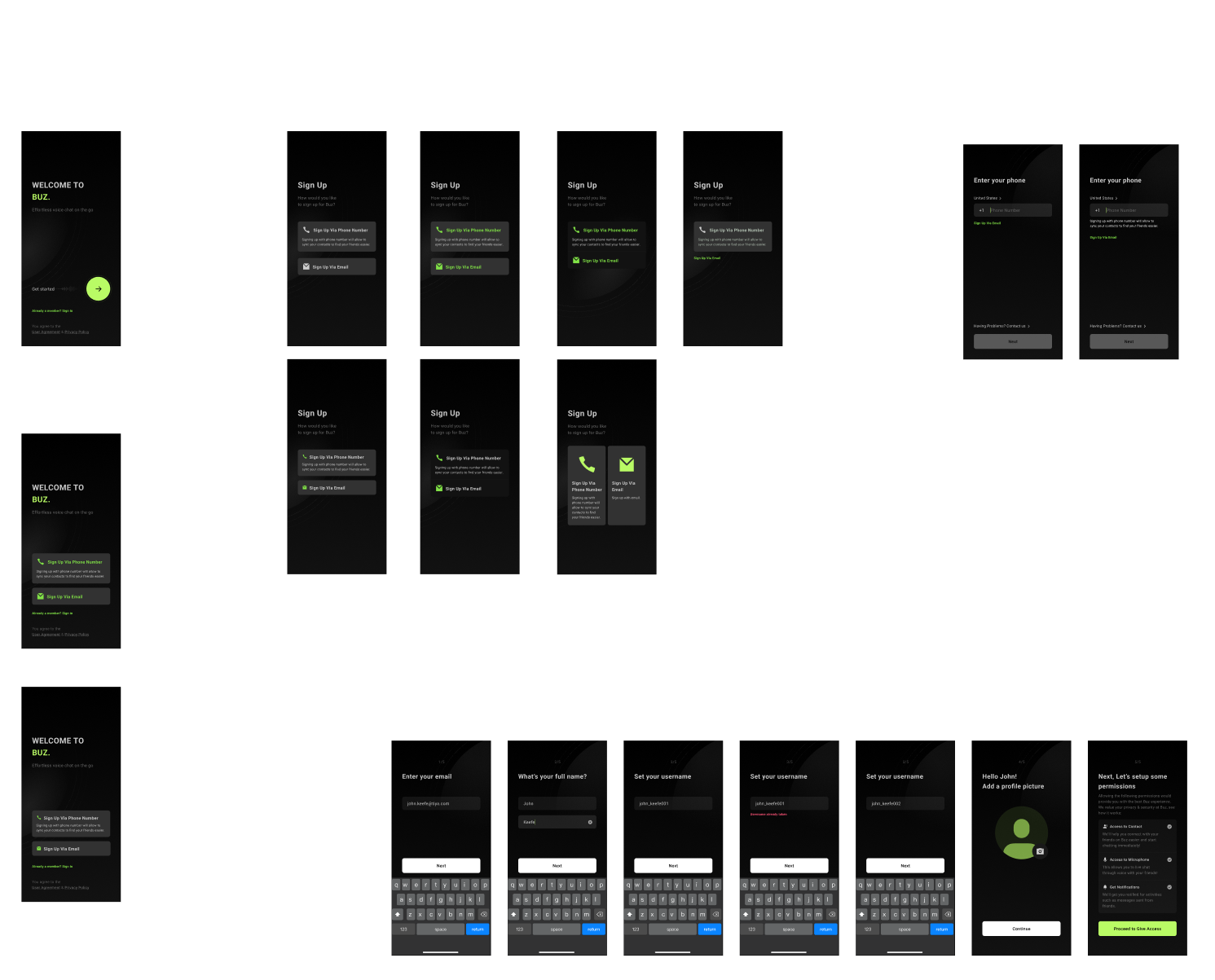
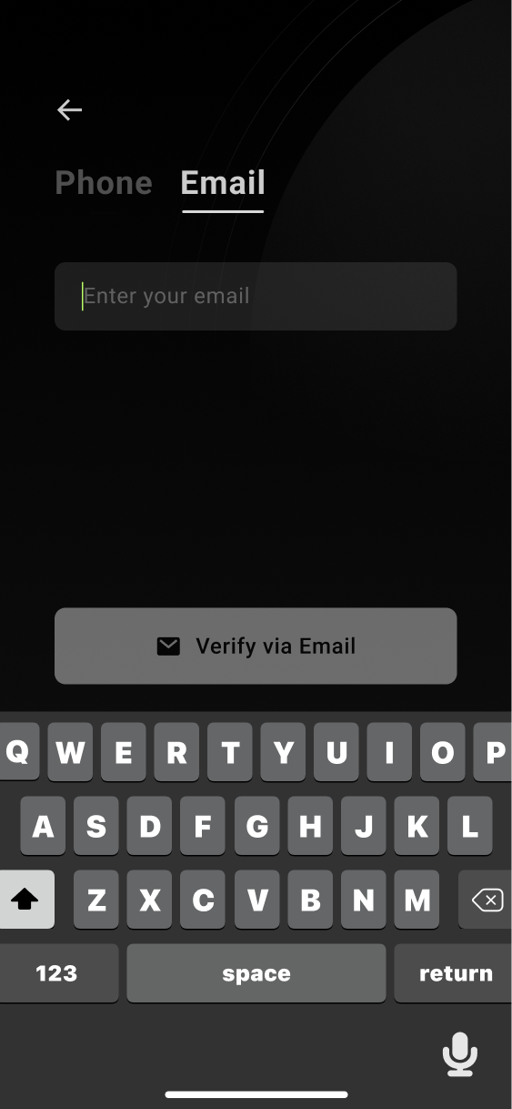
To keep the new solution familiar to Buz's current user base, I added the 'sign up with email' option in a similar flow to minimize confusion and integrate it into a user's normal behavior.
03 -
Design
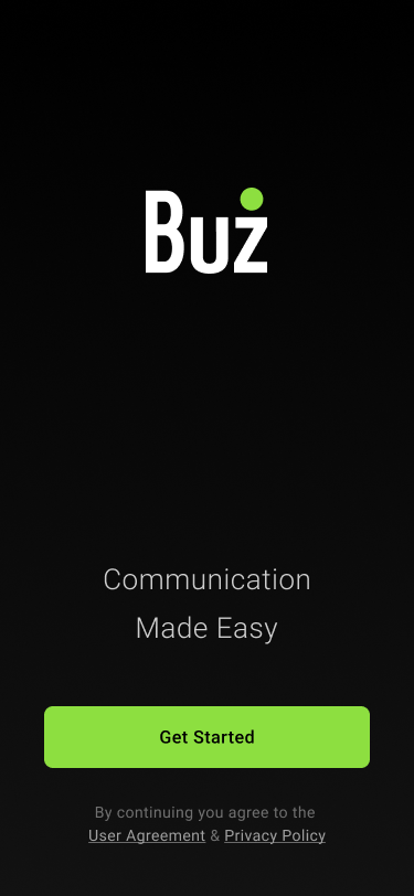
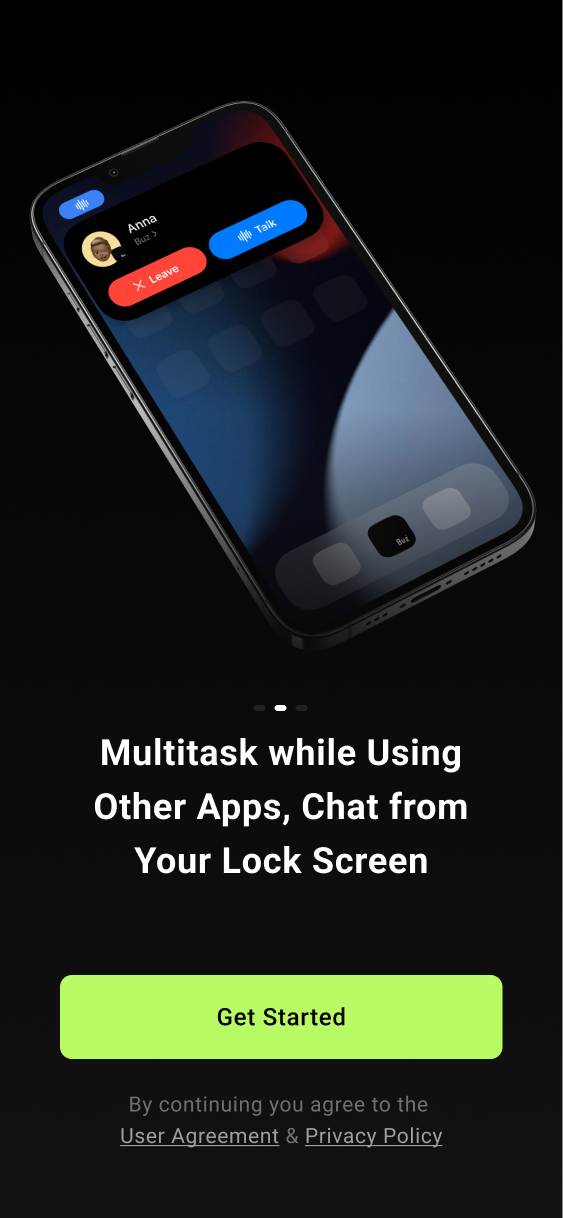
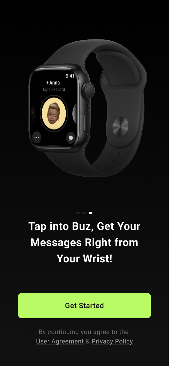
Splash Page
The current splash page at that time was a holdover from the first design of Buz and was in need of an update. I proposed a few new solutions for it.
1.
2.
3.
4.
1. My first idea was to repurpose some of our promotional material that looked sleeker than the current background. This was proposed as a solution in case we ran up against our tight deadline.
2. The second idea was to use the model of many other apps and just have the logo on a solid color. This presented a good option if we started to run low on time.
3. While exploring possible flow ideas, I thought about putting the 'sign up by phone number' and 'email' buttons on the landing page. This idea was considered to reduce the number of steps in registration.
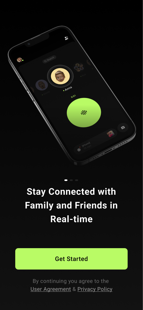
4. My last solution was to create a carousel that displayed the value of Buz to new users. The team agreed that this would be the best use of the space to explain the functions of Buz. The only downside to this approach was the time that would be needed to flesh it out.
Solution
As the project proceeded ahead of schedule, we decided to go with the carousel idea because we had the time, and it provided users with the most value.
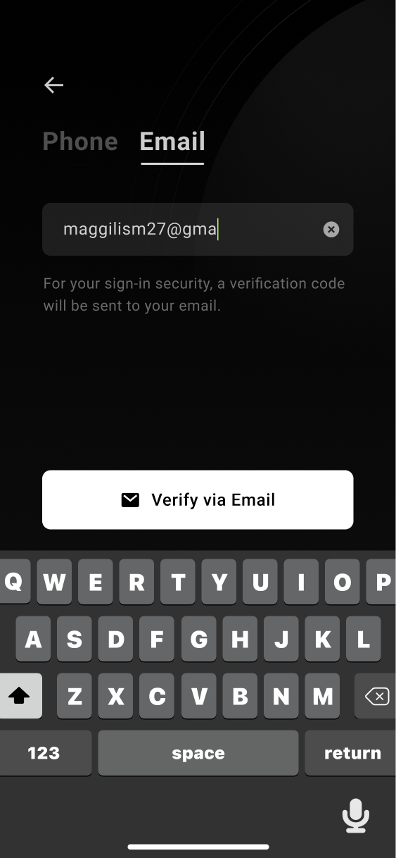
Email Registration
For the initial sprint, the leadership team wanted email to be downplayed as signing up with a phone number provides access to a user's contacts, allowing Buz to help them find their friends more easily. This, in theory, would also lead to more communication happening in the app, as one could connect their contacts more quickly.
Before
After
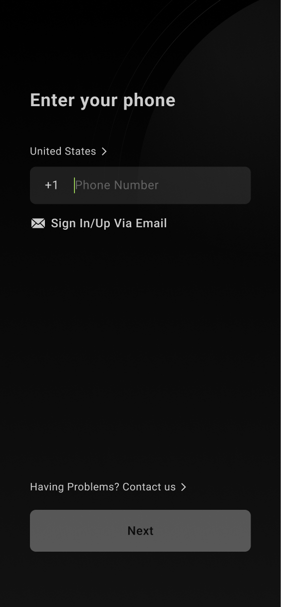
For this sprint, all designs had email a second less visible option.
Later Revisions
The first round of the design brought in so many new users that a few months later, I went back in and redesigned the page to give more emphasis to email registration because it was so successful (See conclusion for product success details).
Information Break Down
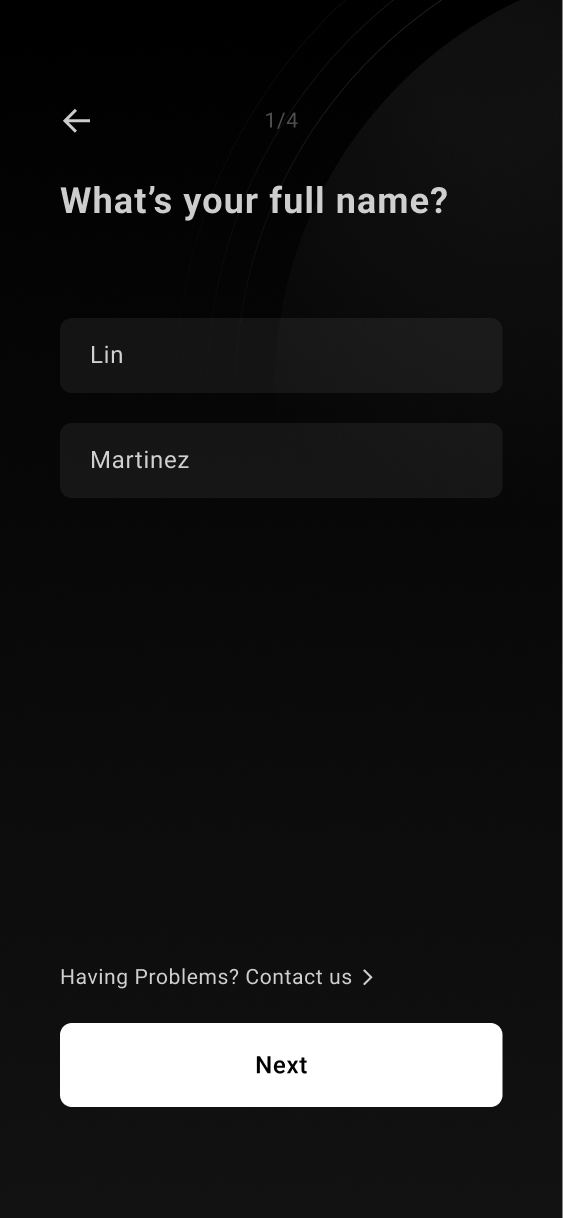
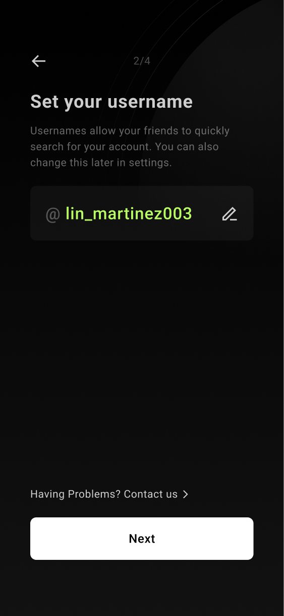
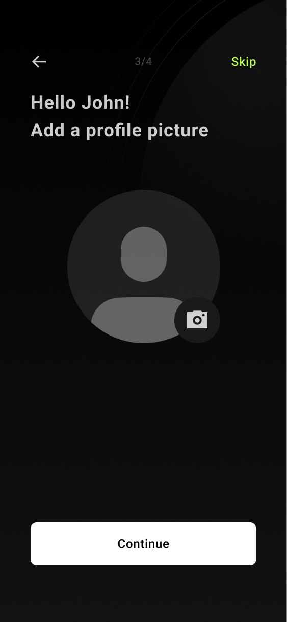
In the original version, most of the process of creating one's account happened on one page. This led to a lot of users expressing that they felt overwhelmed on that page.
Before
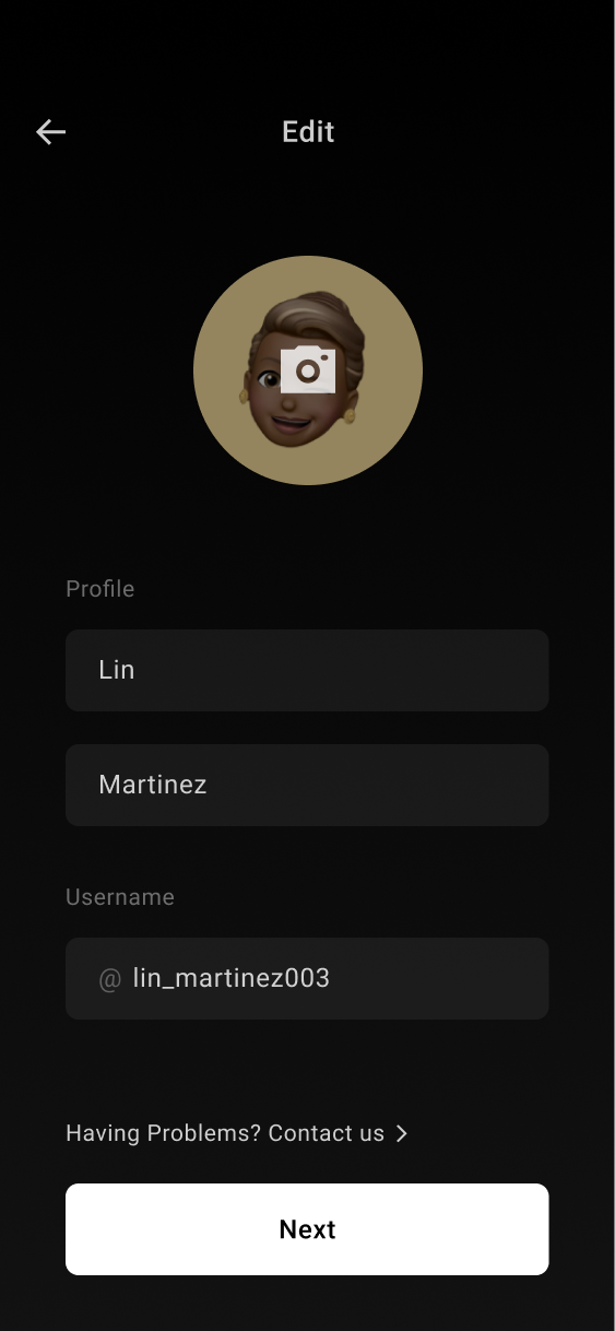
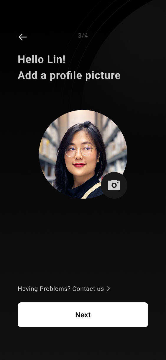
To solve it, I split up each aspect of the profile creation into one page per piece of information.
After
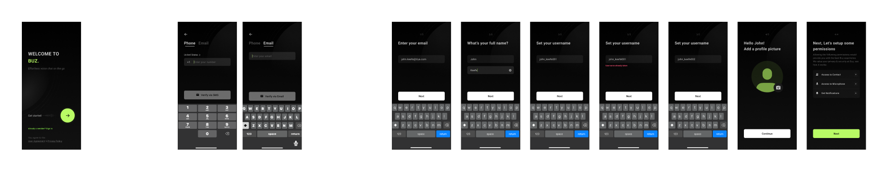
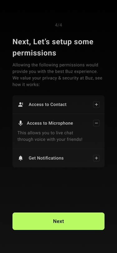
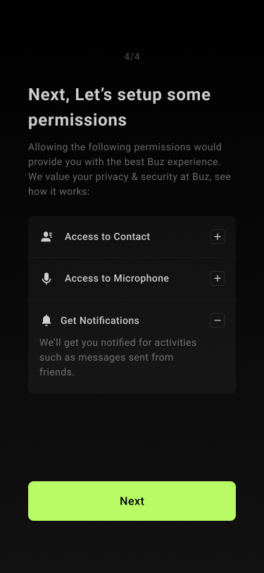
Old Permission Page
Additionally, the permission page was a particular sore spot in our user survey. Participants expressed that they felt like there was too much text on the screen all at once. In addition, some said that it was so wordy it felt like a legal document, which is not good when you are asking for users' contact and access to their phone's data.
Before
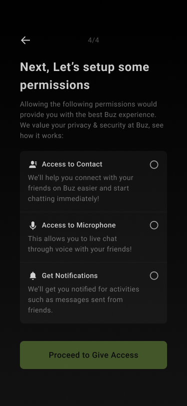
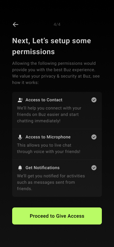
Solution For The Permission Page
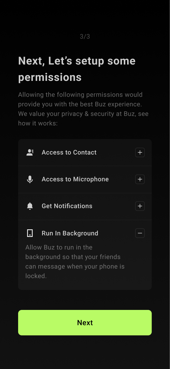
To solve this problem, I made each section collapsible and, more importantly, skippable. This allowed users to breeze by this uncomfortable step.
After

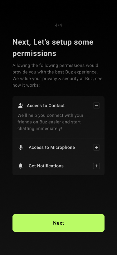
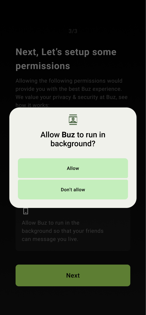
Additionally, for Android to run the out-of-app interactions of Buz, I had to obtain permission from the operating system. I added an additional section to explain 'Run In Background' and what it does. After clicking the bottom CTA, users would give permission to Buz to access all required permissions. With all permissions granted, users can move on to adding their friends after giving access to a user's contacts.
Conecting With Your Friends
The final step of the account creation flow that I had to work on was the process of adding friends on Buz.
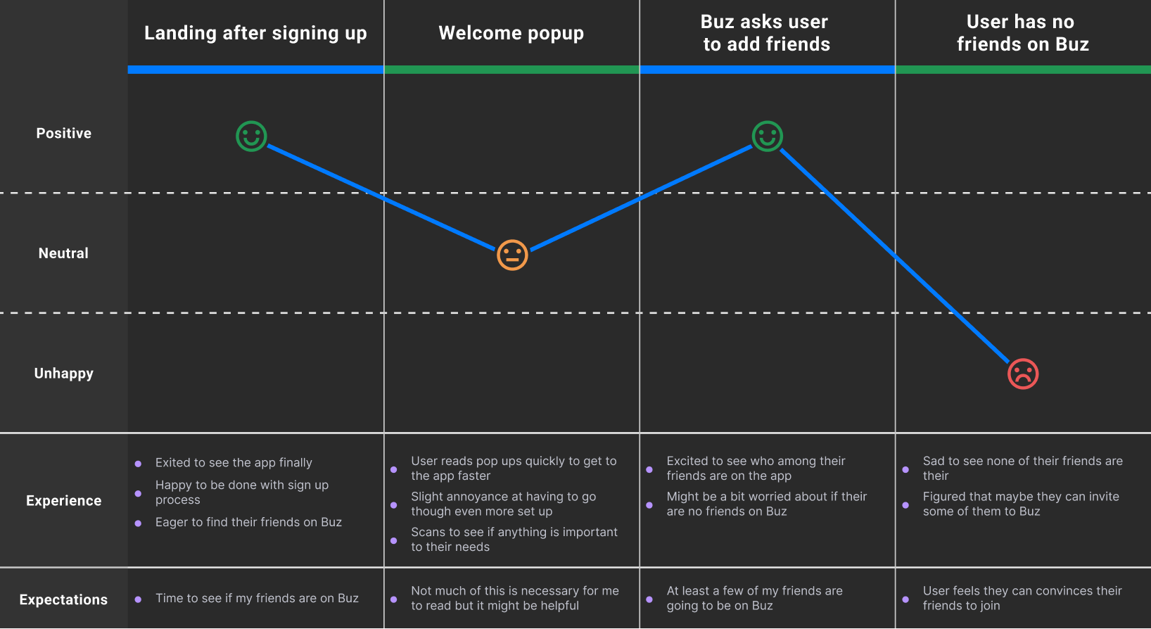
The issue with the old design was that Buz's current user base was small when I started, and it was not uncommon for users to find none of their friends on Buz. They would be presented with a screen that encouraged users to invite more of their friends to Buz. This ended up being a huge drop-off point for most users.
Before
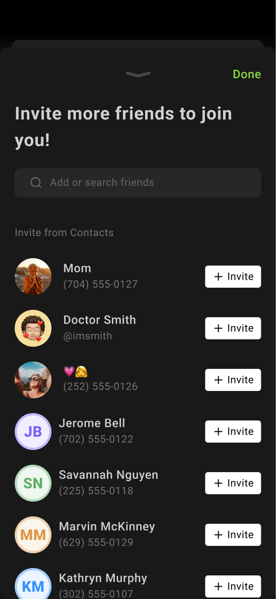
Solution For The Add Friends Flow
To minimize this issue I took two actions.
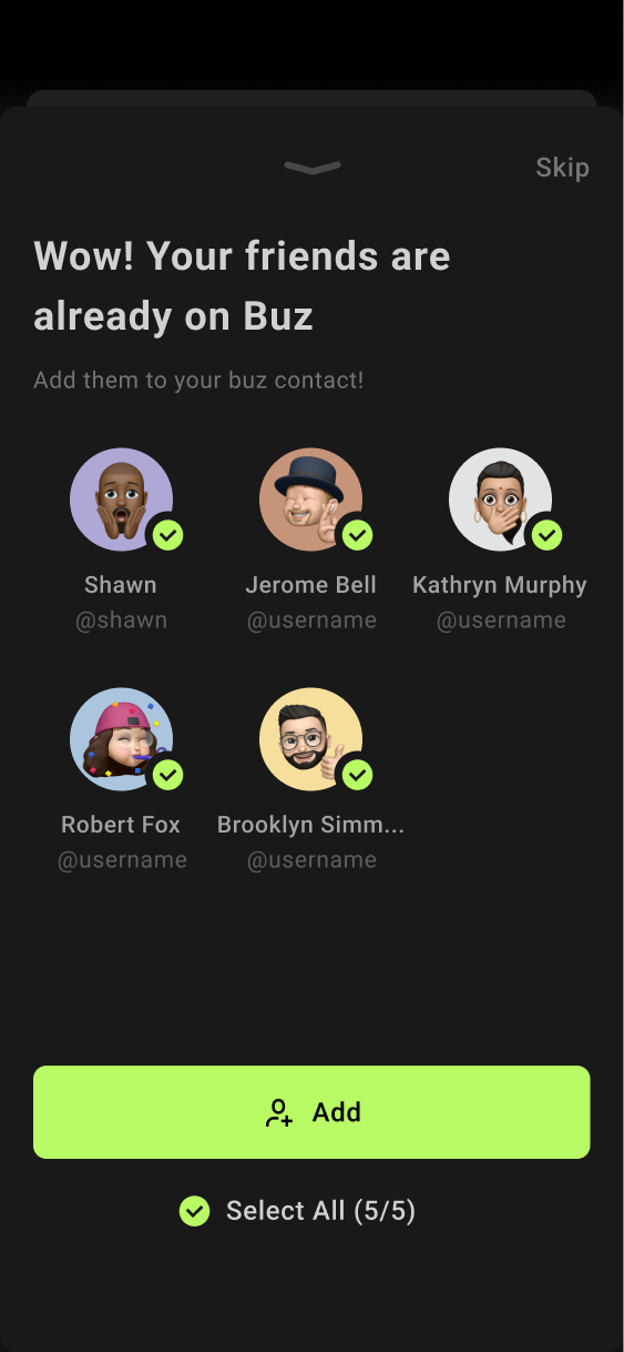
First, I redesigned the 'Add Friends Already On Buz' page to emphasize all of the users who are already on Buz. This helped improve the user's perspective on how many of their friends were already on Buz, with each profile image being enlarged in size. This redesign was backed up by blind user testing.
After
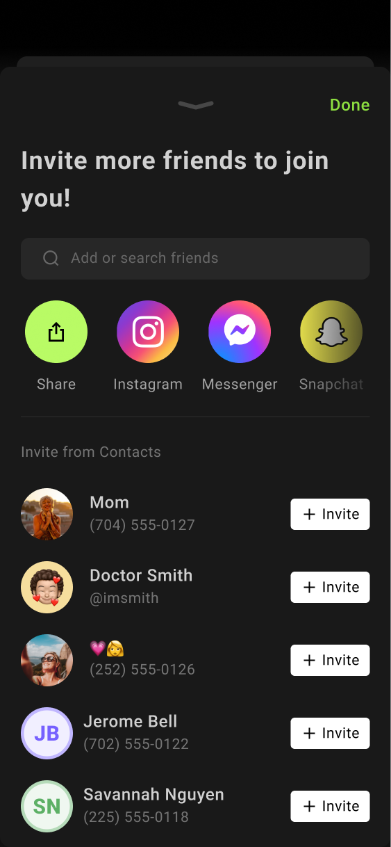
Second, I separated the "Invite New Users" page because this task differed from adding friends who were already on Buz. This also maintained consistency with the logic of the "Creating Profile" page.
As part of my solution, I also embedded other social media pages, as some contacts may only have each other on different social media platforms and may not have each other's phone numbers.
Final Flow & Prototype
Now that we had all the steps designed, it was time to combine them into one final flow before presenting it to stakeholders for approval. After my demonstration, the designs were taken into development.
04 -
Development
Development
UI Handoff
Stakeholder reviews involved lead developers assessing feasibility within our tight timeline. Following Agile methodologies at Buz, I collaborated closely with all teams in scrum sessions, addressing their queries and incorporating enhancements based on their feedback.
User Testing
Every time I received a new build of the app, I would test it in the office to ensure that our solutions were going to work with our intended user base. When issues arose, I would make the appropriate changes to the design and flow to ensure that we were hitting our goals. Once those updates were made, I would loop it back to the development team to keep us on our timeline.
05 -
Conclusion
Conclusion
After launch, in the first month, we saw a 4% growth from our normal user sign-up rate. After 2 months, it grew to 9%. And then, 3 months after the initial launch, the sign-up rate grew to 16%, exceeding our goals.
+ 16 %
Gains
This project served as a valuable opportunity to develop my leadership skills. I worked as the lead designer, responsible for all decisions related to UX. Additionally, I took an active role in project communication to ensure we met our targets. As a stakeholder responsible for the UX side, and being the main point of contact for leadership and development, I witnessed significant personal growth as a designer, seeing this project through to completion.
Check out more 
Check out more
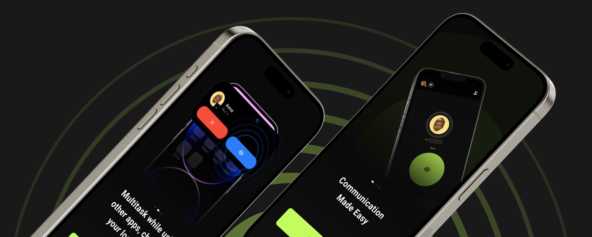
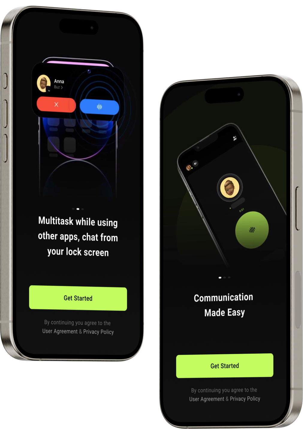
Lead Suspect Management
Buz Handsfree Mode