 Timeline
Winter - Spring, 2024
 Tools Used
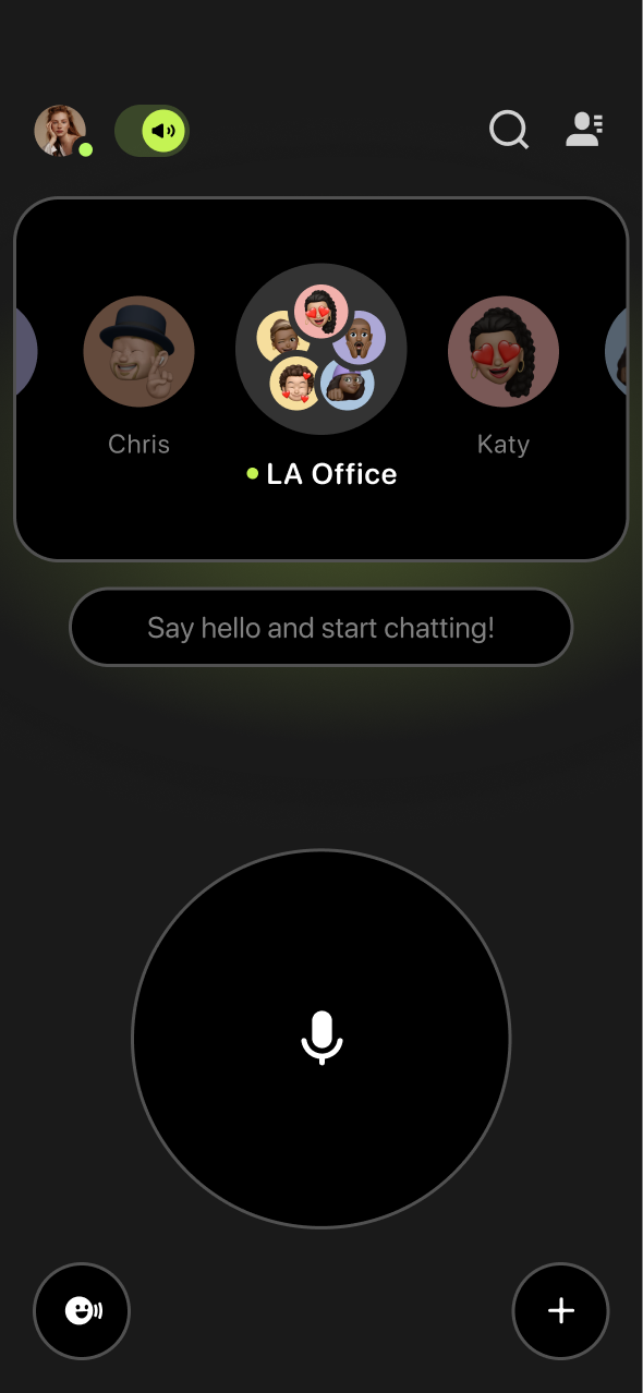
Figma Maze
Figma
 Roles
Roles
Lead Designer for Landing Project Management User Research Visual Design Micro Animation Moblie
User Experience User Research Visual Design Micro Animation
01 -
Overview
Buz was hitting a plateau in user growth. Through user feedback on the App Store and Play Store, we identified key areas of friction that were impacting satisfaction—particularly around usability, accessibility, and the visual interface.
With that in mind, I led a redesign initiative aimed at improving the user experience by focusing on four main opportunities for improvement:
Impact
Impact
Buz’s landing experience is now WCAG 2.1 compliant
Reduced misclicks on the homepage through clearer interaction zones
Directly addressed user complaints pulled from app reviews
Refined the brand’s visual identity
Improved App Store rating from 4.5 to 4.9 stars ⭐⭐⭐⭐⭐
Scroll Down to Read Full Case Study
02 -
Problem
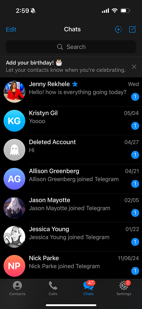
Buz was struggling with growth, as it hadn't had a major UI update in over a year. This was largely due to a lack of updates addressing user concerns.
03 -
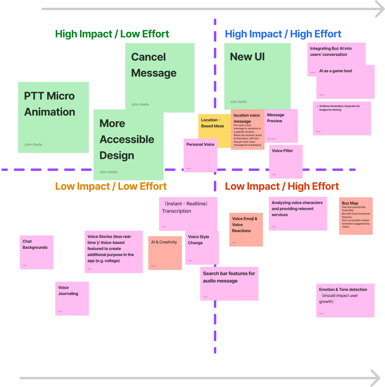
New Feature Effort Mapping
During the Jobs-to-be-Done workshop, we conducted an idea generation exercise and then mapped the best ideas onto an effort-impact matrix. This helped me identify solutions that could be implemented without requiring significant resources from our development team, while still having a strong impact on Buz. The next step was to gather evidence of user need for these features as part of a potential UI redesign.
04 -
Reading The Comments
To validate my ideas, I collected over 100 user reviews from the App Store. This helped demonstrate to stakeholders that there was a clear user need for the updates identified in the effort-impact matrix.
Real Buz reviews from the App Store
"I love the idea of Buz, but the tiny text throughout the app makes it so hard to use. I find myself squinting just to read basic instructions."
"Accidentally sent a voice message while testing the app and realized there’s no way to cancel it. Really wish there was an undo or delete option!"
"The concept is great, but the design feels very bland. The colors and layout are dull and don’t feel modern at all. Needs a visual refresh."
"I was excited to try Buz with friends, but the interface is pretty frustrating. Small font sizes and unclear icons make for a poor experience."
"I sent a message by mistake and couldn’t unsend it — that's a dealbreaker for me. Plus, navigating the app is a nightmare with the tiny text and unmarked buttons."
"I wanted to like Buz, but it looks like an early beta. The UI is boring, and it's hard to figure out how anything works. No polish or cancel features."
05 -
Goals
With approval for the project, I established a clear set of goals to achieve. Our success metrics included a reduction in the types of complaints mentioned above and an increase in overall user satisfaction.
✨ Modernizing the visual design
👆 Reducing homepage misclicks
👓 Addressing accessibility
❌ Adding a way to cancel voice messages
06 -
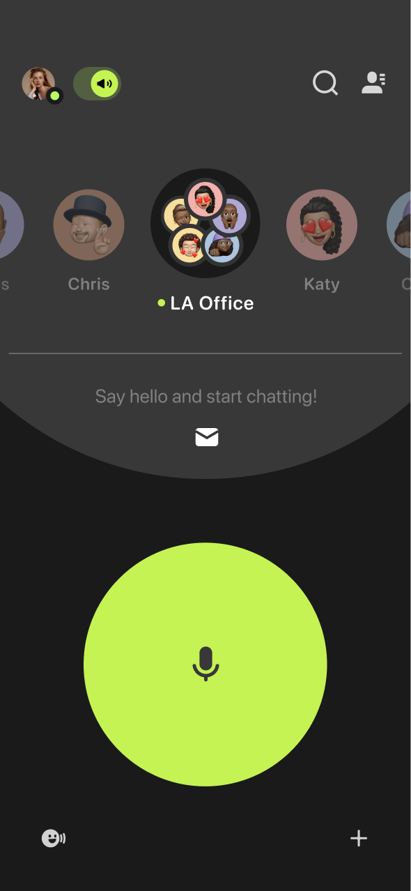
Modernizing the Landing Experience
Insights for the redesign were first surfaced during user testing for Hands-Free Mode, a feature I previously led. While evaluating that feature, I took the opportunity to ask participants how they felt about Buz’s overall look and feel.
Demos made for Hands-Free Mode
Testing A New Design
I took the opportunity to talk with both people in the office as well a our current users base and perform a few rounds of A/B testing with the new test design. Below are the results of my testing.
In office preferred a new design
87.5%
A/B testing with users preferred a new design
81.26%
The feedback was clear!
Users thought the app felt dated and visually flat.
Visual Exploration
During the process of creating Buz's Multitasking Mode, I experimented with a few new designs that served as a jumping-off point for further exploration in Buz V3.
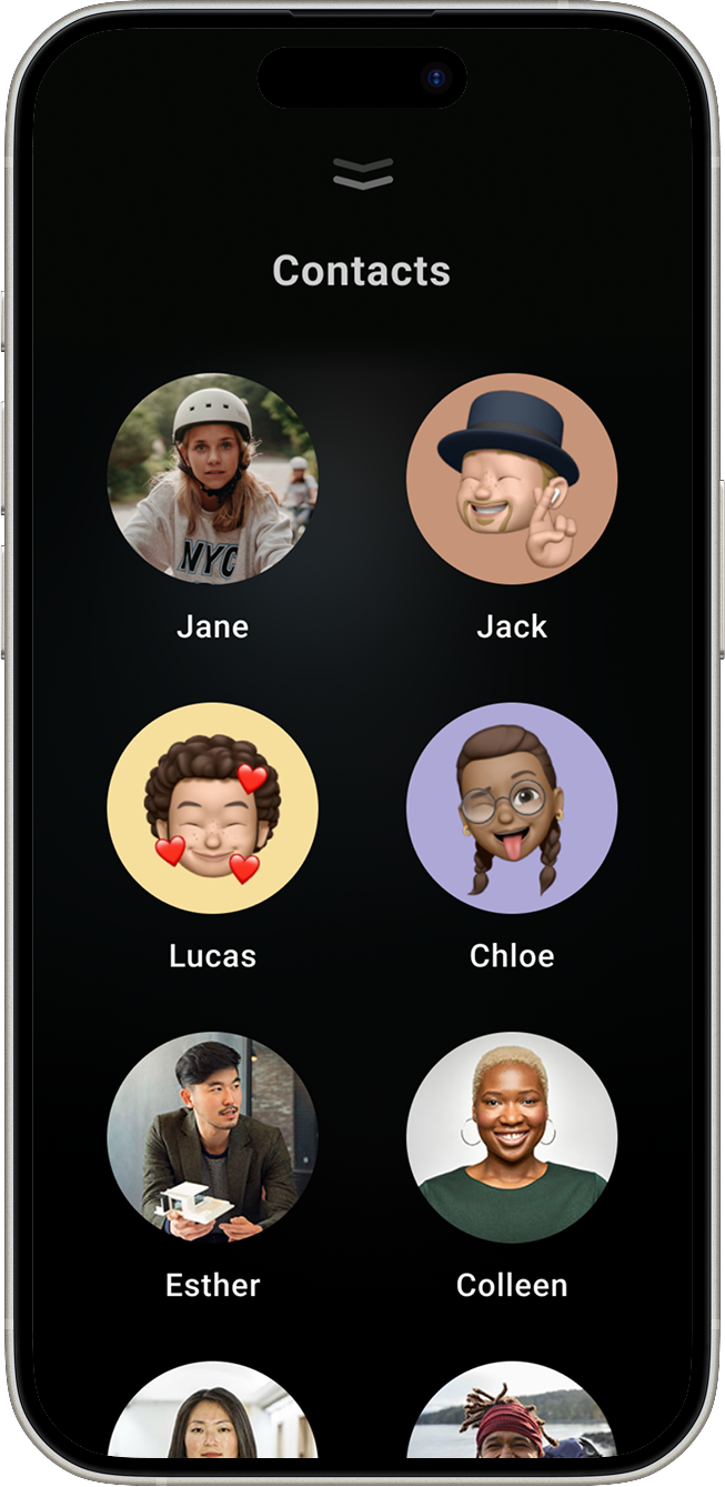
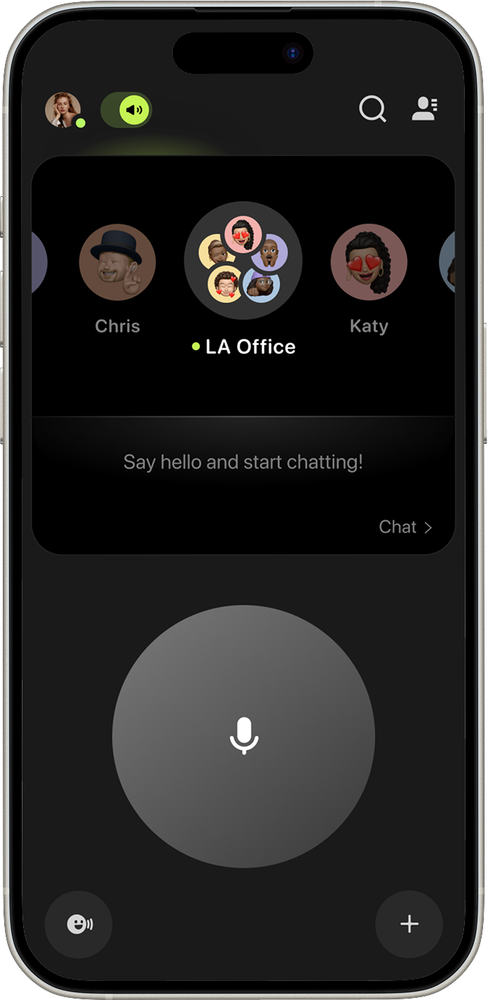
Contact Card
Users consistently gravitated toward a sleek, card-based layout that felt more modern and easier to use. With these discoveries and a direction chosen, we moved on to drafting the final designs.
Finding A Path
Once I realized from user research that users preferred a card-like design for the profile, I began testing several more radical concepts for Buz V3. This phase was meant to explore directions that could help us define what we wanted Buz V3 to become—but just as importantly, it helped me identify what I didn’t want the redesign to be.

Competive Anyisis
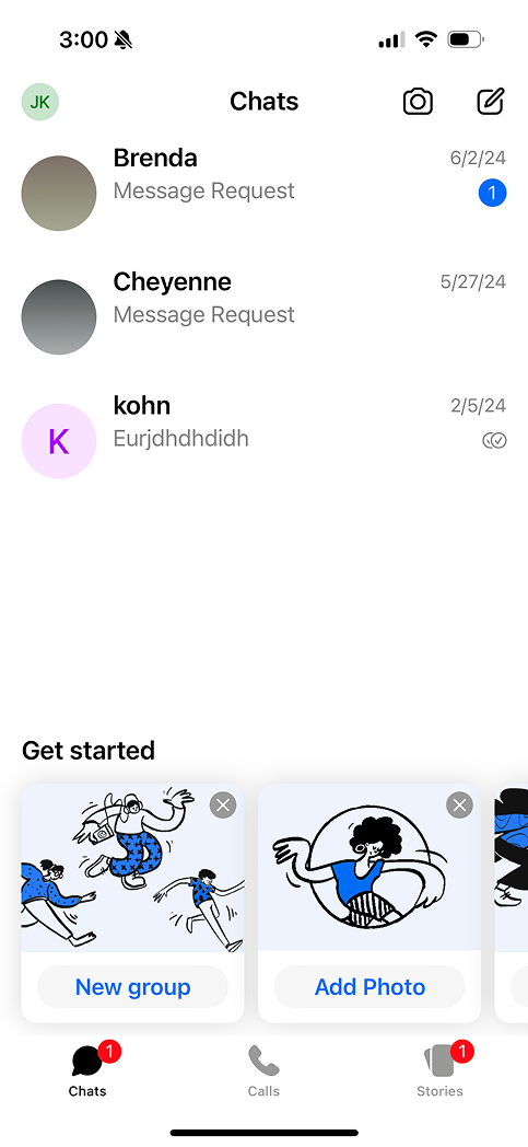
While working on the initial designs, I found that our competitors all embraced a simple flat style, occasionally incorporating 2D illustrations.
Direct Messaging Apps
All of our direct messaging app competitors used vertical profile pictures and flat color schemes in both light and dark modes.
Telagram
Signal
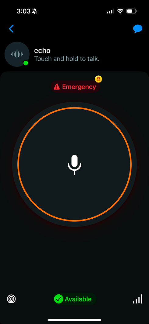
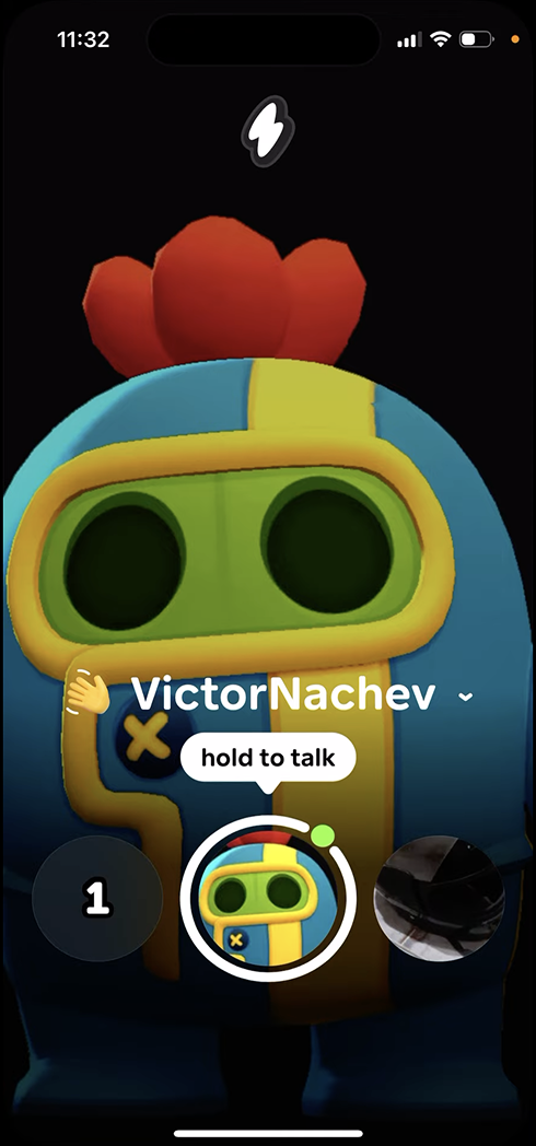
Push To Talk Apps
Similar to all of my competitive research on instant messaging apps, they also use a flat design style and rely on animation to indicate when a message is being recorded or sent.
Zello
Ten Ten
Noon Light
A/B Testing
I presented both flat and skeuomorphic design options to 20 potential users, and 85% of them said they preferred the skeuomorphic design because it felt fresh and captured their attention more effectively.
85%
preferred the skewmorphic design
Take Aways
The user preferred a skeuomorphic design for Buz, which distinguished it from the competition by providing a unique look.
Embracing Skemophism
With takeaways from user research and competitive analysis, I began implementing our new skeuomorphic design. I explored several design variations before presenting the updated concepts for stakeholder approval.

07 -
Final Designs

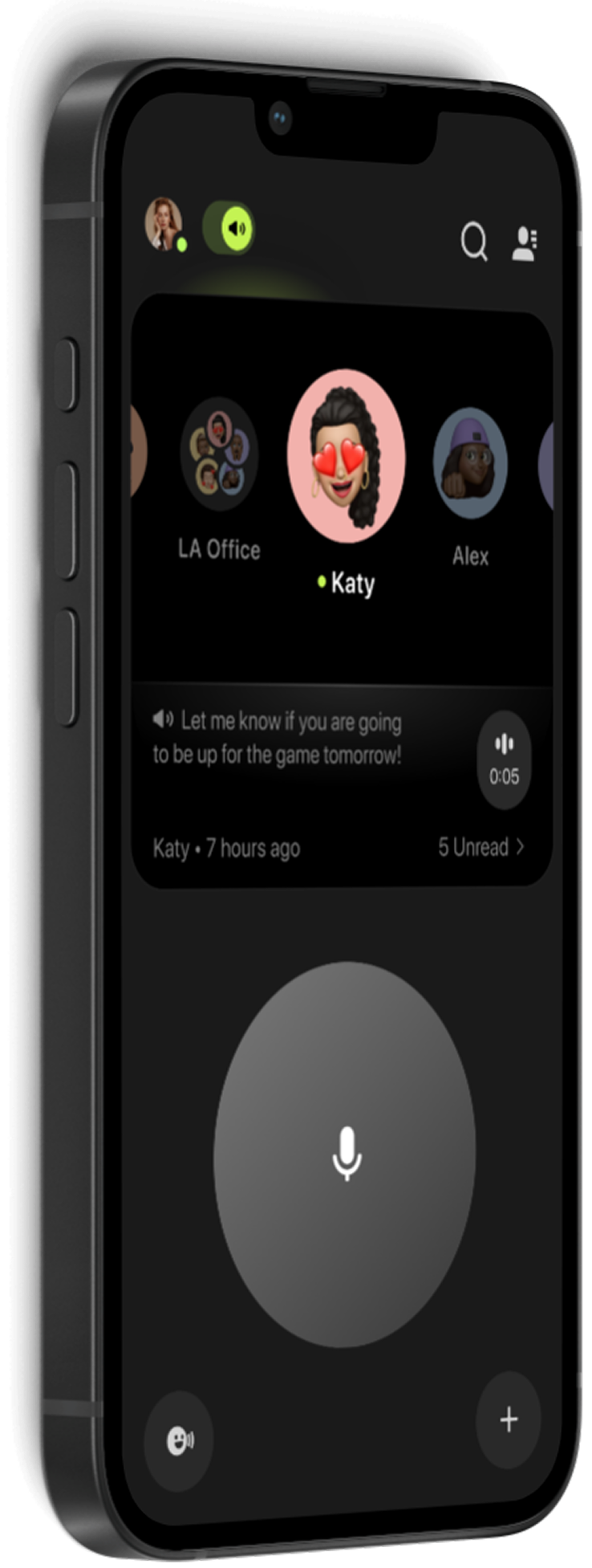
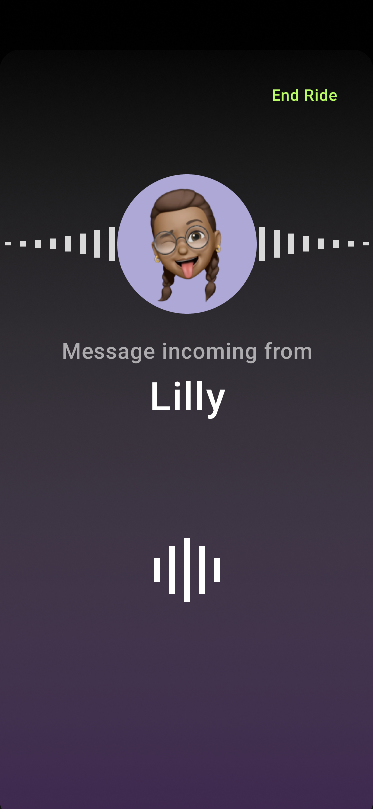
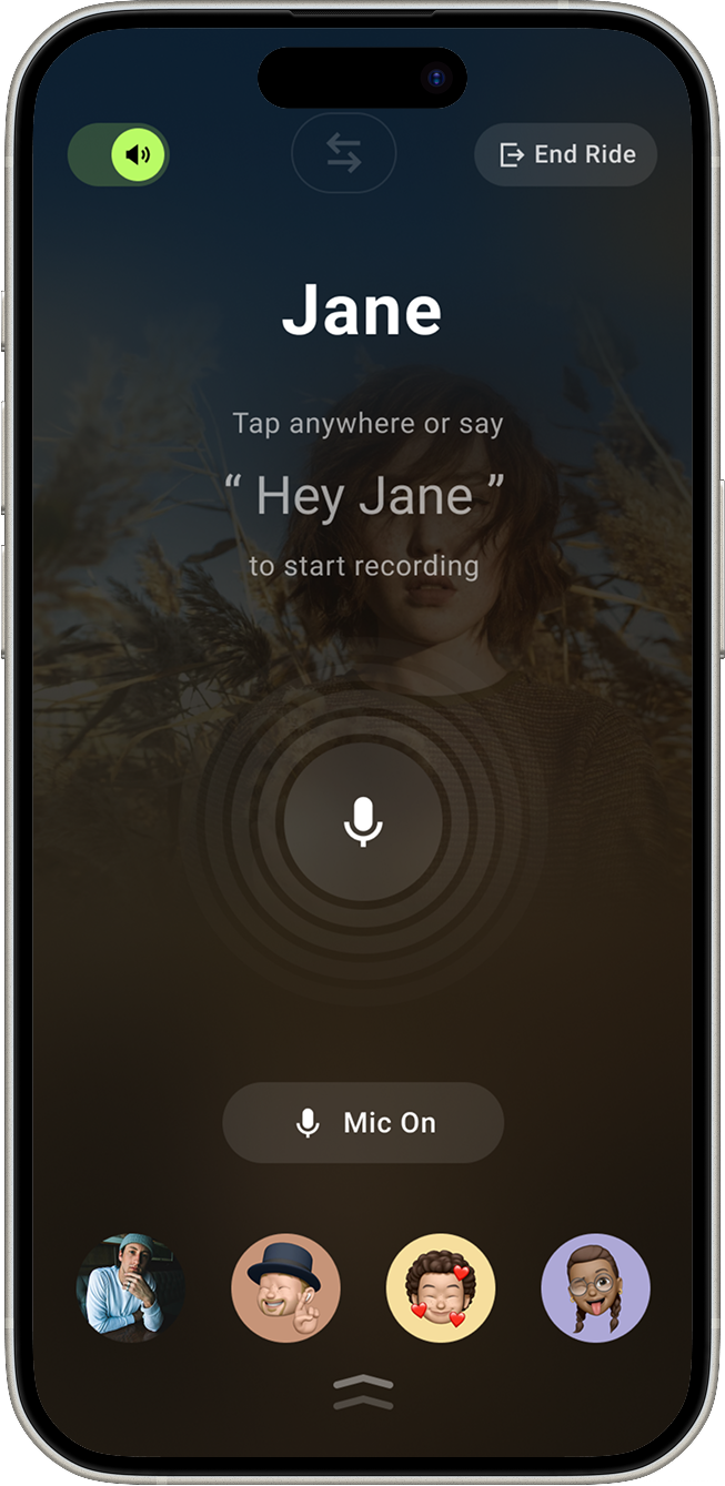
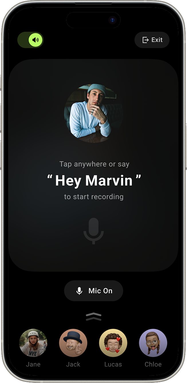
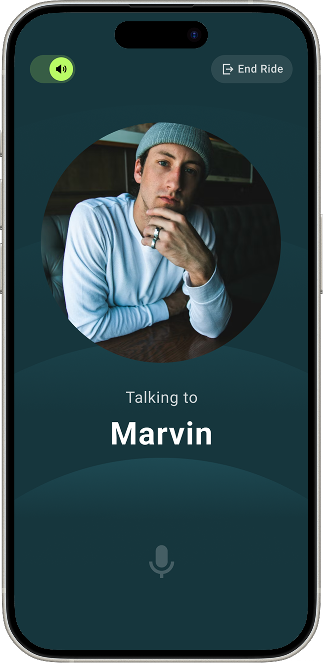
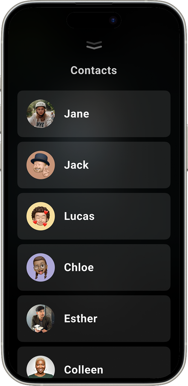
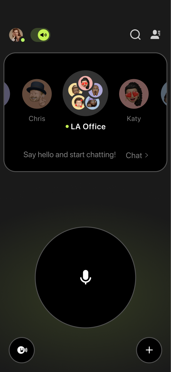
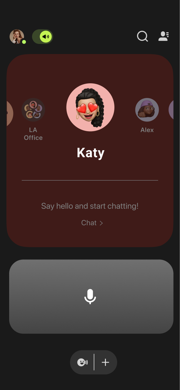
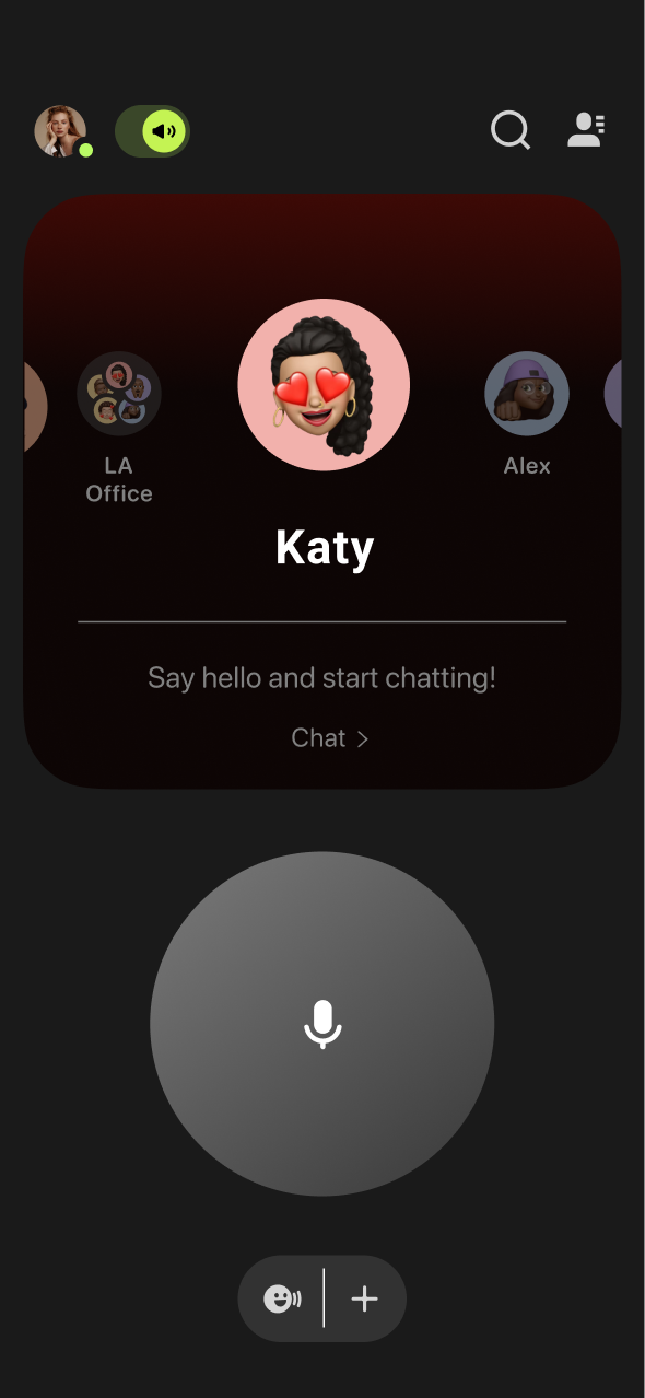
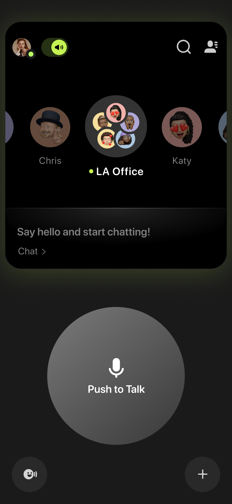
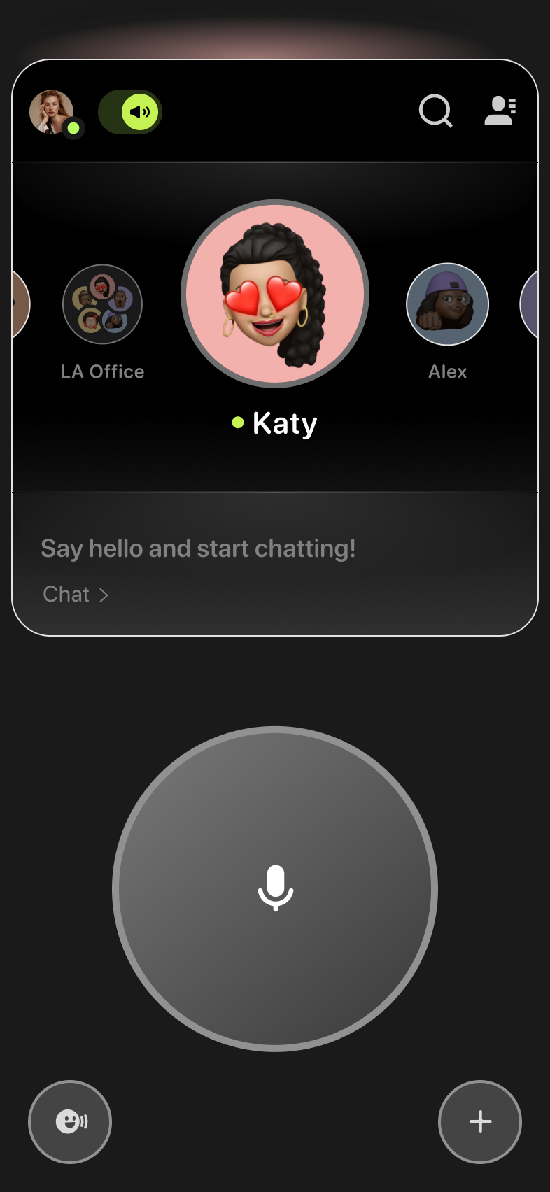
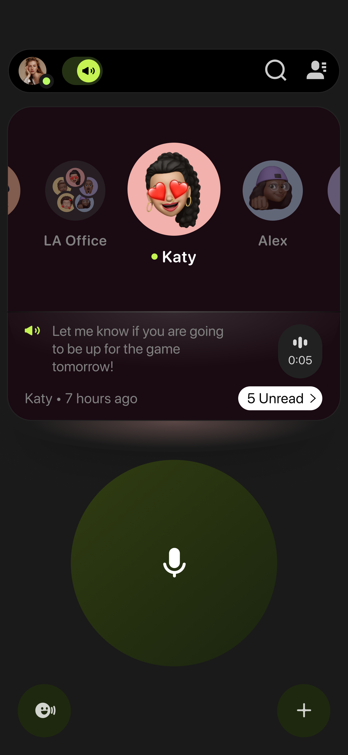
Message and Contact Sync
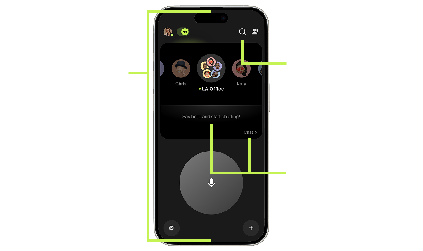
This new layout grouped key information—contact images, message previews, and interaction options—into a unified component, replacing the previously scattered interface.
By applying this design direction to the landing page, we began to see cascading improvements in usability, which directly informed the next phase of the redesign.
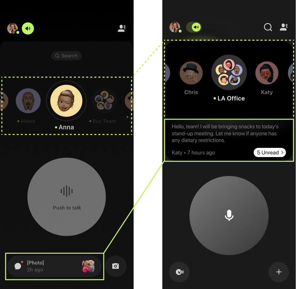
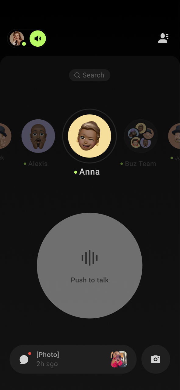
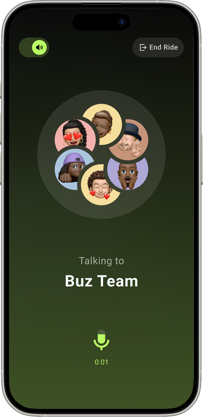
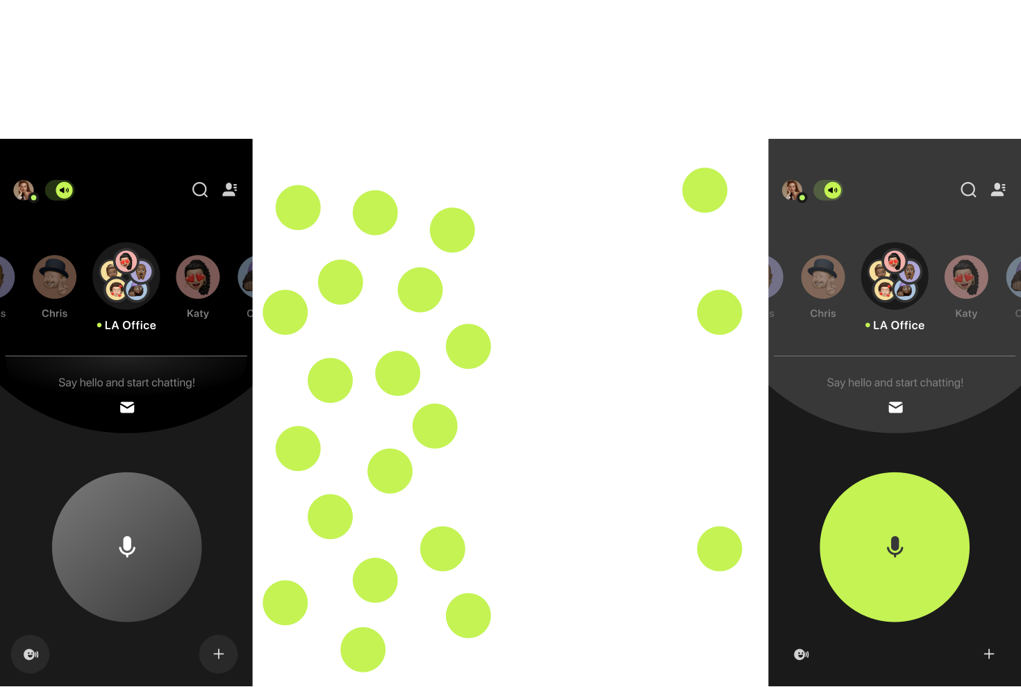
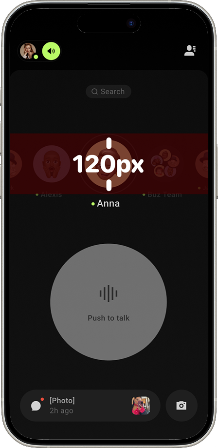
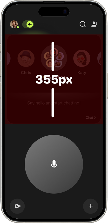
Clearing Up Interaction Zones
A major source of friction in the previous version of Buz was frequent misclicks and accidental swipes, largely caused by ambiguous interaction areas.
The new card-based layout introduced a well-defined visual boundary for each contact, making it immediately clear where users could tap or swipe. This simple structural change drastically reduced misclicks, improved confidence in interactions, and streamlined the overall navigation of the app.
This redesign also opened up opportunities to better preview message content—providing more context at a glance and reducing the need to open every chat thread.
08 -
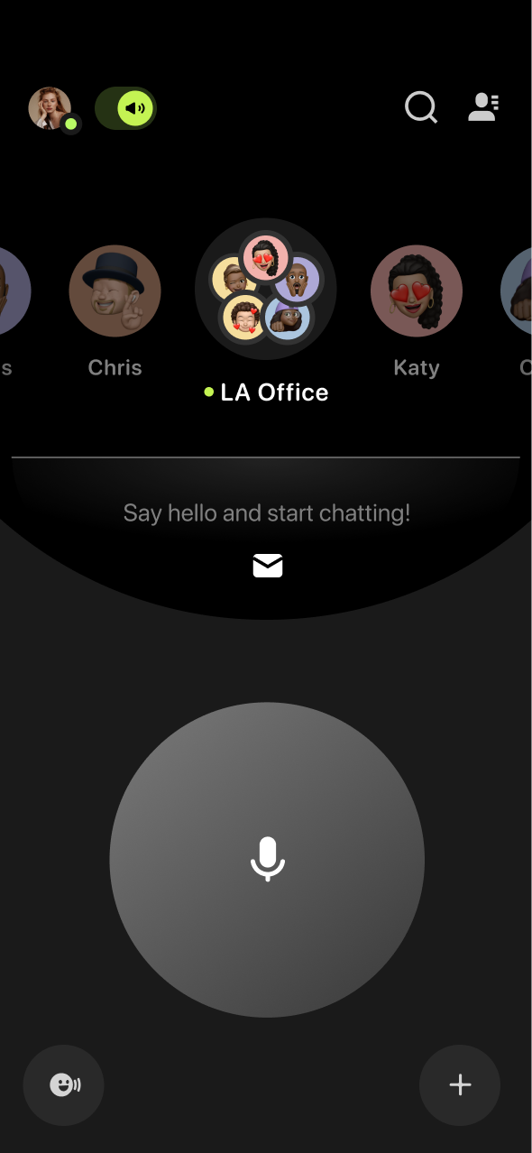
Improving Accessibility
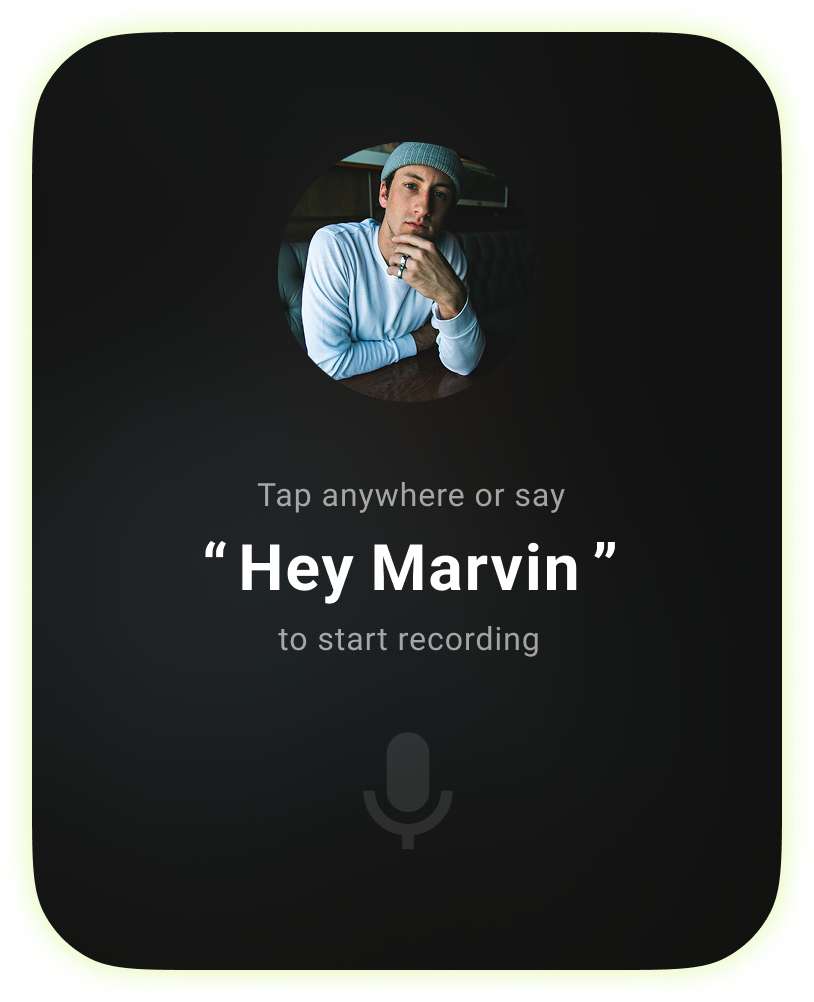
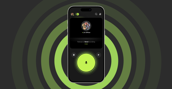
With the visual structure improved, the next step was to ensure the experience was inclusive and accessible. Several quick wins were implemented:
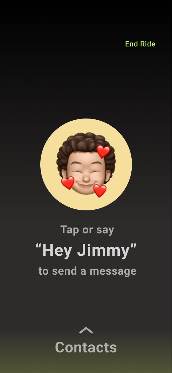
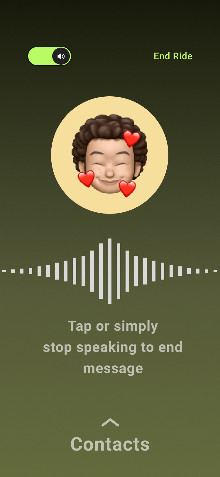
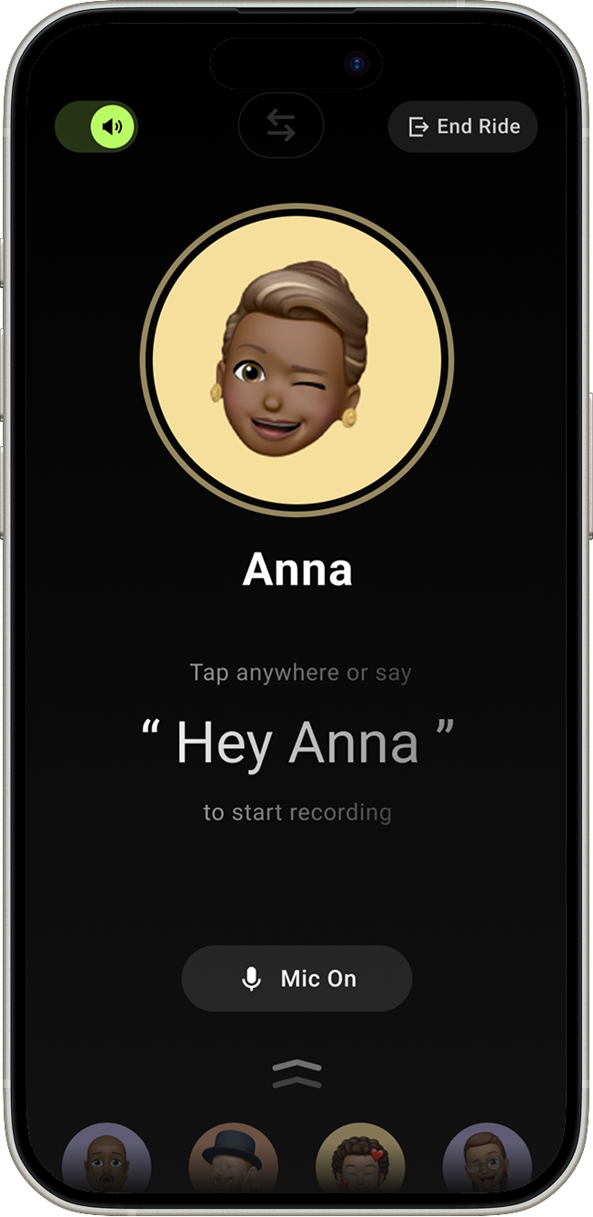
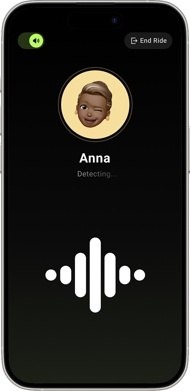
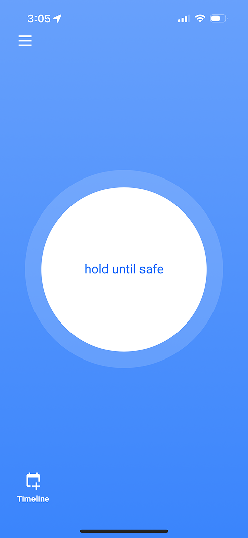
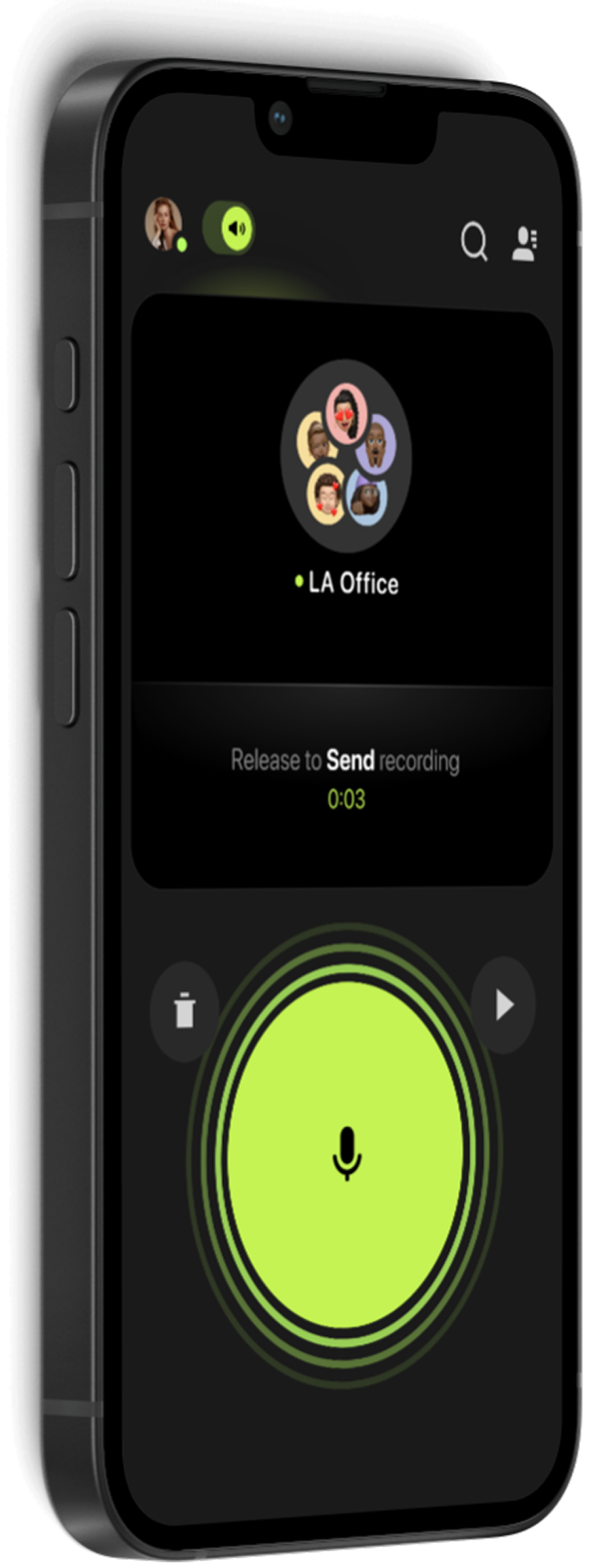
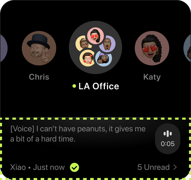
A wave animation was added to the push-to-talk (PTT) button, offering a subtle but effective way to communicate when the app was actively recording—enhancing both accessibility and user confidence.
These updates made the interface feel more polished, but more importantly, they ensured that Buz was usable by a broader range of people.
09 -
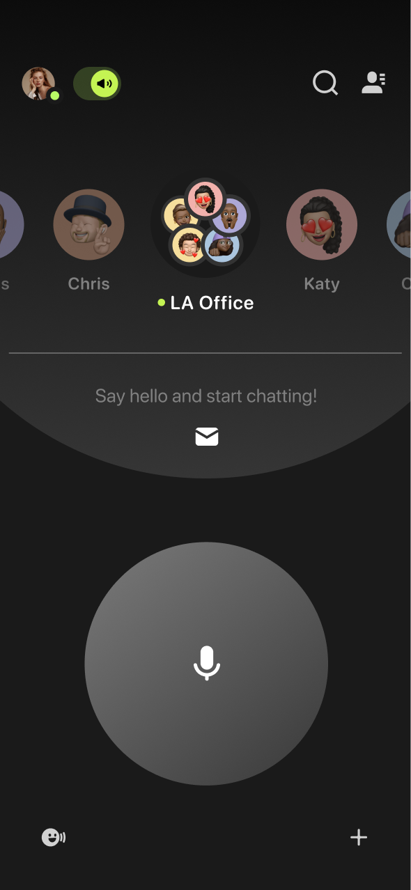
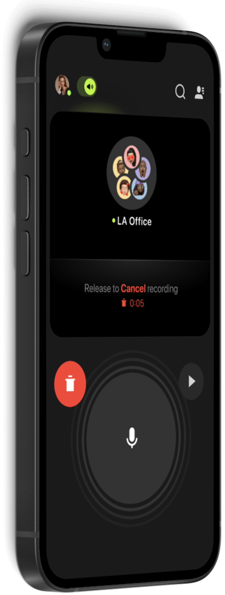
Cancel Functionality
One of the most consistent complaints we saw in user reviews was the lack of a way to cancel a voice message once it started. Users felt hesitant or even embarrassed if they made a mistake, which discouraged them from using Buz’s core PTT feature.
To solve this without disrupting familiar workflows, I designed a slider-based cancel mechanism that worked within the PTT interaction model. Users could now swipe to cancel while recording—preserving the speed and simplicity of the PTT experience while adding a much-needed safety net.
10 -
Conclusion
Once I had designed solutions for these problems, I led the development process by collaborating closely with developers and conducting QA. After launch, the redesign of Buz was a success across the board:
✨ The refreshed visual design helped reposition the brand as more modern, thoughtful, and accessible.
👆 User confidence increased, especially around message control and recording
Impact
Impact
Buz’s landing experience is now WCAG 2.1 compliant
Reduced misclicks on the homepage through clearer interaction zones
Directly addressed user complaints pulled from app reviews
Refined the brand’s visual identity
Improved App Store rating from 4.5 to 4.9 stars ⭐⭐⭐⭐⭐
“I was really impressed that John took the initiative to push for the recent optimisations of Buz. Over the last year, John has pushed for what he believes in, and the team is better for it.”
James Hwang: CEO of Vocalbeats
Check out more 
Check out more
Lead Suspect Management
Buz-V3
Working With Buz