UX/UI Augmented Reality Mobile
UX/UI Augmented Reality Mobile
Bringing accessibility to the business environment and reducing clutter.
Bringing accessibility and reducing clutter to the business environment.
01 -
Overview
Overview
People collect dozens of business cards every year that all end up either taking up space or being thrown out within a week of the cards being printed. Seeing this problem, I decided to create a project that streamlines the meeting and exchanging of contact information process to limit the amount of human waste.
 Tools Used
Figma Cinema 4D After Effects
 Roles
Roles
(Independent) Concepting Visual Effects Visual Design Coding
 Timeline
Timeline
4 Weeks, Spring 2021
Outcome
Round 1: I made a resume in Unity to test out my idea with a real business card. Then, I performed tests on 4 users and noted their feelings about the first iteration of the design as well as issues with accessibility.
Round 2: I revised my design to accommodate for the accessibility issues. The final deliverables include wireframes, high-fidelity comps of both the phone app and the augmented reality screens, and finally a motion graphics piece.
02 -
Problems
Problems
Clutter
The resumes and business cards collected have no connection to common social media apps and websites.
Lack of Information
While business cards are small and portable, they may not provide enough information. On the other hand, resumes offer more comprehensive information but can be cumbersome to carry.
No Connection
Career fairs often result in the collection of numerous business cards and resumes, which can take up a significant amount of office space.
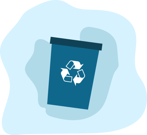
Not Eco Friendly
The massive amount of printing that uses ink and paper contributes to the depletion of the Earth's natural resources.
03 -
Goals
Goals
Informative
Make sure that even though the format is small it gives as much information as possible.
Micro Interactions
I decided that I wanted to have more sliding motions in the game as opposed to taps. This adds a greater level of player interaction. It also gives the player a greater eye candy.
Make a Connection
Create a stronger correlation between the printed material and the digital experience.
Micro Interactions
I decided that I wanted to have more sliding motions in the game as opposed to taps. This adds a greater level of player interaction. It also gives the player a greater eye candy.
Reduce Waste
Eliminate the cycle of printing and throwing away paper and ink by limiting printing to only a few times. Every year, 10 billion business cards are printed, and within a week of their creation, 88% of them are thrown out, leading to an enormous amount of waste.
Micro Interactions
I decided that I wanted to have more sliding motions in the game as opposed to taps. This adds a greater level of player interaction. It also gives the player a greater eye candy.
Eliminate the cycle of printing and throwing away paper and ink. Limit to only printing a few times. 10,000,000,000 business cards are printed every year, and within a week of being made 88% of them are thrown out leading to an enormous amount of waste.
04 -
Solutions
Solutions
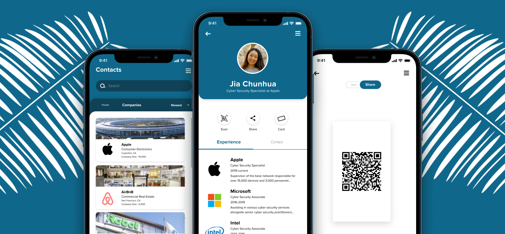
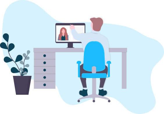
Create an augmented reality experience that expands the limited amount of information present on a business card. This reusable card wouldn't require you to hand it out to every person you meet to make a connection. Instead, all you need to do is let someone scan your card.

This process eliminates the need to have a different card for every person you meet. You can simply keep using the same card over and over again.
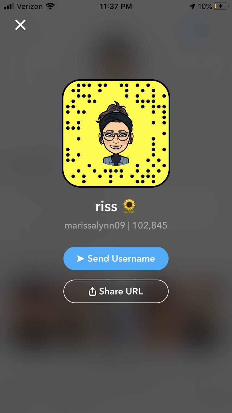
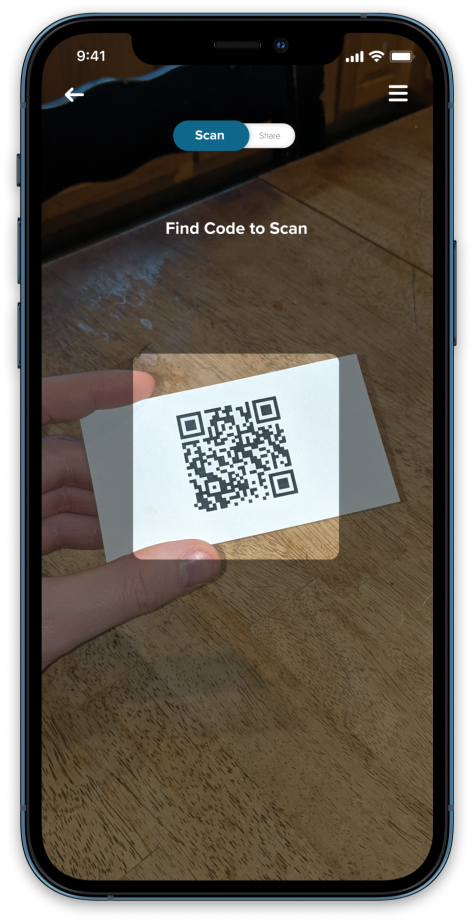
I've developed a system that allows for both digital cards to be scanned and for scanning others' cards through QR codes. This system is similar to Snapchat, bringing the convenience of quick scanning to the world of business.
05 -
Sketches
Sketches
I sketched out an initial user flow to map out how I anticipated the app would work. This also helped me identify the screens I would need to create.
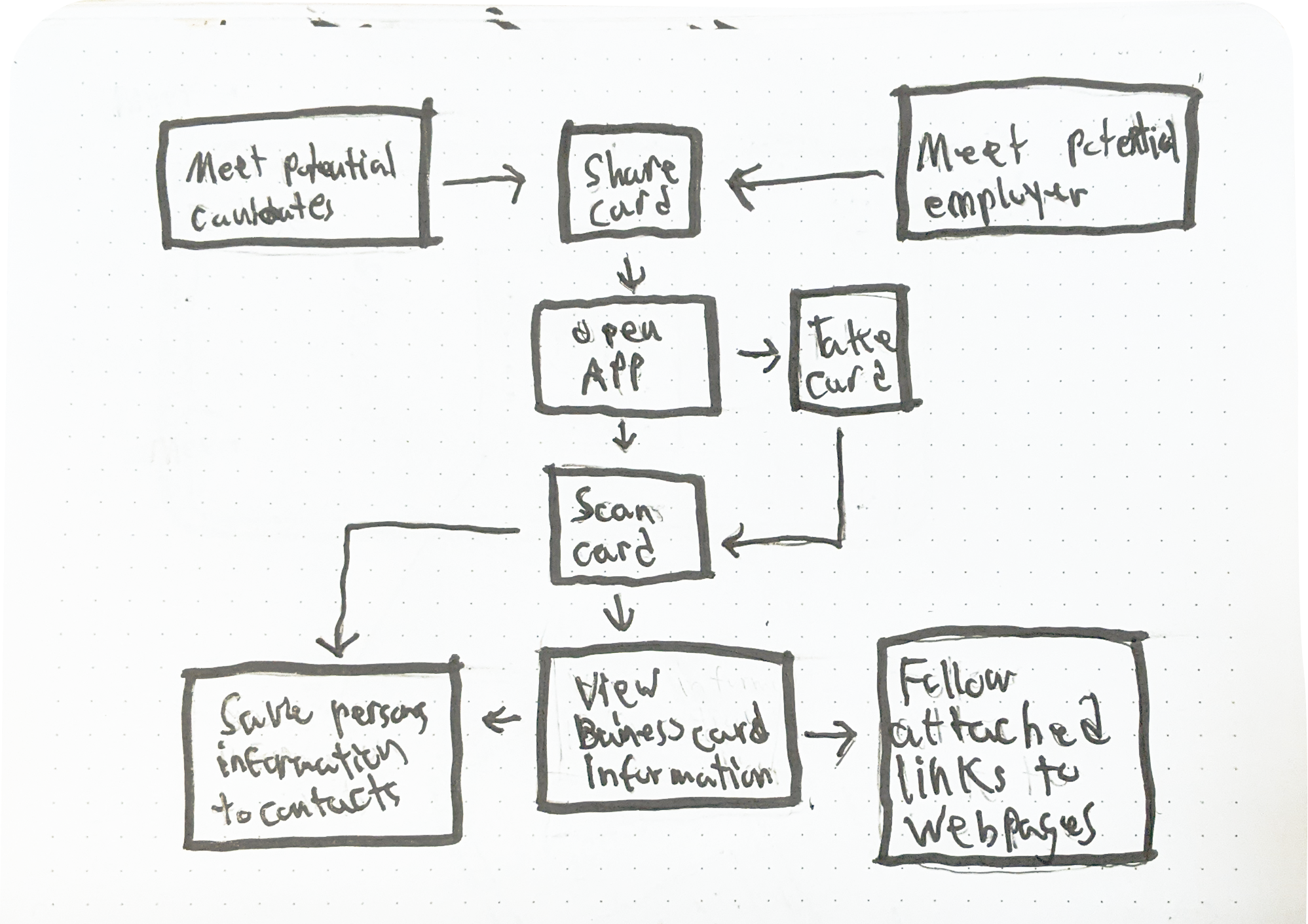
In my first attempt, I found that pointing the camera at a card to display all the information at once might meet my goals.
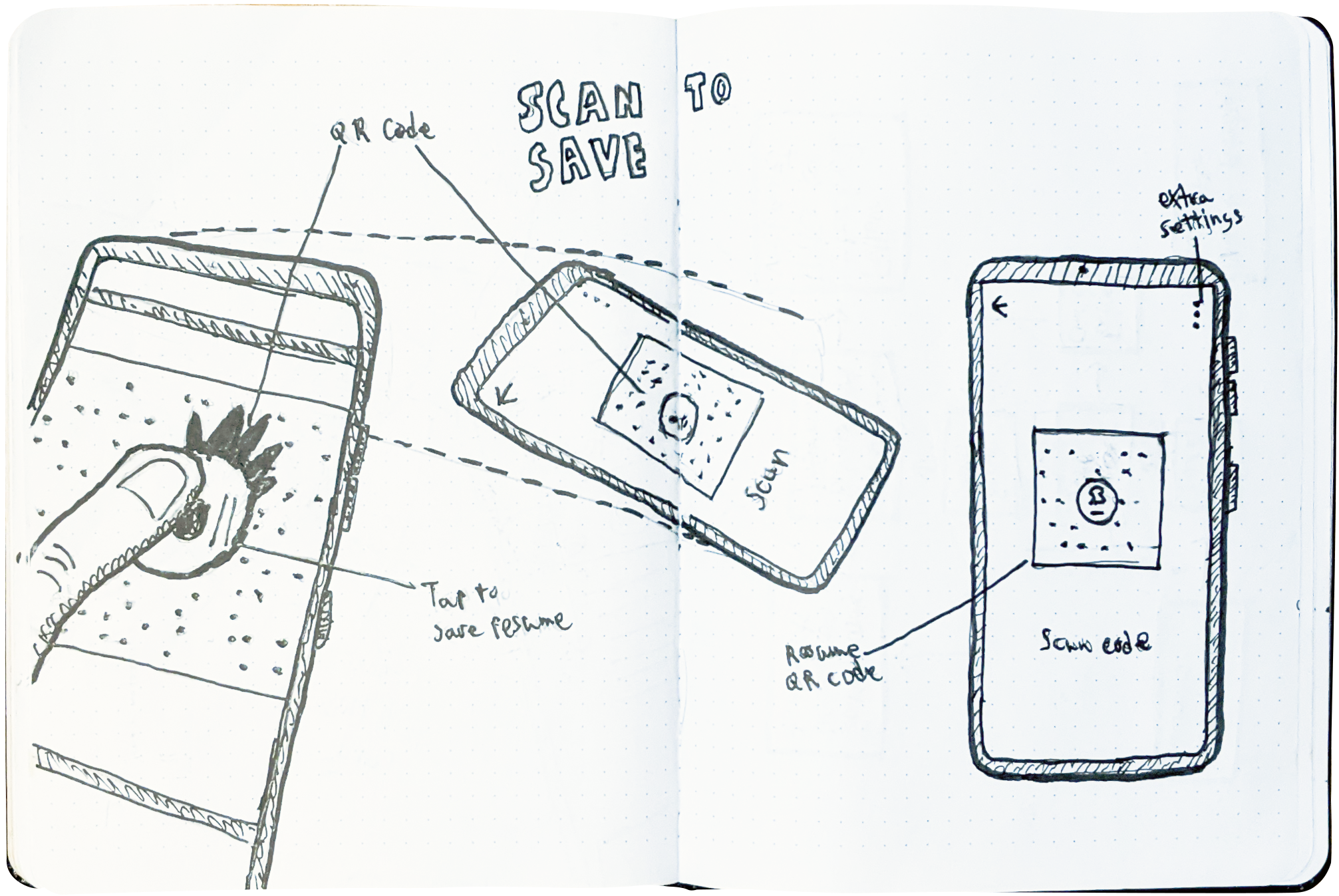
During this stage, I also came up with the idea of creating a personal code that users could scan in the phone app.
At this stage, I also come up with the idea of having a personal code that you can scan in the phone app.
06 -
User Stories
User Stories

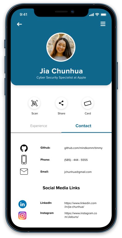
Jia Chunhua - Potential Applicant
Jia is a cybersecurity expert who wants to demonstrate her experience and showcase her up-to-date knowledge of new technologies using NECT.
Micro Interactions
I decided that I wanted to have more sliding motions in the game as opposed to taps. This adds a greater level of player interaction. It also gives the player a greater eye candy.

Kenneth Ramsay - Recruiter
Kenneth wants a quick and efficient way to gather information about potential applicants without creating clutter later on.
Micro Interactions
I decided that I wanted to have more sliding motions in the game as opposed to taps. This adds a greater level of player interaction. It also gives the player a greater eye candy.
Kenneth wants a quick way to gather information about possible applicants. He also doesn't want too much clutter later on either.
I created a user flow to clarify how Jia and Kenneth may interact with each other and how they can move through the experience. This process also helped me to create wireframes and build the architecture of my user interface.
07 -
Wireframes
Wireframes
With the user flow complete, I knew which screens needed to be developed to complete the journey. To achieve this goal, I drafted wireframes to show the mobile user interface and illustrate my vision.
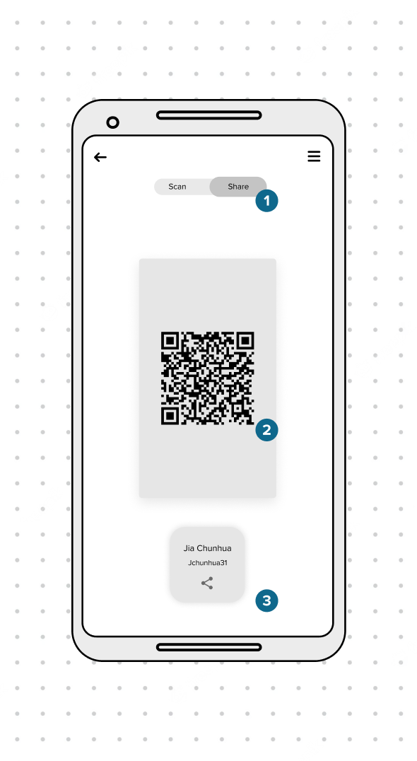
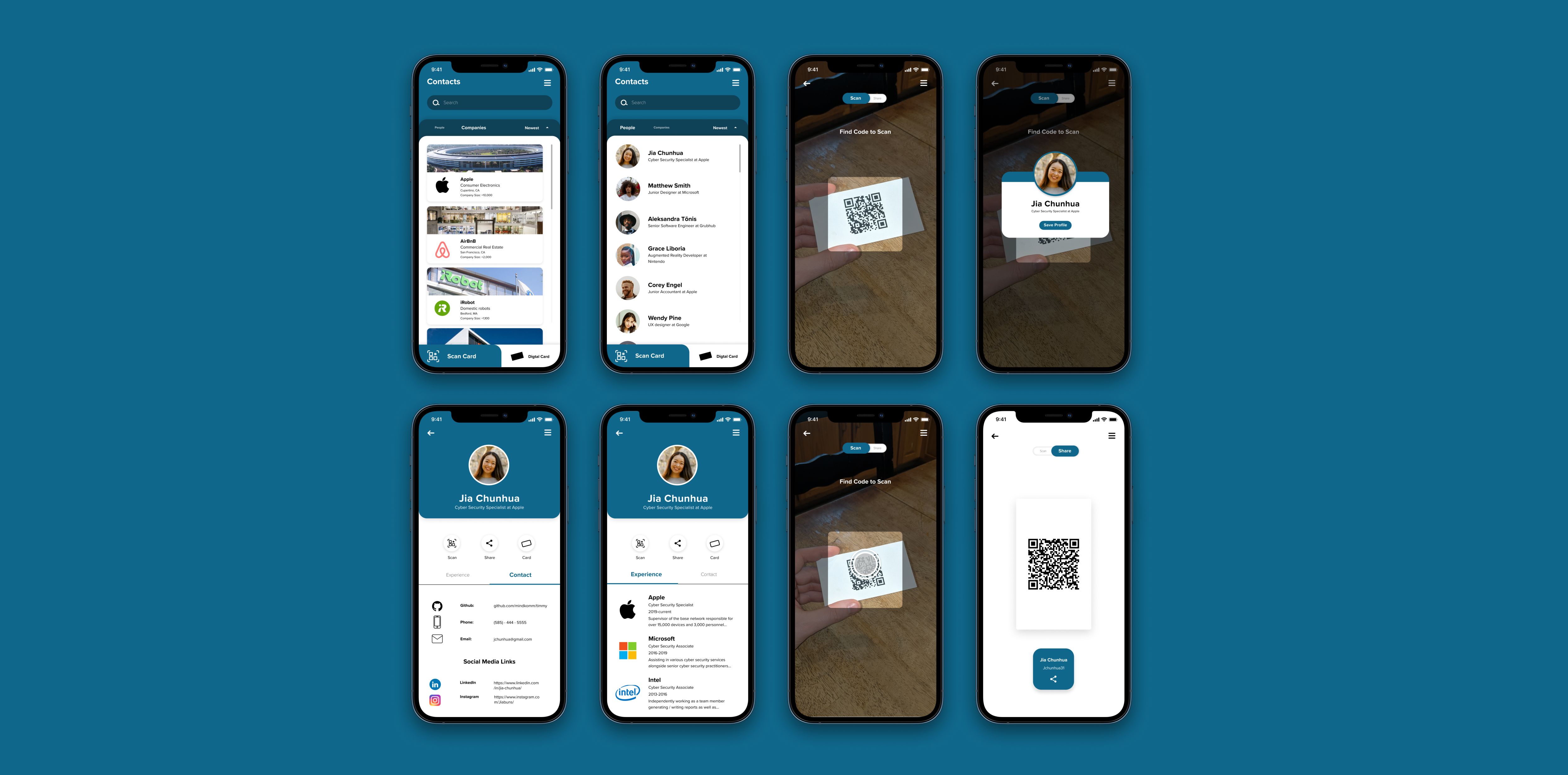
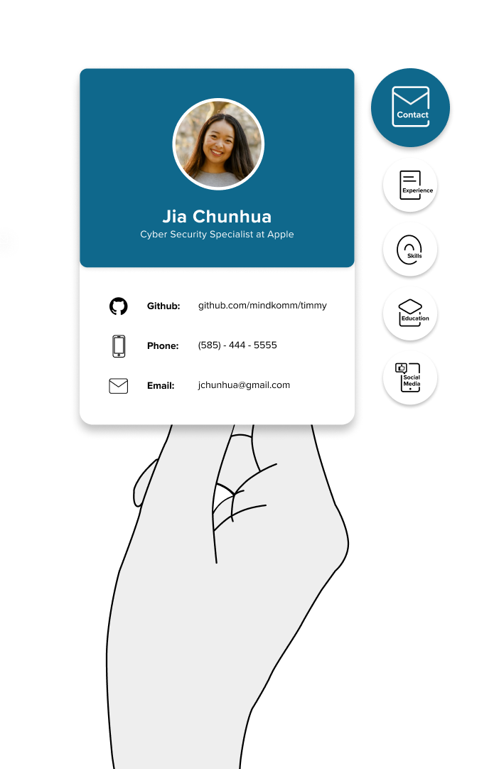
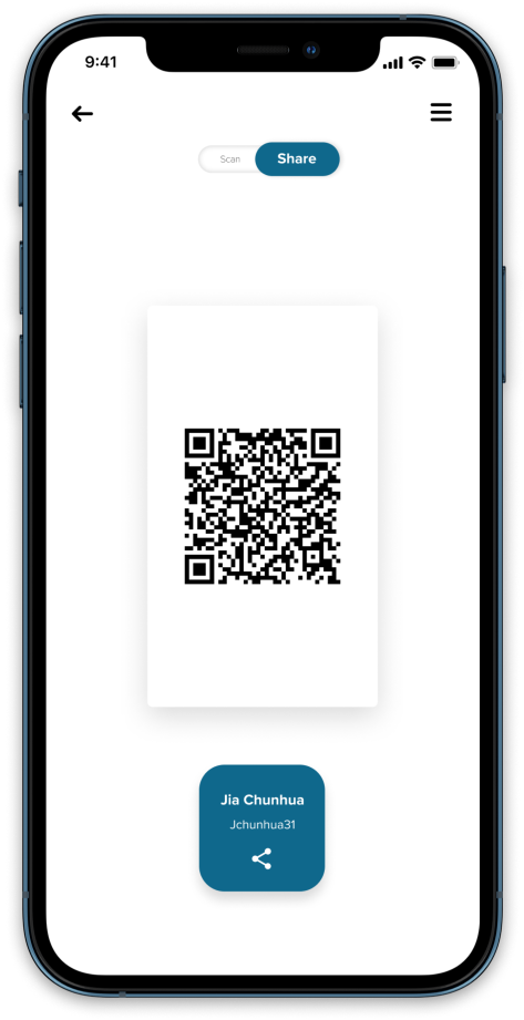
Digital Card
01 - Scan/Share Toggle
Switch between scan and share states.
02 - Scanable Card
QR code that can be scanned to send over NECT profile and save for future referral.
03 - Share Button
Share NECT profile through other means than the app itself.
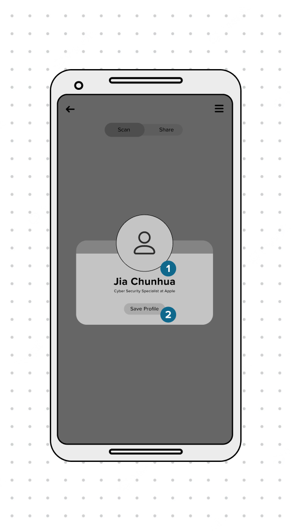
Scan Pop
01 - Profile
Information about the person whos card was scanned with a headshot, title, and place of employment.
02 - Save Profile
Save profile to the contact library in the app.
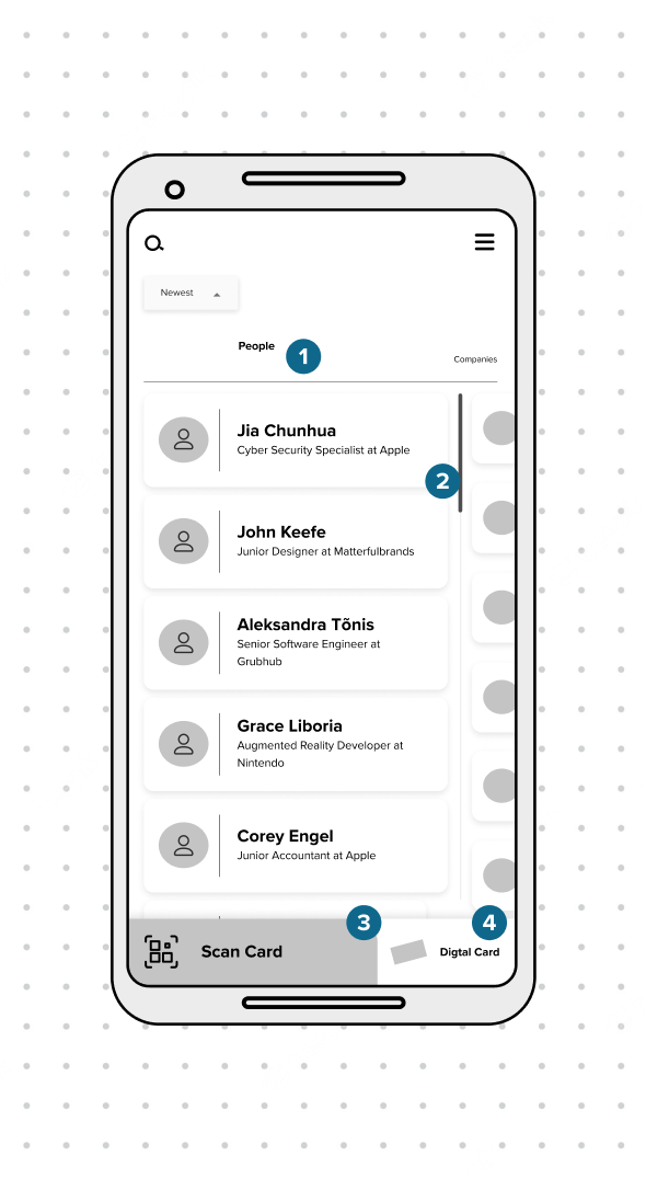
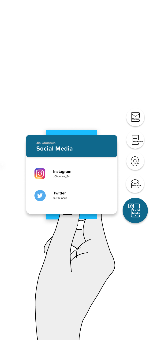
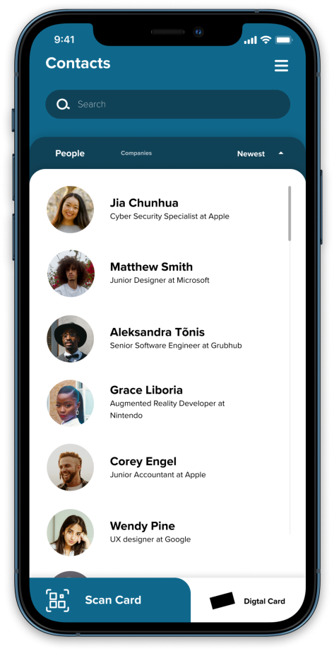
Contacts
01 - People/Companies Tabs
Switch between saved people and companies in one's saved contacts.
02 - Saved Profile
A link to a saved person's profile that displays basic information about that contact.
03 - Scan Button
Takes the user to the Scan Card state.
04 - Digital Card Button
Take the user to the Digital Card state.
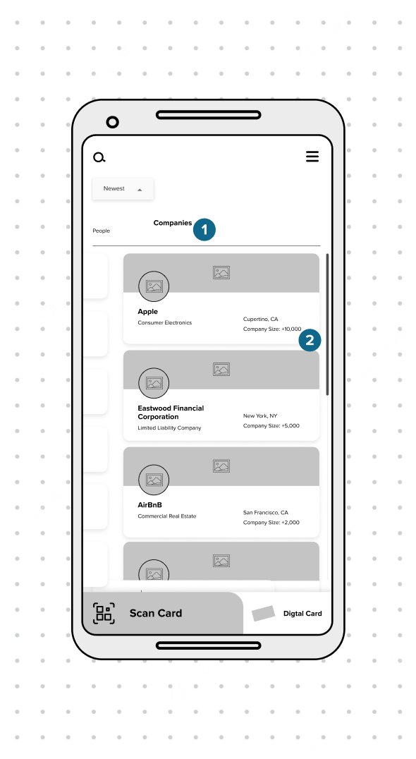
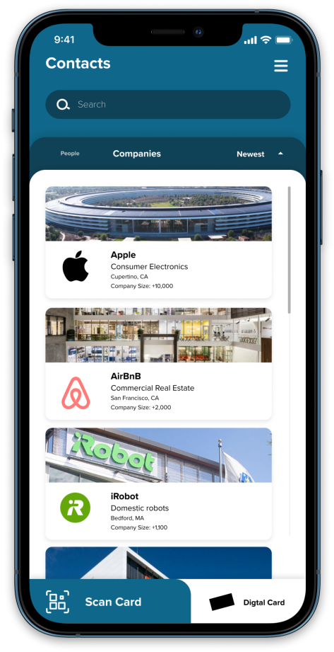
Companies
01 - People/Companies Tabs
Switch between saved People and Companies in one's saved contacts.
02 - Saved Company
Links to pages with company information and displays basic information.
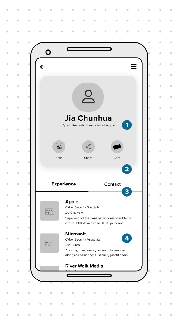
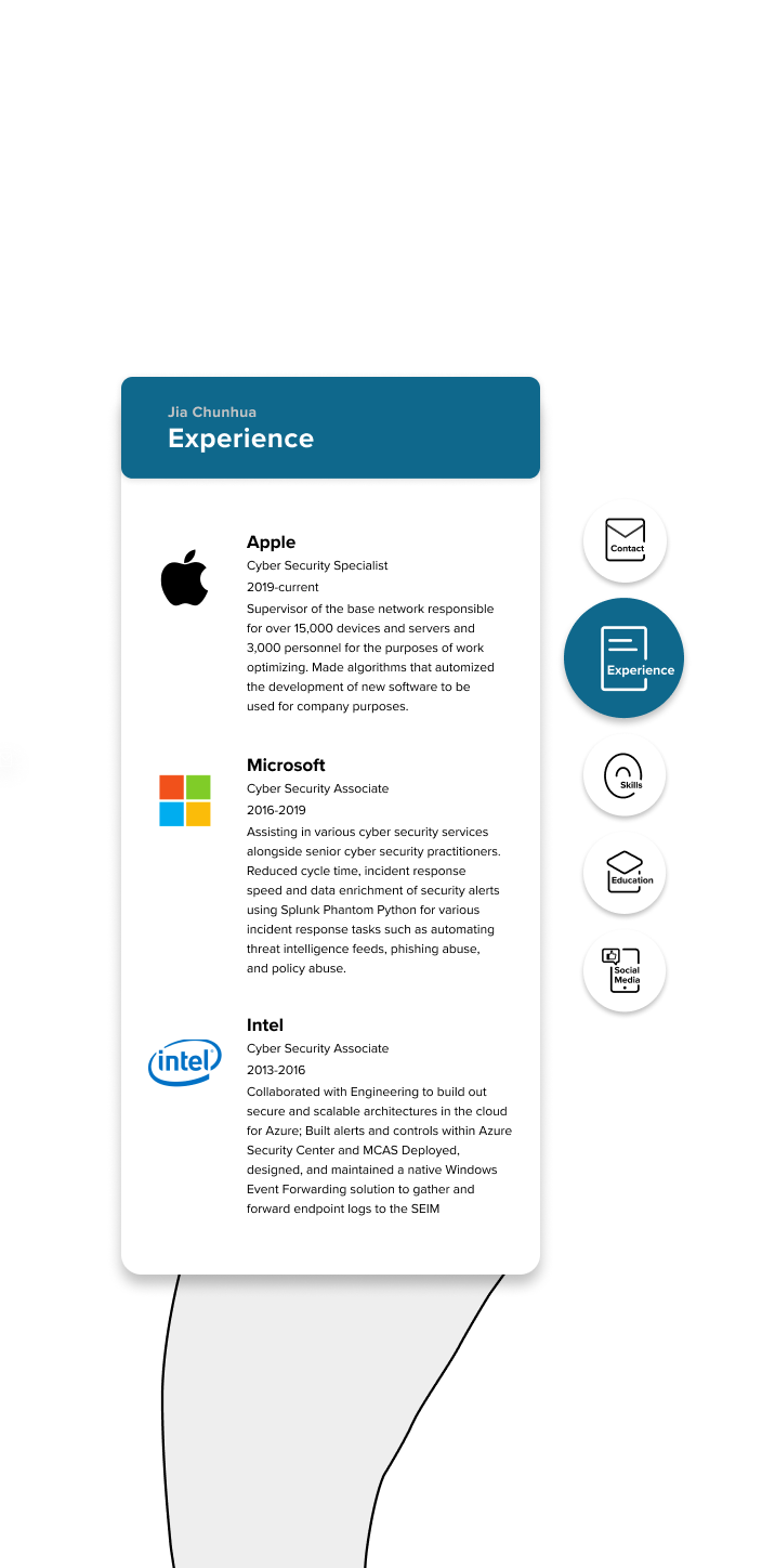
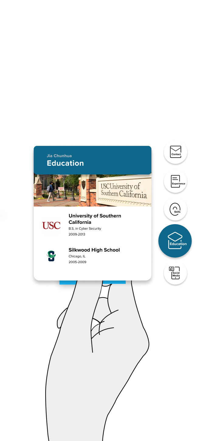
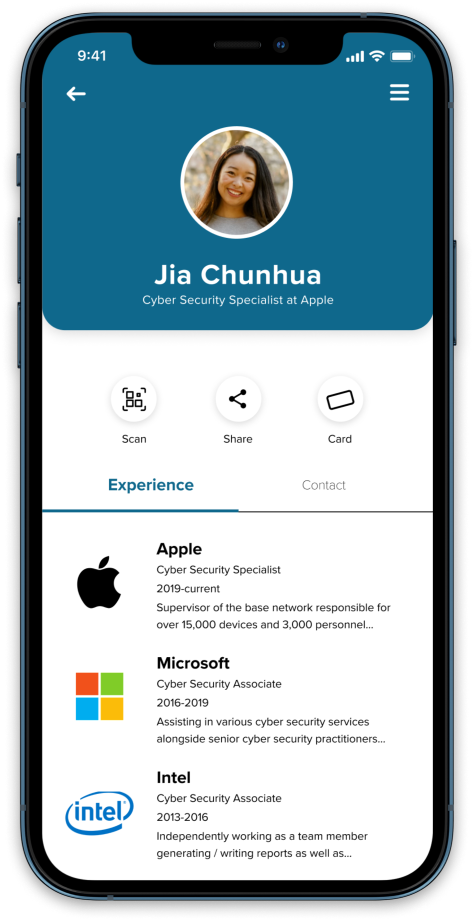
Profile
01 - Profile
Basic information about the profile.
02 - Calls to Action
Options to scan, share, and show card.
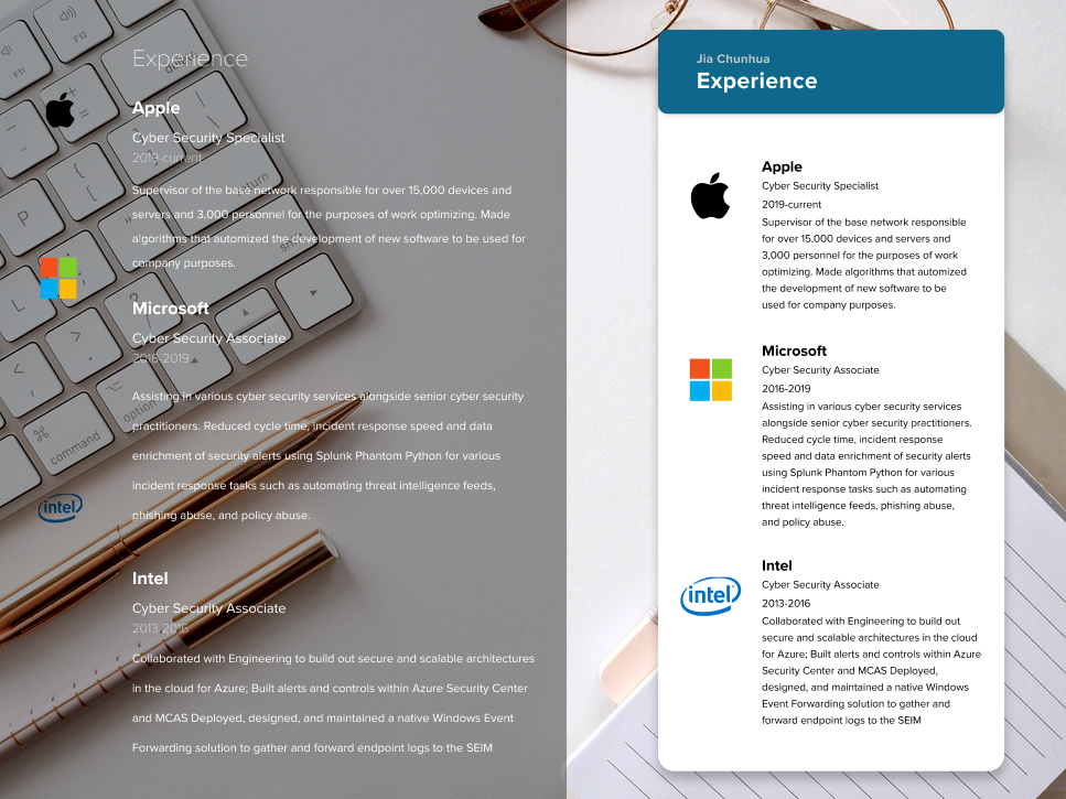
03 - Experience/Contact Tabs
Switch between the Experience and Contacts tabs.
04 - Experience
A resume of past experience of the contact who has been save.
08 -
User Testing For AR Business Cards
User Testing For AR Business Cards
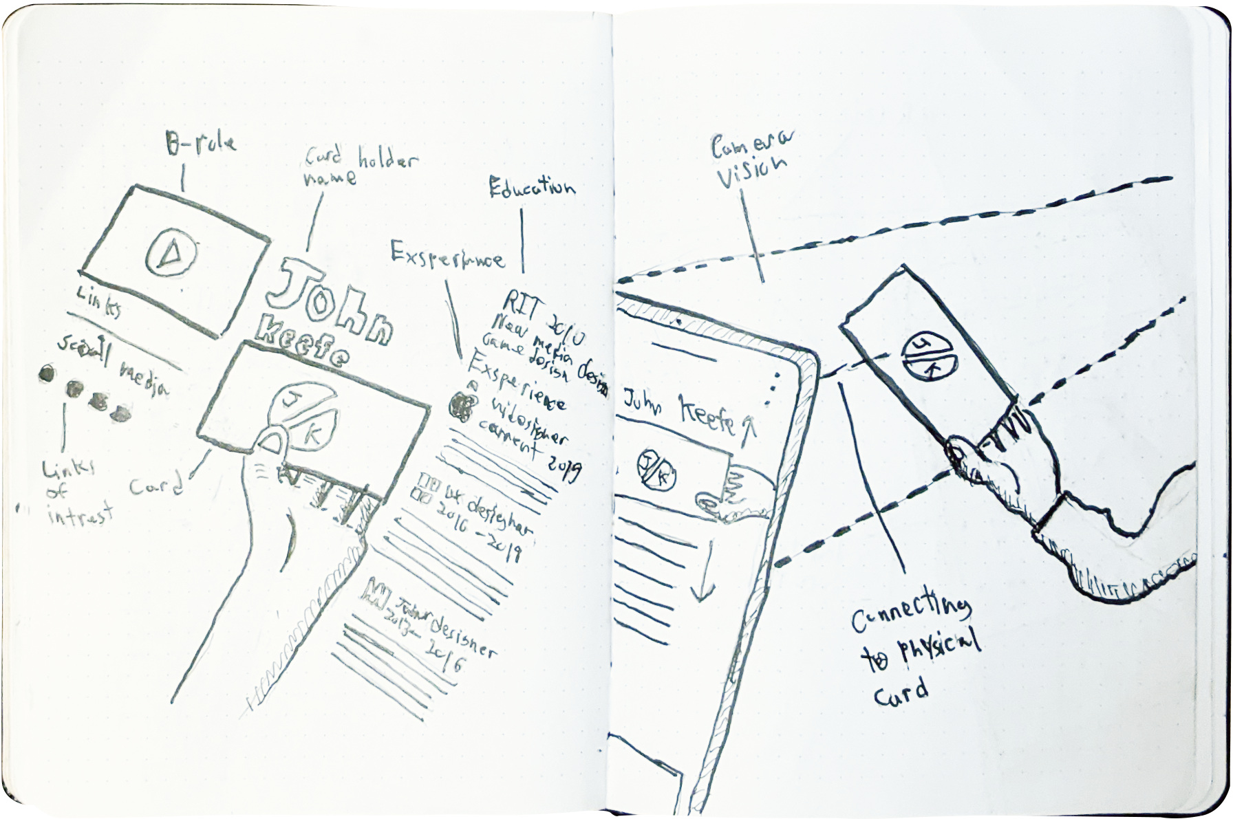
To evaluate the usability of my scalable card idea, I utilized Jia's resume and created several layouts that present all the information simultaneously.
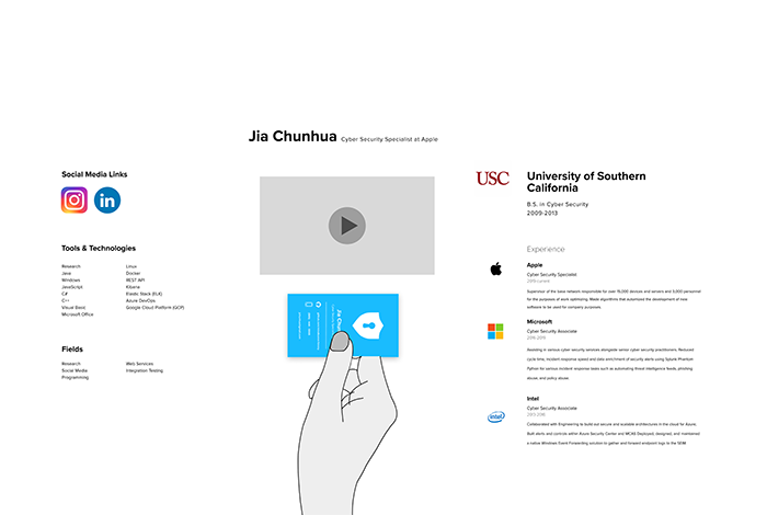
After creating my personas, I uploaded Jia's resume into Unity to test my design and assess its viability. I also wanted to identify any potential issues with the current idea.
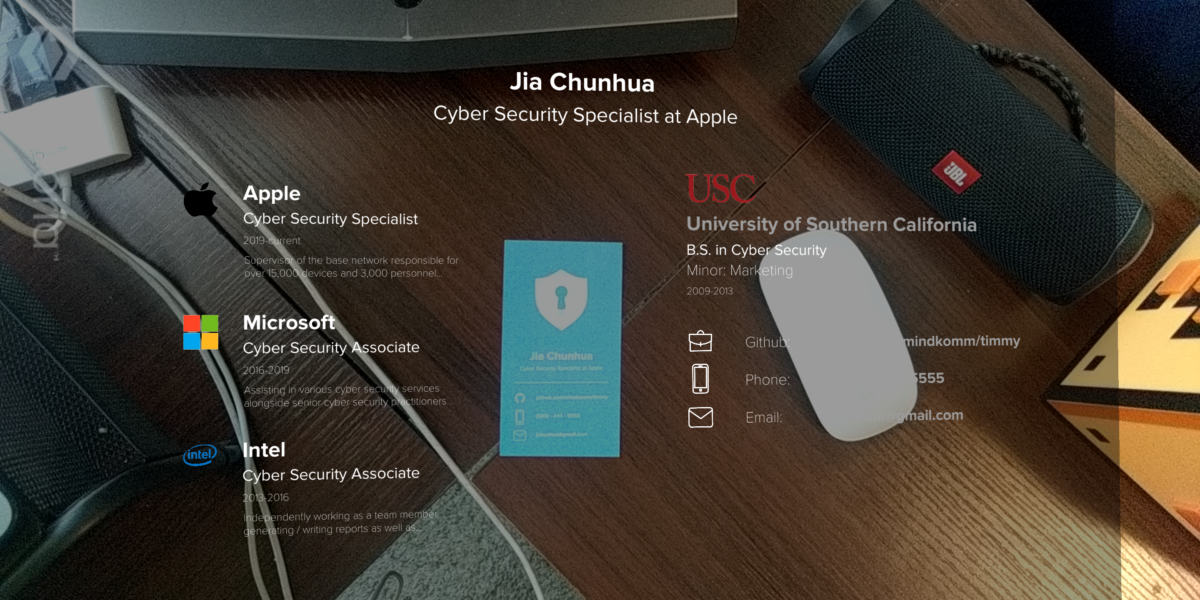
Issues With Full-sized Display
After testing I came up with a few consistent problems.
Overwhelming Information
There was too much info on the screen leading to no piece of information standing out or being especially readable.
Spread Out
To be able to read certain parts of the resume users would have to tilt the card and phone to make it visible in the viewport.
Desync
There was a problem with the camera having to look away from the trigger turning to experience off.
Hard to Touch
As one hand is holding the card and the other is holding the phone that leaves no hands available for solely touching the screen leading to accessibility issues for some users.
As one hand is holding the card and the other is holding the phone that leaves no hands available for solely touching the screen leading to accessibility issues for some users.
09 -
Fixing User Issues
Fixing User Issues
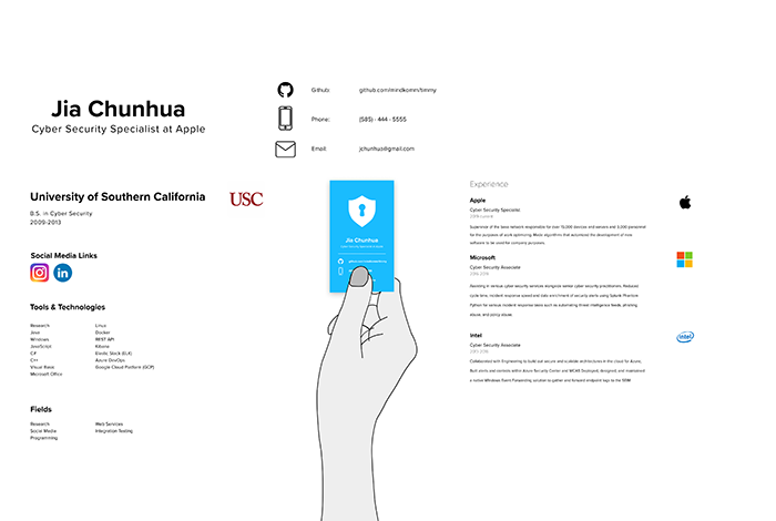
A More Professional Display
To solve the issues with the first three problems, I redesigned the experience to have multiple categories so that only a small amount of information is shown at a time. Additionally, this prevents desyncing by always keeping the camera pointing directly at the card.
Micro Interactions
I decided that I wanted to have more sliding motions in the game as opposed to taps. This adds a greater level of player interaction. It also gives the player a greater eye candy.
To solve the issues with the first 3 problems, I redesigned the experience to have multiple categories so that only a small amount of information is shown at a time. Also, this leads to the camera always pointing directly onto the card stopping desync.
Legibility
The black transparent background was removed because it made the body copy harder to read. The type overlaid on the background, making it blend in. With the white background of the new design, reading the applicant's information is no longer an issue.
Micro Interactions
I decided that I wanted to have more sliding motions in the game as opposed to taps. This adds a greater level of player interaction. It also gives the player a greater eye candy.
Gaze Based Interaction
To address the issue of inaccessible interaction for users with limited hand and wrist mobility, I designed a hands-free system of navigation. My solution involves small buttons on the side of the screen that can be tapped, or users can trigger the function by having the buttons in the middle of the screen for a second. This allows users to simply look at the screen and move to the next bit of information.
10 -
Final Comps
Final Comps
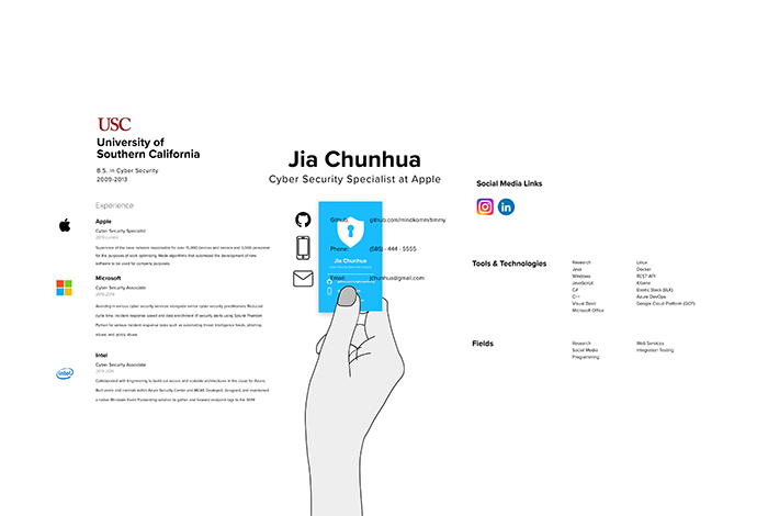
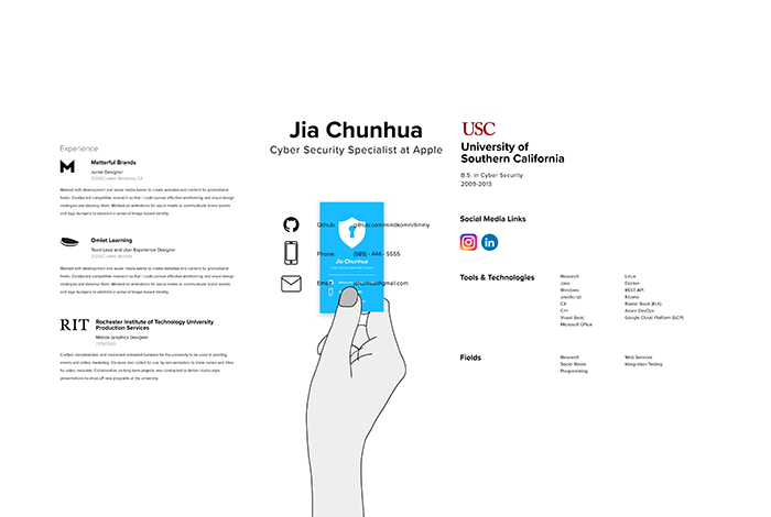
Augmented Reality
NECT utilizes Augmented Reality to enhance the limited information on a business card by providing as much detail as a full resume or online profile. The application supports both tap and gaze interaction for seamless exploration.
Easy to Share
The app scans QR codes on the back of the business cards, enabling users to quickly and easily share their contact information and professional experience.
Building a Network
Building a Network
All the scanned cards are automatically added to the app-based network, allowing users to not only search for people but also keep them in their network. The contacts are saved as both individuals and companies.
Micro Interactions
I decided that I wanted to have more sliding motions in the game as opposed to taps. This adds a greater level of player interaction. It also gives the player a greater eye candy.
Personal Mark
Users can create their profile with information on their contacts, skills, and experience, presenting their best self to the world with the hope of advancing their career.
11 -
Conclusion
Conclusion
Gains
With this opportunity, I polished both my UI/UX and motion design skills. I also learned to make practical Augmented Reality (AR) products that are more than just cool pieces of technology.
Challenges
Accessibility in Augmented Reality
Accessibility in Augmented Reality
AR is a new field of development. I did a lot of testing and research to see what not only I found would be comfortable, but also what less experienced users would find cosy.
No Scifi
No Scifi
For this project, I wanted to tie the design of the product to what is possible with available software. I had to learn a lot about the Unity Game Engine to create simple prototypes that demonstrate that my design is very achievable and not just science fiction
If I Had More Time
Customization
Overwhelming Information
It would have been helpful to demonstrate the process of creating and customizing a profile to better understand how to use NECT.
Micro Interactions
I decided that I wanted to have more sliding motions in the game as opposed to taps. This adds a greater level of player interaction. It also gives the player a greater eye candy.
More Options For Recruiters
More Options For Recruiters
The application is also used by recruiters to find qualified candidates. Unfortunately, I didn't have the time to connect with recruiters and delve deeper into what they require.
Micro Interactions
I decided that I wanted to have more sliding motions in the game as opposed to taps. This adds a greater level of player interaction. It also gives the player a greater eye candy.
Check out more 
Check out more
Lead Suspect Management
Buz-V3
Working With Buz